Chart position — tracked daily by LaunchShots
Screenshot style breakdown
Sampled from 5 of المصحف المدرسي's App Store screenshots — background, accent and theme, measured by LaunchShots (not something Apple publishes).
#ECECEC bg
#CFCFCF
#049484 accent
#111111 text
Screenshots
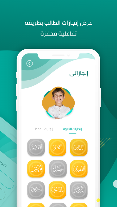
iPad screenshots
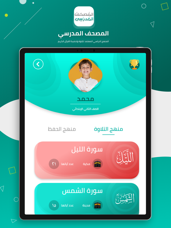
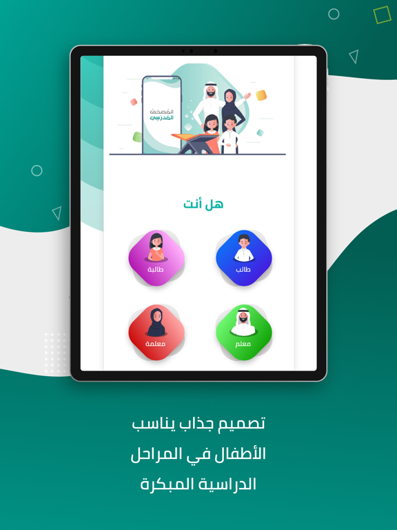
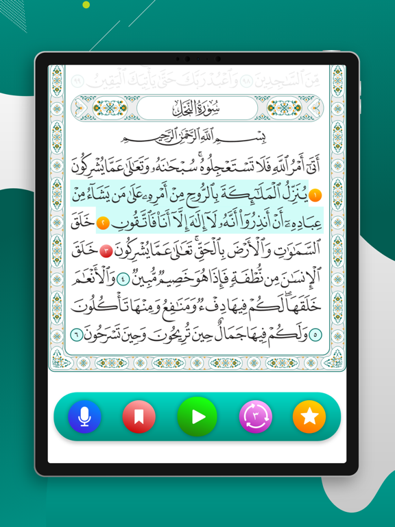


Icon palette
About this app
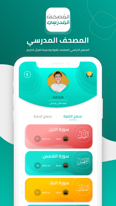
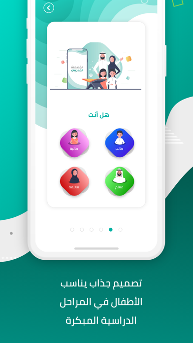
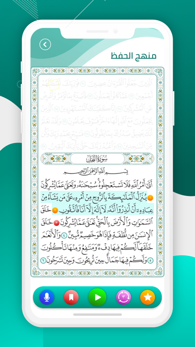
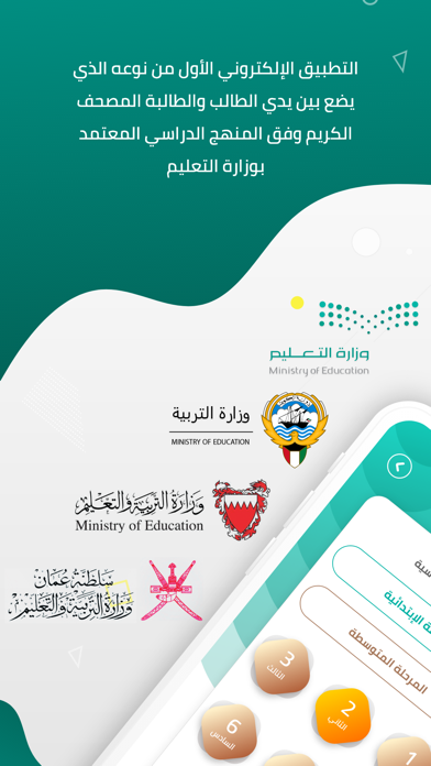
المنهج الدراسي: عرض المصحف وفقا للمنهج الدراسي المعتمد من وزارة التعليم لمادة القرآن الكريم. - المنهج المعتمد لوزارة التعليم بالسعودية - المنهج المعتمد لوزارة التعليم بالكويت - المنهج المعتمد لوزارة التعليم بالبحرين - المنهج المعتمد لوزارة التعليم بعمان حسابات للطلاب والمعلمين: إنشاء أكثر من حساب في مراحل تعليمية مختلفة في جوال واحد. منهج التلاوة والحفظ: تمييز منهج التلاوة والحفظ على مختلف الصفوف والفصول الدراسية. تلاوات لمشاهير القراء: تلاوات لأكثر من 10 مشاهير من القراء والسماع لها بالإنترنت وبدونه. 1. الشيخ عبدالرحمن السديس 2. الشيخ سعود الشريم 3. الشيخ إبراهيم الأخضر 4. الشيخ عبدالله بصفر 5. الشيخ محمد أيوب 6. الشيخ علي الحذيفي 7. الشيخ مشاري العفاسي 8. الشيخ ماهر المعيقلي 9. الشيخ محمد المنشاوي 10. الشيخ محمد المنشاوي وأطفال 11. الشيخ خليفة الطنيجي 12. الشيخ أحمد العجمي تصميم جذاب: يتناسب مع الأطفال في المراحل الدراسية المبكرة. تغيير لون المصحف: 4 ألوان مختلفة لصفحات المصحف تتلائ…
App details
What you can learn from المصحف المدرسي
Every shipping app on the App Store has gone through the same decisions you're working through right now: which screenshot goes first, what caption sits over it, which device frame to show, what color the background should be. The 10 screenshots above are المصحف المدرسي's answers to those questions — they're public, they're real, and they made it through Apple's review.
What the numbers say: المصحف المدرسي runs a mixed light-and-dark set where the background shifts from screenshot to screenshot (first shot #ECECEC) — each image has to stand on its own, so the captions carry more of the story. The accent colour we picked up, #049484, is the one to reuse for badges, arrows and highlighted words if you borrow this look. Hit Use this style to open the editor with these exact colours and drop your own screenshot in.
Notice the first screenshot in particular. It's the one users see in search results and on the product page, and it's where most apps spend their best caption and tightest design. Look at the proportion of background to phone, where the text sits, what one thing the image is trying to communicate.
Want to see how other Education apps approach the same problem? Browse more Education apps in the showcase.
Take what works into your own screenshots
Open LaunchShots and design your App Store & Google Play screenshots — pick a device frame, drop captions, ship in minutes. Free, in your browser.
Open the screenshot editor →Apps with a similar look
Closest background + accent colours among the listings we've analysed — useful when you want to see the same palette handled by a different team.