Chart position — tracked daily by LaunchShots
Screenshot style breakdown
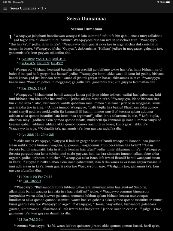
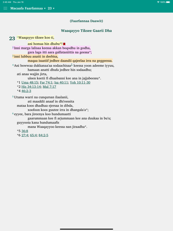
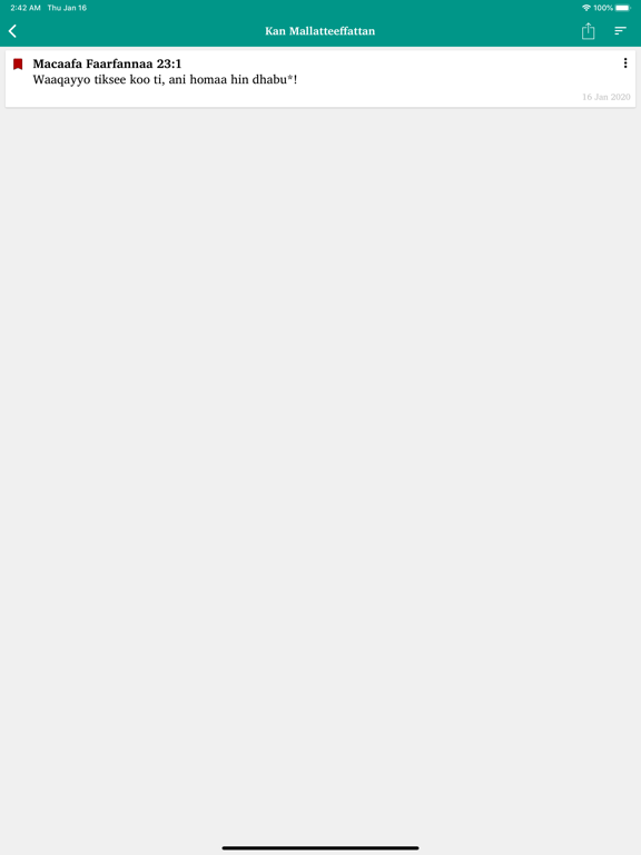
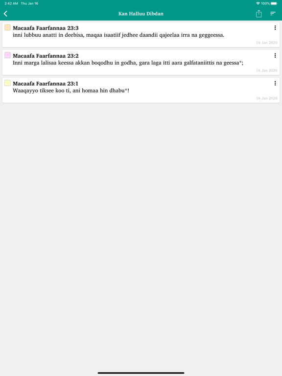
Sampled from 6 of Macaafa Qulqulluu Afaan Oromoo's App Store screenshots — background, accent and theme, measured by LaunchShots (not something Apple publishes).
#E4E4E4 bg
#C8C8C8
#04948C accent
#111111 text
Screenshots

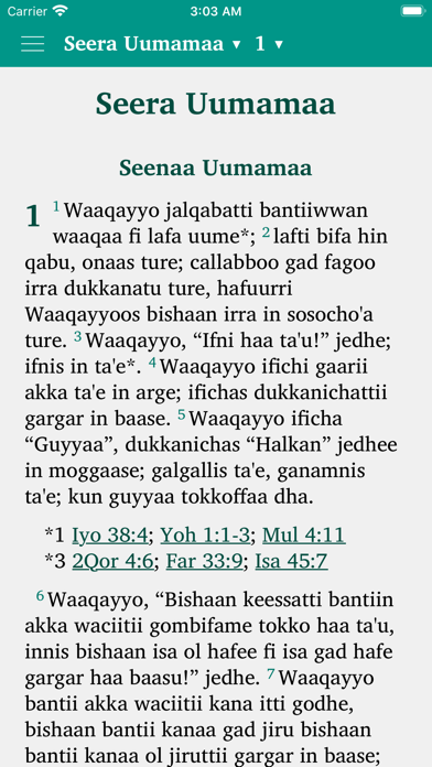

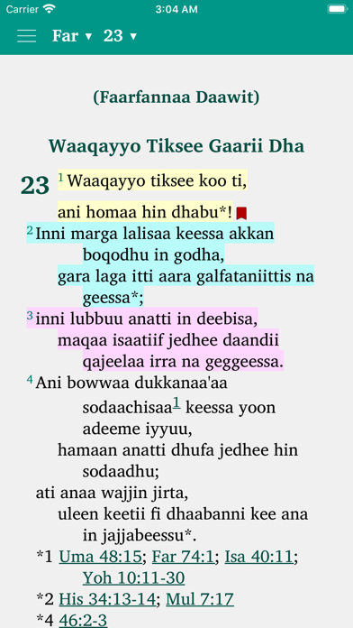


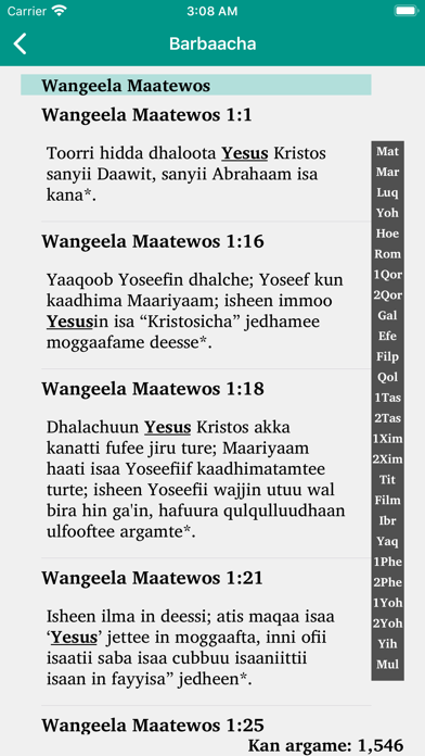


iPad screenshots

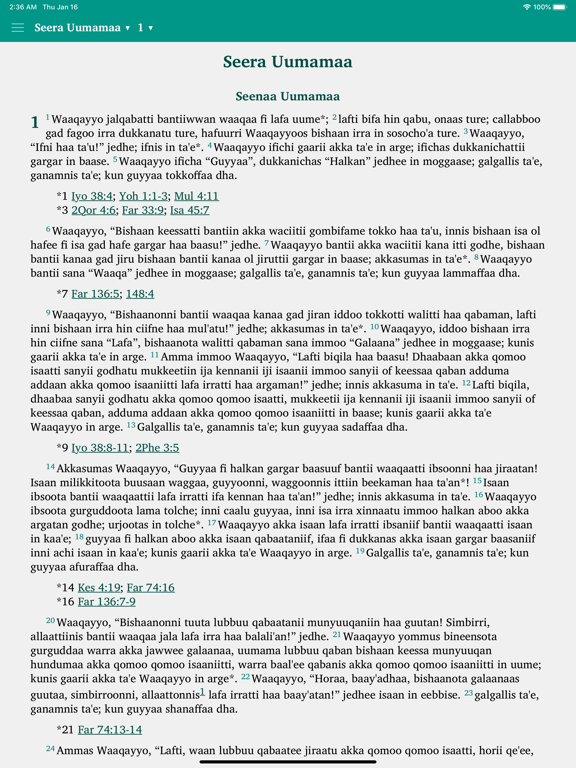




Icon palette
About this app
Macaafa Qulqulluu Onesmus Nesib namni biyya Oromoo bar 1899ti Macaafa Qulqulluu afaan Oromootti hiikee maxxansiisuudhaan saba Oromootiin ga’ee sabni keenya sagalee Waaqayyoo afaan isaatiin akka inni dubbiffatu godhe. Waggaa 120 booda, bara digitalaa (Digital Age) jedhamuundhaan kan beekamu jaarraa 21ffaa keessa akka itti ilmaan namootaa waa dubbifatan geeddaramaa dhufe. Har’a namni baayyeen waa dubbisuudhaaf meeshaa harkatti baatamu (Mobile device)tti fayyadama. Kana hubannaa keessa galchuudhaan karaa Tokkumma Woldootii Oromoo Warra Wangeelaa Awurooppaa Macaafa Qulqulluu Afaan Oromoo kana dubbisoota jaarraa 21ffaaf yeroo dhiheessinu gammachuu guddaatu nutti dhaga’ama; dubbistanii akka itti eebbifamtanis abdii qabna! L.Dr. Tasgara Hirpo Robsan Mako Developed by Waktola Merdassa waktolam@gmail.com Amajji, 2020
App details
What you can learn from Macaafa Qulqulluu Afaan Oromoo
Every shipping app on the App Store has gone through the same decisions you're working through right now: which screenshot goes first, what caption sits over it, which device frame to show, what color the background should be. The 20 screenshots above are Macaafa Qulqulluu Afaan Oromoo's answers to those questions — they're public, they're real, and they made it through Apple's review.
What the numbers say: Macaafa Qulqulluu Afaan Oromoo runs a mixed light-and-dark set where the background shifts from screenshot to screenshot (first shot #E4E4E4) — each image has to stand on its own, so the captions carry more of the story. The accent colour we picked up, #04948C, is the one to reuse for badges, arrows and highlighted words if you borrow this look. Hit Use this style to open the editor with these exact colours and drop your own screenshot in.
Notice the first screenshot in particular. It's the one users see in search results and on the product page, and it's where most apps spend their best caption and tightest design. Look at the proportion of background to phone, where the text sits, what one thing the image is trying to communicate.
Want to see how other Book apps approach the same problem? Browse more Book apps in the showcase.
Take what works into your own screenshots
Open LaunchShots and design your App Store & Google Play screenshots — pick a device frame, drop captions, ship in minutes. Free, in your browser.
Open the screenshot editor →Apps with a similar look
Closest background + accent colours among the listings we've analysed — useful when you want to see the same palette handled by a different team.