Chart position — tracked daily by LaunchShots
Screenshot style breakdown
Sampled from 6 of アパ直:アパ トラベル ホテル直接予約's App Store screenshots — background, accent and theme, measured by LaunchShots (not something Apple publishes).
#14140C bg
#34342E
#BCA454 accent
#FFFFFF text
Screenshots

Icon palette
About this app
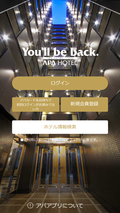
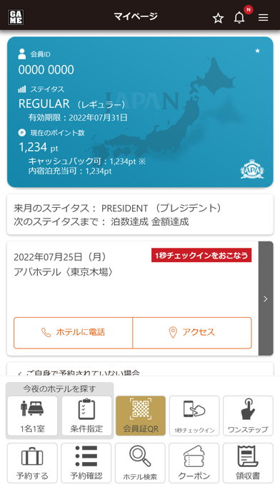
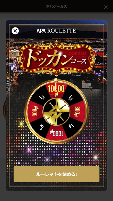
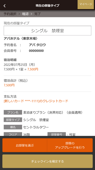
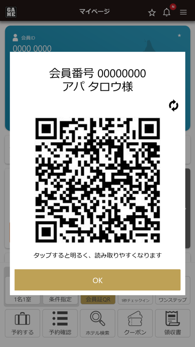
このアプリは、アパホテル株式会社および関連会社が運営する「アパホテル公式アプリ」です。 全国のアパホテルを検索して、条件にあった宿泊・日帰り・デイユースプランの予約、オンライン決済、アプリでチェックインのお手続き等ができます。 ■アプリでチェックインのお手続きを済ませて、ホテルへ到着すると「1秒チェックイン専用機」をご利用いただけます。専用機にアプリ会員証(QRコード)をタッチすれば、フロントでの面倒な手続きがスムーズに、お待たせすることなくお部屋のルームキーをお渡しいたします。※QRコードは株式会社デンソーウェーブの登録商標です ■【新都市型アパホテル】全国のアパホテルをご利用頂いた宿泊料金に応じて、アパポイントがたまります。アパホテル公式アプリからの予約なら、アパホテル公式サイト「アパ直」と同様に、他の宿泊サイトの10倍のポイントがたまり、常に最安値(ベストレート)です。貯まったポイントは現金で還元!またはカタログギフトと交換! ■機能紹介 1)ホテル検索 ・お使いのスマートホンのGPS機能で、現在…
App details
What you can learn from アパ直:アパ トラベル ホテル直接予約
Every shipping app on the App Store has gone through the same decisions you're working through right now: which screenshot goes first, what caption sits over it, which device frame to show, what color the background should be. The 6 screenshots above are アパ直:アパ トラベル ホテル直接予約's answers to those questions — they're public, they're real, and they made it through Apple's review.
What the numbers say: アパ直:アパ トラベル ホテル直接予約 runs a mixed light-and-dark set where the background shifts from screenshot to screenshot (first shot #14140C) — each image has to stand on its own, so the captions carry more of the story. The accent colour we picked up, #BCA454, is the one to reuse for badges, arrows and highlighted words if you borrow this look. Hit Use this style to open the editor with these exact colours and drop your own screenshot in.
Notice the first screenshot in particular. It's the one users see in search results and on the product page, and it's where most apps spend their best caption and tightest design. Look at the proportion of background to phone, where the text sits, what one thing the image is trying to communicate.
Want to see how other Travel apps approach the same problem? Browse more Travel apps in the showcase.
Take what works into your own screenshots
Open LaunchShots and design your App Store & Google Play screenshots — pick a device frame, drop captions, ship in minutes. Free, in your browser.
Open the screenshot editor →Apps with a similar look
Closest background + accent colours among the listings we've analysed — useful when you want to see the same palette handled by a different team.