Chart position — tracked daily by LaunchShots
Screenshot changes — detected by LaunchShots
Screenshot style breakdown
Sampled from 6 of goesti. бартер с блогерами's App Store screenshots — background, accent and theme, measured by LaunchShots (not something Apple publishes).
#0C0C0C bg
#2E2E2E
#846454 accent
#FFFFFF text
Screenshots




Icon palette
About this app
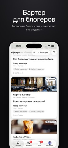
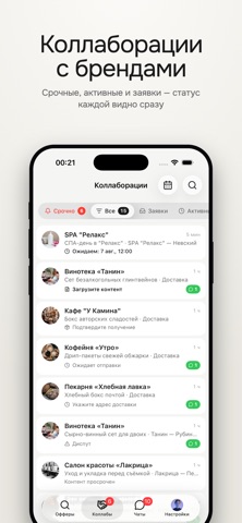
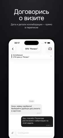
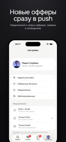
Коллаборации с местами и брендами, которые тебе нравятся. goesti. — здесь рестораны, кофейни, бары, салоны красоты, фитнес-студии, а также бренды и интернет-магазины сами ищут блогеров. Выбираешь оффер под свою аудиторию: бронируешь визит или получаешь товар с доставкой. Без холодных питчей и неловких переговоров о бартере. Рекомендуешь только то, что попробовал сам — а это то, что аудитория ценит больше всего. КАК ЭТО РАБОТАЕТ 1. Листаешь ленту офферов: визиты в заведения и товары от брендов. 2. Откликаешься — бронируешь визит на удобную дату или оставляешь заявку на товар. 3. Подтверждаешь визит QR-кодом на месте — или просто получаешь посылку домой. 4. Публикуешь контент в срок — и берёшь следующий оффер. ЗАЧЕМ ТЕБЕ goesti. — Доступ к местам по бартеру: впечатления вместо счёта — Онлайн-коллаборации: бренды отправляют товар — снимаешь распаковку и обзор, не выходя из дома — Офферы…
App details
What you can learn from goesti. бартер с блогерами
Every shipping app on the App Store has gone through the same decisions you're working through right now: which screenshot goes first, what caption sits over it, which device frame to show, what color the background should be. The 10 screenshots above are goesti. бартер с блогерами's answers to those questions — they're public, they're real, and they made it through Apple's review.
What the numbers say: goesti. бартер с блогерами runs a mixed light-and-dark set where the background shifts from screenshot to screenshot (first shot #0C0C0C) — each image has to stand on its own, so the captions carry more of the story. The accent colour we picked up, #846454, is the one to reuse for badges, arrows and highlighted words if you borrow this look. Hit Use this style to open the editor with these exact colours and drop your own screenshot in.
Notice the first screenshot in particular. It's the one users see in search results and on the product page, and it's where most apps spend their best caption and tightest design. Look at the proportion of background to phone, where the text sits, what one thing the image is trying to communicate.
Want to see how other Lifestyle apps approach the same problem? Browse more Lifestyle apps in the showcase.
Take what works into your own screenshots
Open LaunchShots and design your App Store & Google Play screenshots — pick a device frame, drop captions, ship in minutes. Free, in your browser.
Open the screenshot editor →Apps with a similar look
Closest background + accent colours among the listings we've analysed — useful when you want to see the same palette handled by a different team.