Chart position — tracked daily by LaunchShots
Screenshot style breakdown
Sampled from 6 of ไพ่แคง-รวมดัมมี่ ป๊อกเด้ง ไฮโล's App Store screenshots — background, accent and theme, measured by LaunchShots (not something Apple publishes).
#7494CC bg
#6682B3
#FC9404 accent
#111111 text
Screenshots
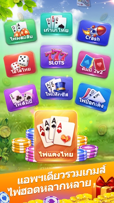
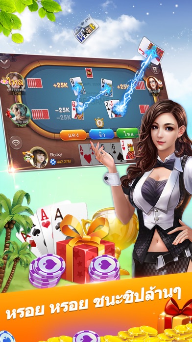
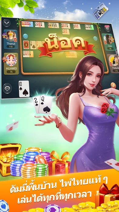
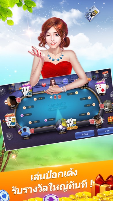
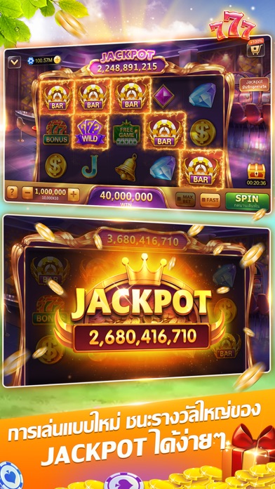
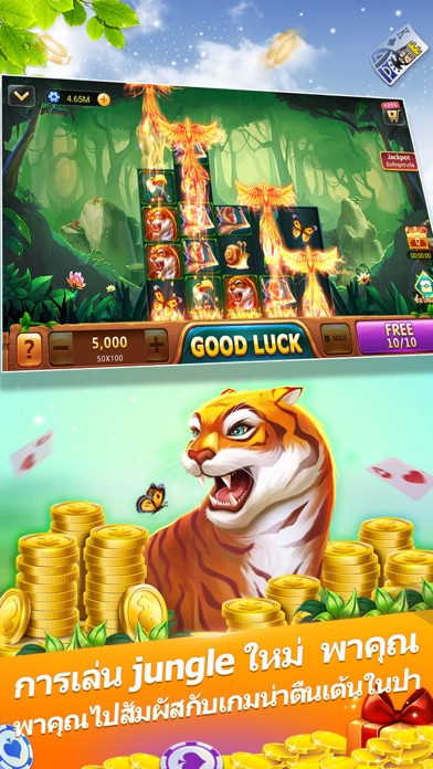
iPad screenshots

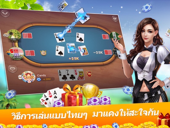


Icon palette
About this app
ไพ่แคงเป็นเกมสุดฮิตที่มีคนไทยเล่นกันเยอะมาก จำเป็นต้องอาศัยทักษะและความจำด้วย ผู้เล่นเทียบแต้มกันด้วย ใครได้แต้มน้อย จะเป็นผู้ชนะ ไม่ว่าจะเป็นคนชอบเล่นไพ่เท็กซัส ไพ่เก้าเก ไพ่ดัมมี่ ป๊อกเด้ง ไฮโล หรือ SLOTS มั่นใจว่าลองเล่นเกมนี้แล้วจะติดใจแน่ๆ มาสัมผัสกับความสนุกตื่นเต้นที่เกมไพ่แคงสิ 1.โหลดมาเล่นฟรี สามารถรับชิปฟรีโดยล็อกอินเกทุกวัน ชวนเพื่อนและทำภารกิจ ไม่เสียเงินก็เล่นอย่างสนุก 2.ผู้เล่นที่สมัครเข้าใหม่ จะได้รับรางวัลมือใหม่สุดหรูต่อเนื่อง 3 วัน ชิปฟรีมากมายและของขวัญสวยเก๋รอท่านมารับอยู่ 3.แค่ล็อกอินเกมทุกวันก็จะได้รับชิปมากมาย ล็อกอินด้วยบัญชี Facebook จะได้รับรางวัลเพิ่มอีก 50% 4.แรงกิ้งอัพเดททุกวัน ผู้เล่นสามารถเพิ่มเซียนมือเป็นเพื่อนแล้วติดตามเข้าไปเล่นในห้องเดียวกันได้ 5.ชวนเพื่อนเฟสบุ๊คมาเล่นเกมกัน เชิญชวนปุ๊บรับรางวัลปุ๊บ ยังสามารถเพิ่มผู้เล่นอื่นมาเป็นเพื่อน แล้วส่งชิปให้ซึ่งกันและกันได้ 6.ปั่นสล็อตฮอดฮิตและวงล้อนำโชคก็สามารถรับรางวัลชิปได้มากมาย ผู้ที่โชคดีๆรีบมาเข้าเล่นกั…
App details
What you can learn from ไพ่แคง-รวมดัมมี่ ป๊อกเด้ง ไฮโล
Every shipping app on the App Store has gone through the same decisions you're working through right now: which screenshot goes first, what caption sits over it, which device frame to show, what color the background should be. The 12 screenshots above are ไพ่แคง-รวมดัมมี่ ป๊อกเด้ง ไฮโล's answers to those questions — they're public, they're real, and they made it through Apple's review.
What the numbers say: ไพ่แคง-รวมดัมมี่ ป๊อกเด้ง ไฮโล runs a light set where the background shifts from screenshot to screenshot (first shot #7494CC) — each image has to stand on its own, so the captions carry more of the story. The accent colour we picked up, #FC9404, is the one to reuse for badges, arrows and highlighted words if you borrow this look. Hit Use this style to open the editor with these exact colours and drop your own screenshot in.
Notice the first screenshot in particular. It's the one users see in search results and on the product page, and it's where most apps spend their best caption and tightest design. Look at the proportion of background to phone, where the text sits, what one thing the image is trying to communicate.
Want to see how other Games apps approach the same problem? Browse more Games apps in the showcase.
Take what works into your own screenshots
Open LaunchShots and design your App Store & Google Play screenshots — pick a device frame, drop captions, ship in minutes. Free, in your browser.
Open the screenshot editor →Apps with a similar look
Closest background + accent colours among the listings we've analysed — useful when you want to see the same palette handled by a different team.