Chart position — tracked daily by LaunchShots
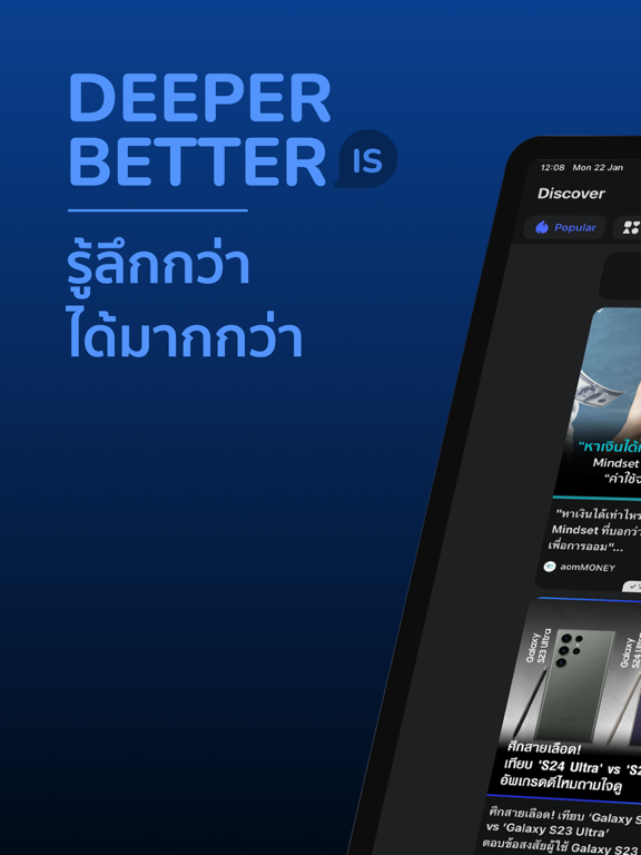
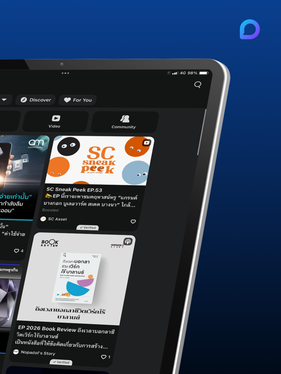
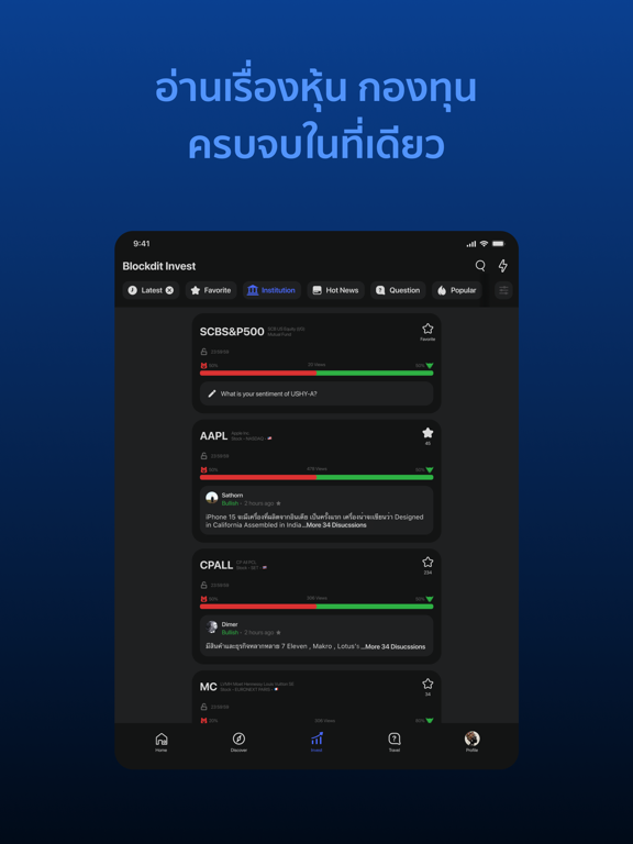
Screenshot style breakdown
Sampled from 5 of Blockdit's App Store screenshots — background, accent and theme, measured by LaunchShots (not something Apple publishes).
#0C3C8C bg
#2E579C
#5494FC accent
#FFFFFF text
Screenshots

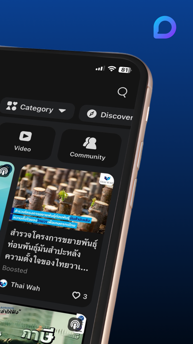
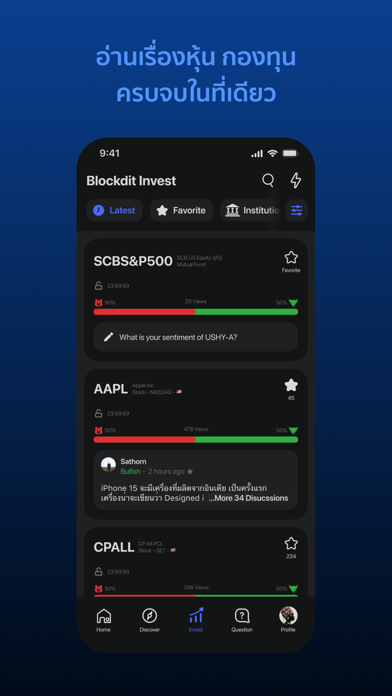
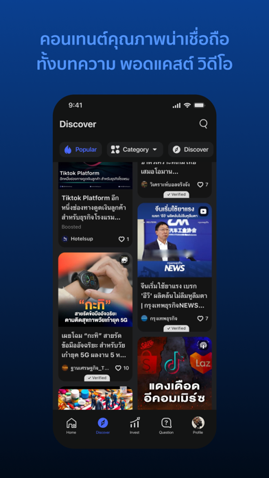
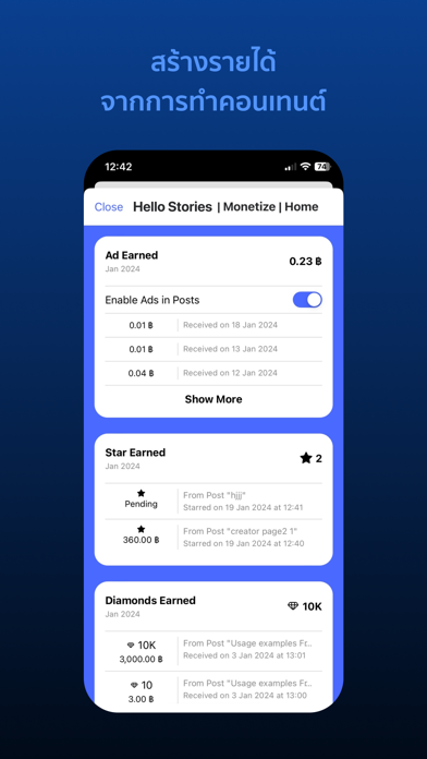
iPad screenshots


Icon palette
About this app
Blockdit เป็นแพลตฟอร์มสำหรับผู้ที่มองหาไอเดียใหม่ ๆ ซึ่งกำลังเป็นที่นิยมในกลุ่มคนที่หลงใหลในการอ่าน เขียน เล่าเรื่องราว และต้องการสร้างสรรค์สังคมให้ดีขึ้นในเรื่องที่พวกเขาสนใจ Blockdit ไม่มีระบบเพื่อน ทำให้เราสามารถโฟกัสเฉพาะเรื่องราวที่เราติดตาม เพจ หรือนักเขียนที่เราชื่นชอบ ซึ่งทำให้เกิดไอเดียใหม่ได้ เข้ามาร่วมเป็นส่วนหนึ่งกับสังคมได้ที่นี่ ทำความรู้จักกับสังคมใน Blockdit นักทำคอนเทนต์ - แชร์ไอเดียของเรา ผ่านบทความ วิดีโอ และพอดแคสต์ - มีระบบสร้างรายได้ - สนุกไปกับฟีเจอร์สำหรับนักทำคอนเทนต์โดยเฉพาะ เช่น โหมดร่างไอเดีย ตั้งเวลา ดูข้อมูลเชิงลึก นักอ่าน - รับไอเดียใหม่ๆ จากผู้คน และเพจมากมาย - มีคอนเทนต์จากหลายหมวดหมู่ให้ติดตาม - เลือกติดตามนักเขียนได้ตามความสนใจ และสามารถให้รางวัลแก่โพสต์ที่เราชื่นชอบ - แสดงความคิดเห็น หรือส่งข้อความโดยตรงไปหาเพจเพื่อใกล้ชิดกับผู้สร้างคอนเทนต์ แล้ว Blockdit มีจุดเด่นอะไร จะทำให้เกิดไอเดียได้อย่างไร? - คอนเทนต์หลายประเภท บางคนเกิดไอเดียจากการอ่าน…
App details
What you can learn from Blockdit
Every shipping app on the App Store has gone through the same decisions you're working through right now: which screenshot goes first, what caption sits over it, which device frame to show, what color the background should be. The 10 screenshots above are Blockdit's answers to those questions — they're public, they're real, and they made it through Apple's review.
What the numbers say: Blockdit runs a dark set where the background shifts from screenshot to screenshot (first shot #0C3C8C) — each image has to stand on its own, so the captions carry more of the story. The accent colour we picked up, #5494FC, is the one to reuse for badges, arrows and highlighted words if you borrow this look. Hit Use this style to open the editor with these exact colours and drop your own screenshot in.
Notice the first screenshot in particular. It's the one users see in search results and on the product page, and it's where most apps spend their best caption and tightest design. Look at the proportion of background to phone, where the text sits, what one thing the image is trying to communicate.
Want to see how other News apps approach the same problem? Browse more News apps in the showcase.
Take what works into your own screenshots
Open LaunchShots and design your App Store & Google Play screenshots — pick a device frame, drop captions, ship in minutes. Free, in your browser.
Open the screenshot editor →Apps with a similar look
Closest background + accent colours among the listings we've analysed — useful when you want to see the same palette handled by a different team.