Chart position — tracked daily by LaunchShots
Screenshot style breakdown
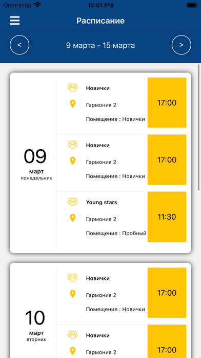
Sampled from 6 of Юниор's App Store screenshots — background, accent and theme, measured by LaunchShots (not something Apple publishes).
#FCFCFC bg
#DDDDDD
#1C3C64 accent
#111111 text
Screenshots




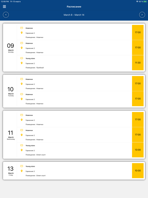
iPad screenshots




Icon palette
About this app
Крупнейшая в России сеть частных футбольных школ ведет набор детей с 3-х лет. Футбольная школа Юниор - это возможность для каждого ребёнка получить качественную спортивную подготовку. Тем, кто проявляет талант, мы даём возможность попробовать свои силы в ведущих местных и европейских футбольных клубах. Однако стоит признаться, что далеко не все дети стремятся сделать карьеру профессионального футболиста. Но это не означает, что тренировки по футболу станут для них пустой тратой времени. Наоборот - лучшее, что есть в детском спорте - это не изматывающая гонка за карьерой, а полезное увлечение ребёнка, которое улучшает здоровье, формирует спортивный характер и позволяет найти верных друзей. В ФШ Юниор учебный процесс построен таким образом, чтобы ребенок с удовольствием посещал наши тренировки. Современные дети всё больше времени проводят у компьютера. Наша миссия - привить им увлечени…
App details
What you can learn from Юниор
Every shipping app on the App Store has gone through the same decisions you're working through right now: which screenshot goes first, what caption sits over it, which device frame to show, what color the background should be. The 12 screenshots above are Юниор's answers to those questions — they're public, they're real, and they made it through Apple's review.
What the numbers say: Юниор runs a mixed light-and-dark set where the background shifts from screenshot to screenshot (first shot #FCFCFC) — each image has to stand on its own, so the captions carry more of the story. The accent colour we picked up, #1C3C64, is the one to reuse for badges, arrows and highlighted words if you borrow this look. Hit Use this style to open the editor with these exact colours and drop your own screenshot in.
Notice the first screenshot in particular. It's the one users see in search results and on the product page, and it's where most apps spend their best caption and tightest design. Look at the proportion of background to phone, where the text sits, what one thing the image is trying to communicate.
Want to see how other Sports apps approach the same problem? Browse more Sports apps in the showcase.
Take what works into your own screenshots
Open LaunchShots and design your App Store & Google Play screenshots — pick a device frame, drop captions, ship in minutes. Free, in your browser.
Open the screenshot editor →Apps with a similar look
Closest background + accent colours among the listings we've analysed — useful when you want to see the same palette handled by a different team.