Chart position — tracked daily by LaunchShots
Screenshot style breakdown
Sampled from 5 of Metrovalencia oficial's App Store screenshots — background, accent and theme, measured by LaunchShots (not something Apple publishes).
#FCFCFC bg
#DDDDDD
#C40C3C accent
#111111 text
Screenshots



Icon palette
About this app
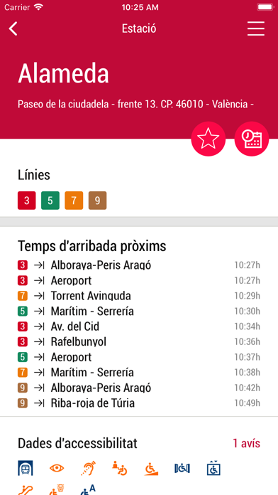
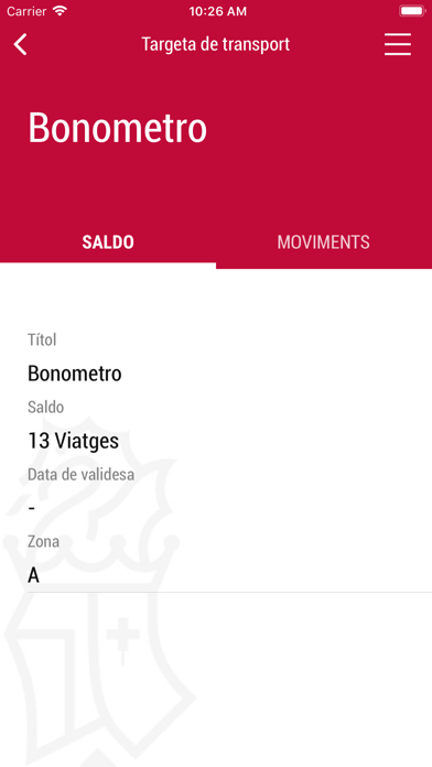
Metrovalencia és l'aplicació oficial del servei de metro i tramvia de la ciutat de València i la seua àrea metropolitana. Ací trobaràs tota la informació que necessites i podràs fer gestions i consultes estigues on estigues. Amb esta aplicació podràs: Consultar els horaris de pas per la teua estació. - Consultar el pla de la xarxa. - Planificar el teu trajecte. - Registrar les teues targetes per a beneficiar-te dels avantatges que oferix. - Recarregar títols online. - Consultar el saldo de la teua targeta. - Consultar informació bàsica com a normes de viatge, tarifes aplicables, etc. - Estar al dia de les novetats i modificacions. - Rebre avisos davant d'incidències en el servei. - Contactar directament amb el nostre servei d'atenció al client. - Personalitzar l'idioma, guardar estacions i trajectes com a favorits per a agilitzar les consultes… - I moltes més. Amb la garantia de ser l…
App details
What you can learn from Metrovalencia oficial
Every shipping app on the App Store has gone through the same decisions you're working through right now: which screenshot goes first, what caption sits over it, which device frame to show, what color the background should be. The 5 screenshots above are Metrovalencia oficial's answers to those questions — they're public, they're real, and they made it through Apple's review.
What the numbers say: Metrovalencia oficial runs a light set with one background colour (#FCFCFC) carried across every screenshot — the listing reads as a single poster when the shots sit side by side in search results. The accent colour we picked up, #C40C3C, is the one to reuse for badges, arrows and highlighted words if you borrow this look. Hit Use this style to open the editor with these exact colours and drop your own screenshot in.
Notice the first screenshot in particular. It's the one users see in search results and on the product page, and it's where most apps spend their best caption and tightest design. Look at the proportion of background to phone, where the text sits, what one thing the image is trying to communicate.
Want to see how other Navigation apps approach the same problem? Browse more Navigation apps in the showcase.
Take what works into your own screenshots
Open LaunchShots and design your App Store & Google Play screenshots — pick a device frame, drop captions, ship in minutes. Free, in your browser.
Open the screenshot editor →Apps with a similar look
Closest background + accent colours among the listings we've analysed — useful when you want to see the same palette handled by a different team.