Chart position — tracked daily by LaunchShots
Screenshot style breakdown
Sampled from 6 of 海釣図V ~海底地形がわかる海釣りマップ~'s App Store screenshots — background, accent and theme, measured by LaunchShots (not something Apple publishes).
#04447C bg
#275E8E
#6CB4DC accent
#FFFFFF text
Screenshots
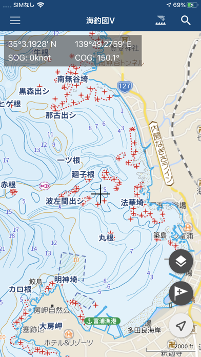
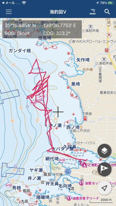
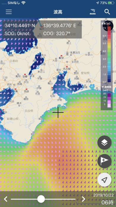
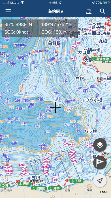

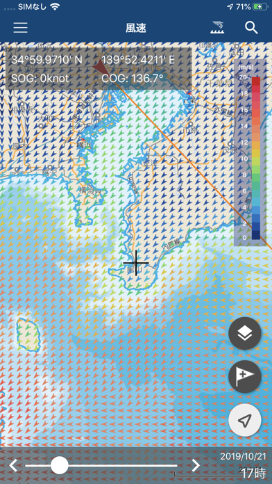
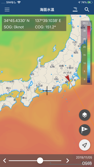

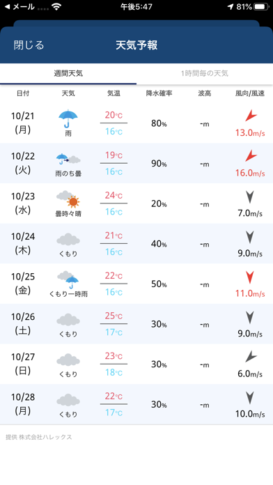
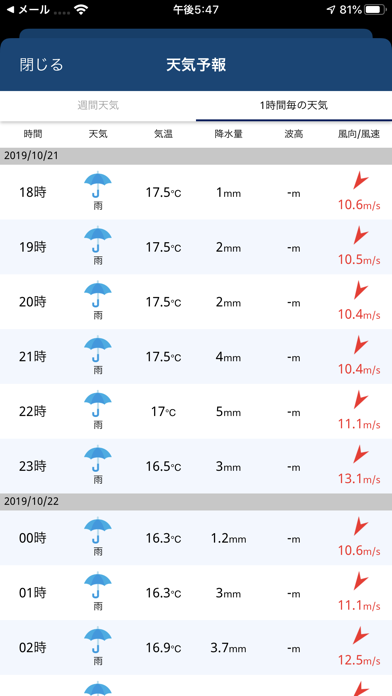
iPad screenshots
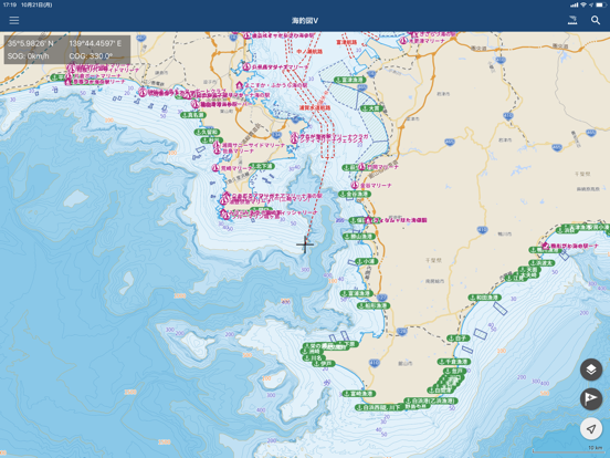
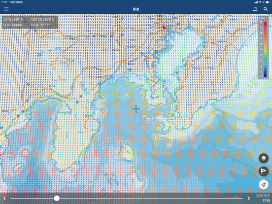
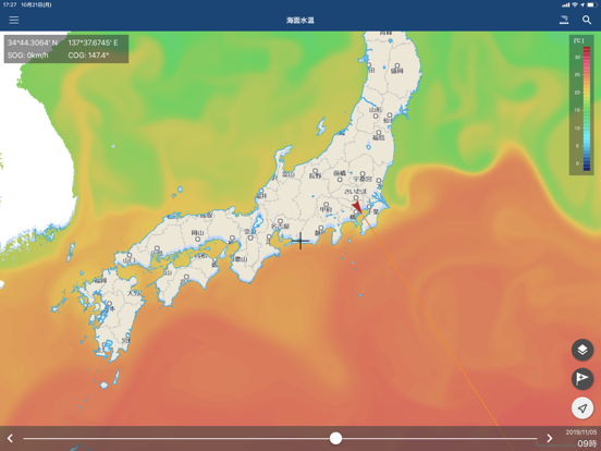
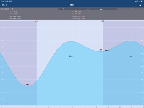
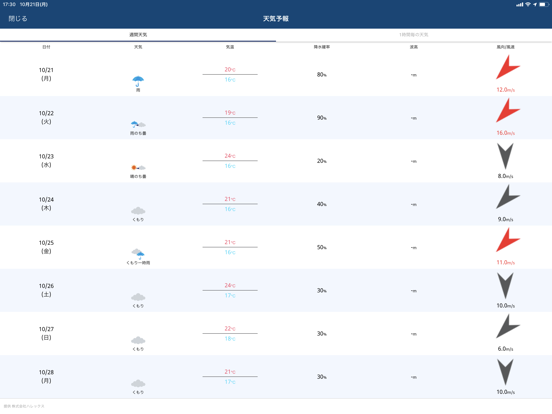
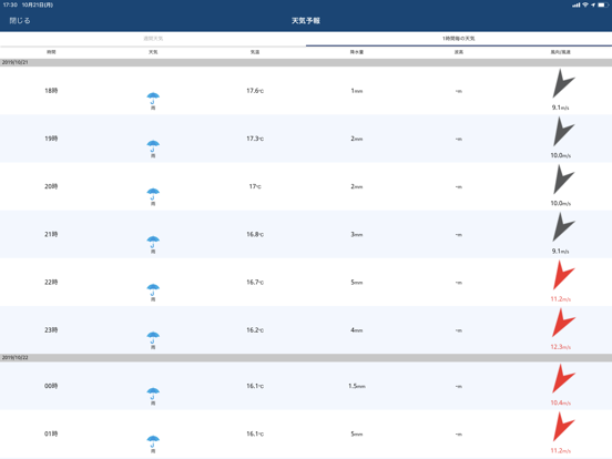
Icon palette
About this app
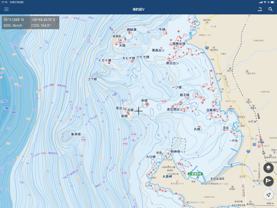
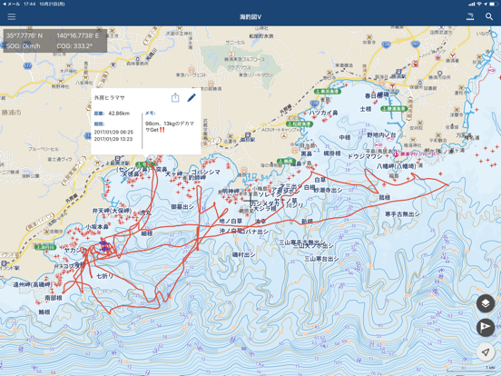
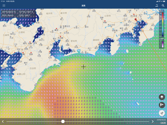
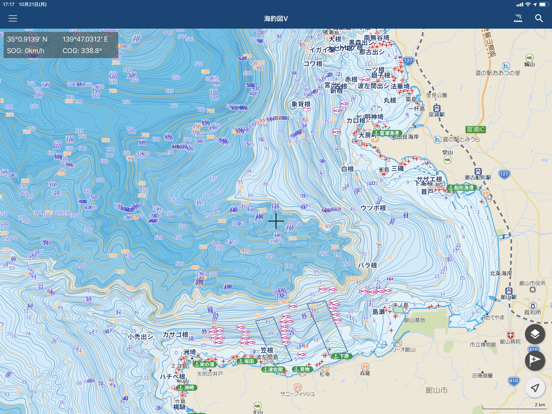
海釣りジャンルのNo.1アプリ「海釣図」がリニューアルして新登場!! ■『海釣図V』ってどんなアプリ? 『海釣図V』は、「航海用電子参考図 new pec(提供:(財)日本水路協会)」を採用した海釣りジャンルのNo.1アプリ「海釣図」の後継版アプリです。 これまでに、現在提供中の「海釣図」ユーザー様からいただいた ・エリアを追加して欲しい! ・地図の境目が使いづらい! ・拡大すると画像が粗い! など、沢山のご指摘・ご要望の多くに対応した、新たな海釣りマップアプリが『海釣図V』! もちろん、「海釣図」でご好評いただいていました ・最小1m単位の等深線が確認できる地図 ・風・波などの海況予報やピンポイント天気 ・タイドグラフ などの主な機能を継承! さらにiPhoneにプリインストールされているマップアプリのように、シームレスでサクサク使えるアプリとして、大幅リニューアルした海釣りマップアプリです。 ■『海釣図V』と「海釣図」の大きな違い! ○提供エリアが日本全域に大幅拡大! ・「new pec」の提供エリアを網羅 ・これ…
App details
What you can learn from 海釣図V ~海底地形がわかる海釣りマップ~
Every shipping app on the App Store has gone through the same decisions you're working through right now: which screenshot goes first, what caption sits over it, which device frame to show, what color the background should be. The 20 screenshots above are 海釣図V ~海底地形がわかる海釣りマップ~'s answers to those questions — they're public, they're real, and they made it through Apple's review.
What the numbers say: 海釣図V ~海底地形がわかる海釣りマップ~ runs a dark set with one background colour (#04447C) carried across every screenshot — the listing reads as a single poster when the shots sit side by side in search results. The accent colour we picked up, #6CB4DC, is the one to reuse for badges, arrows and highlighted words if you borrow this look. Hit Use this style to open the editor with these exact colours and drop your own screenshot in.
Notice the first screenshot in particular. It's the one users see in search results and on the product page, and it's where most apps spend their best caption and tightest design. Look at the proportion of background to phone, where the text sits, what one thing the image is trying to communicate.
Want to see how other Sports apps approach the same problem? Browse more Sports apps in the showcase.
Take what works into your own screenshots
Open LaunchShots and design your App Store & Google Play screenshots — pick a device frame, drop captions, ship in minutes. Free, in your browser.
Open the screenshot editor →Apps with a similar look
Closest background + accent colours among the listings we've analysed — useful when you want to see the same palette handled by a different team.