Chart position — tracked daily by LaunchShots
Screenshot style breakdown
Sampled from 5 of تدارس القرآن's App Store screenshots — background, accent and theme, measured by LaunchShots (not something Apple publishes).
#FCFCFC bg
#DDDDDD
#84744C accent
#111111 text
Screenshots
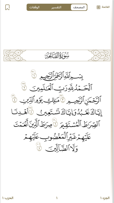
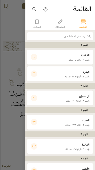
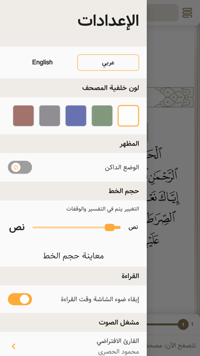
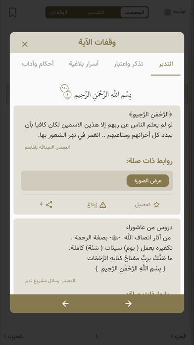
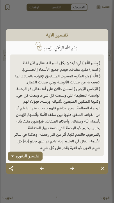
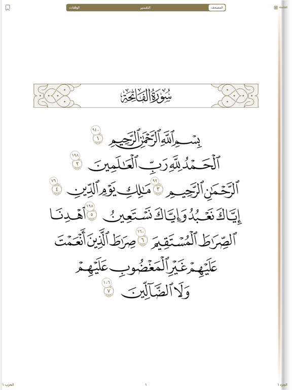
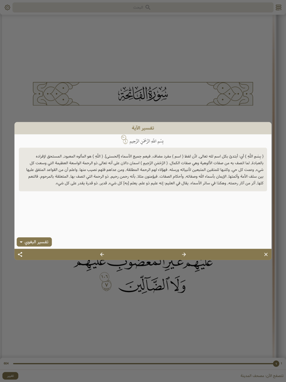
iPad screenshots


Icon palette
About this app
بفكرة إبداعية غير مسبوقة ، وبجهد ضخم بلغ عشرات الآلاف من ساعات العمل المتواصلة ، يسرنا ان نقدم لكم تطبيق ( تدارس القرآن ) : وهو مصحف جديد تتلوا من خلاله القرآن الكريم ، و تجد في كل آية منه وقفات متنوعه ، تبحر بها إلى كنوز القران وتنهل من لآلئ خيراته ، وذلك من خلال أقسام متعدده تحتوي على أكثر من مائة ألف وقفة مقسمة كالتالي : ١- تدبرات وتأملات قرآنية منوعه ما بين نصية وجرافيك ومقاطع يوتيوب مع امكانية المستخدم كتابة تدبراته الخاصة والتفاعل مع الوقفات الاخرى. ٢- تفسير للقرآن الكريم بمقاطع مرئية ومسموعة لكبار المشايخ المعاصرين مثل ابن باز وابن عثيمين والشنقيطي والشعراوي ، وغيرهم الكثير الكثير . ٣- الأسرار البلاغية في الآية : الآلاف من الاسرار البلاغية التي استنبطها العلماء وقدمناها بعدة اشكال مرئية ومسموعة ومكتوبة . ٤- تذكر وإعتبار : قسم منوع فيه الإعجاز العلمي في القران ، وقصص مع الآيه ، وكلمات العلماء عنها ، وغيره من علوم الآية وكنوزها . ٥- الأحكام الفقهية والأداب التي تحد…
App details
What you can learn from تدارس القرآن
Every shipping app on the App Store has gone through the same decisions you're working through right now: which screenshot goes first, what caption sits over it, which device frame to show, what color the background should be. The 10 screenshots above are تدارس القرآن's answers to those questions — they're public, they're real, and they made it through Apple's review.
What the numbers say: تدارس القرآن runs a mixed light-and-dark set where the background shifts from screenshot to screenshot (first shot #FCFCFC) — each image has to stand on its own, so the captions carry more of the story. The accent colour we picked up, #84744C, is the one to reuse for badges, arrows and highlighted words if you borrow this look. Hit Use this style to open the editor with these exact colours and drop your own screenshot in.
Notice the first screenshot in particular. It's the one users see in search results and on the product page, and it's where most apps spend their best caption and tightest design. Look at the proportion of background to phone, where the text sits, what one thing the image is trying to communicate.
Want to see how other Book apps approach the same problem? Browse more Book apps in the showcase.
Take what works into your own screenshots
Open LaunchShots and design your App Store & Google Play screenshots — pick a device frame, drop captions, ship in minutes. Free, in your browser.
Open the screenshot editor →Apps with a similar look
Closest background + accent colours among the listings we've analysed — useful when you want to see the same palette handled by a different team.