Chart position — tracked daily by LaunchShots
Screenshot style breakdown
Sampled from 6 of Thư Viện Số - ViLIB's App Store screenshots — background, accent and theme, measured by LaunchShots (not something Apple publishes).
#FCCC44 bg
#DDB33B
#045CAC accent
#111111 text
Screenshots
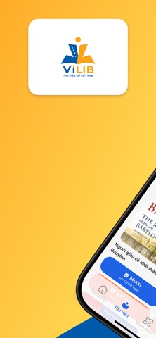

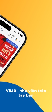


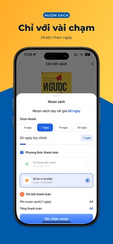

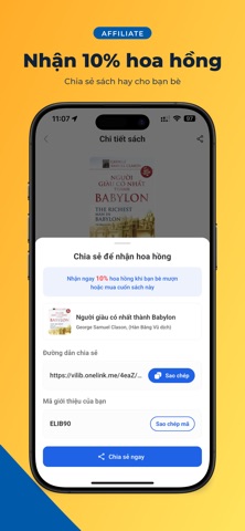
iPad screenshots


Icon palette
About this app
Đọc thử trước khi mượn, gia hạn linh hoạt và mang cả thư viện số theo bên mình. ViLIB là nơi bạn tìm, mượn và đọc sách, giáo trình, tài liệu nghiên cứu, luận văn và bài báo khoa học bất cứ khi nào bạn cần. Với ViLIB, bạn có thể: - Khám phá kho sách được sắp theo chủ đề: phát triển bản thân, triết học, chữa lành, kinh doanh, nuôi dạy con cùng nhiều lĩnh vực học thuật khác. - Đọc thử trước khi mượn, để chắc chắn cuốn sách thật sự hợp với mình rồi mới quyết định. - Mượn sách chỉ với vài chạm, đọc trong thời gian sử dụng và gia hạn linh hoạt khi chưa đọc xong. - Theo dõi tủ sách cá nhân: biết mình đang mượn gì, còn bao nhiêu ngày và đọc tới đâu. - Tham gia thư viện của trường học, doanh nghiệp hoặc tổ chức bằng mã mời. Dành cho Học sinh, sinh viên, giảng viên, nghiên cứu sinh, người đi làm và bất kỳ ai thích đọc, thích học hỏi mỗi ngày. Gia đình và doanh nghiệp có thể dùng chung một tủ sá…
App details
What you can learn from Thư Viện Số - ViLIB
Every shipping app on the App Store has gone through the same decisions you're working through right now: which screenshot goes first, what caption sits over it, which device frame to show, what color the background should be. The 12 screenshots above are Thư Viện Số - ViLIB's answers to those questions — they're public, they're real, and they made it through Apple's review.
What the numbers say: Thư Viện Số - ViLIB runs a mixed light-and-dark set where the background shifts from screenshot to screenshot (first shot #FCCC44) — each image has to stand on its own, so the captions carry more of the story. The accent colour we picked up, #045CAC, is the one to reuse for badges, arrows and highlighted words if you borrow this look. Hit Use this style to open the editor with these exact colours and drop your own screenshot in.
Notice the first screenshot in particular. It's the one users see in search results and on the product page, and it's where most apps spend their best caption and tightest design. Look at the proportion of background to phone, where the text sits, what one thing the image is trying to communicate.
Want to see how other Book apps approach the same problem? Browse more Book apps in the showcase.
Take what works into your own screenshots
Open LaunchShots and design your App Store & Google Play screenshots — pick a device frame, drop captions, ship in minutes. Free, in your browser.
Open the screenshot editor →Apps with a similar look
Closest background + accent colours among the listings we've analysed — useful when you want to see the same palette handled by a different team.