Screenshot style breakdown
Sampled from 6 of Кавёр: знакомства и встречи's App Store screenshots — background, accent and theme, measured by LaunchShots (not something Apple publishes).
#040404 bg
#272727
#044C64 accent
#FFFFFF text
Screenshots
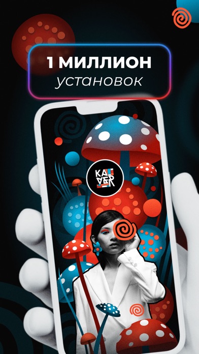
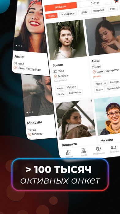
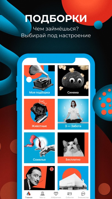
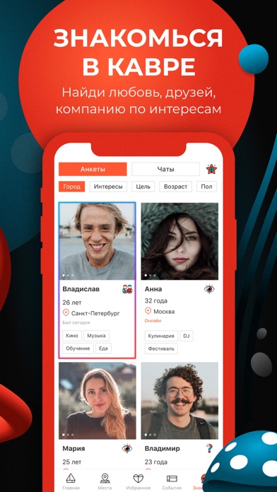
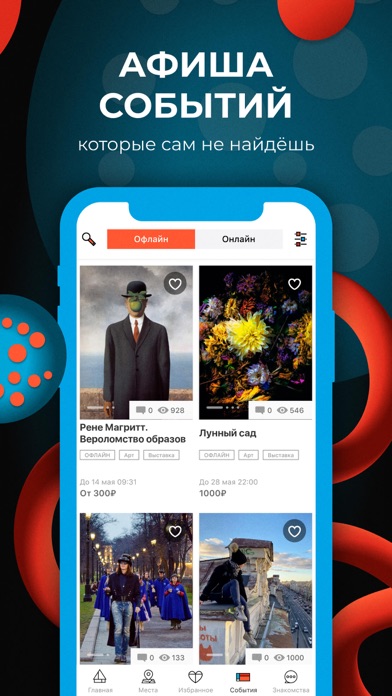
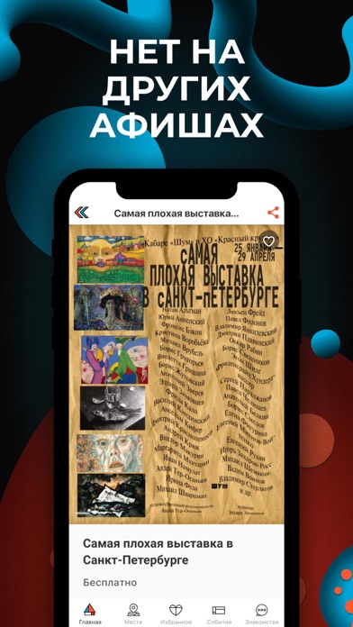
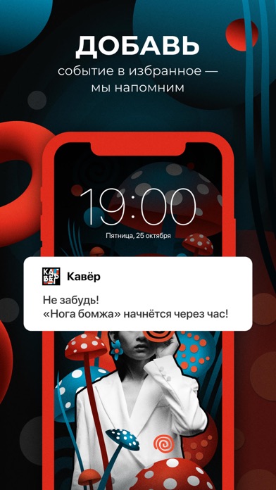
Icon palette
About this app
Кавёр — новые знакомства без свайпов и афиша необычных событий Хочешь пообщаться, выбраться куда-то или просто посмотреть, кто рядом? Кавёр — это спокойное пространство, где можно найти людей, события и лёгкий повод выйти из дома. Что делает Кавёр особенным: • Уникальный формат: афиша + знакомства = меньше давления, больше жизни; • Никаких свайпов и матчей — пиши, когда хочешь, без ожиданий; • Фильтр “онлайн и готов к встрече” — если появилось настроение увидеться сегодня; • Подборки событий в твоём городе — от тихих арт-вечеров до безумных тусовок; • Возможность найти компанию по интересам: сходить вместе, познакомиться, пообщаться; • Здесь не гонятся за лайками — просто делятся планами и ищут компанию. Что внутри: • Общение без алгоритмов; • Возможность написать первым; • Без напряга и лишнего шума — просто живые люди и город вокруг; • Повод выйти, когда захочется; • …
App details
What you can learn from Кавёр: знакомства и встречи
Every shipping app on the App Store has gone through the same decisions you're working through right now: which screenshot goes first, what caption sits over it, which device frame to show, what color the background should be. The 7 screenshots above are Кавёр: знакомства и встречи's answers to those questions — they're public, they're real, and they made it through Apple's review.
What the numbers say: Кавёр: знакомства и встречи runs a mixed light-and-dark set where the background shifts from screenshot to screenshot (first shot #040404) — each image has to stand on its own, so the captions carry more of the story. The accent colour we picked up, #044C64, is the one to reuse for badges, arrows and highlighted words if you borrow this look. Hit Use this style to open the editor with these exact colours and drop your own screenshot in.
Notice the first screenshot in particular. It's the one users see in search results and on the product page, and it's where most apps spend their best caption and tightest design. Look at the proportion of background to phone, where the text sits, what one thing the image is trying to communicate.
Want to see how other Entertainment apps approach the same problem? Browse more Entertainment apps in the showcase.
Take what works into your own screenshots
Open LaunchShots and design your App Store & Google Play screenshots — pick a device frame, drop captions, ship in minutes. Free, in your browser.
Open the screenshot editor →Apps with a similar look
Closest background + accent colours among the listings we've analysed — useful when you want to see the same palette handled by a different team.