Chart position — tracked daily by LaunchShots
Screenshot style breakdown
Sampled from 6 of Penmark 大学生の時間割アプリ、履修・課題管理に対応's App Store screenshots — background, accent and theme, measured by LaunchShots (not something Apple publishes).
#2CC474 bg
#26AC66
#FCCC4C accent
#111111 text
Screenshots



iPad screenshots


Icon palette
About this app
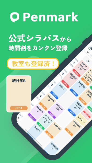
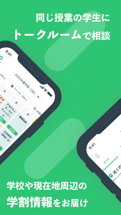
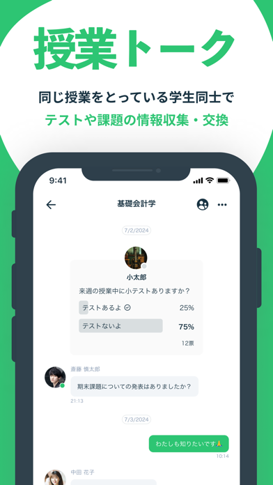
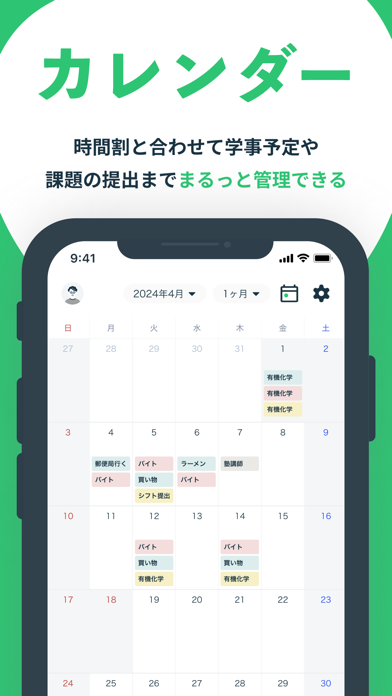
日々の大学生活を快適に! Penmarkは時間割作成から学生間のコミュニケーションまで、 大学生活をすごく豊かにする時間割・コミュニティアプリです。 ◆公式シラバスを基に簡単に最適な時間割を作成 ◆豊富な授業レビューを参考に履修する科目を選択できる ◆ 同じ履修授業を選択している学生とトークルームで情報交換も簡単 ◆試験対策や授業資料をドライブで共有。効率的な学習を支援! 【Penmarkの特徴】 ①授業レビューをみながら、ワンタップで時間割登録(時間割機能) 公式シラバスのデータから、自分に合った授業をサクサク登録。 先輩の授業レビューを見ながら、あなたにぴったりな時間割を作れます。 ②課題や授業メモ、出欠率を一括管理!(課題・出欠管理機能) 課題の締め切りや出欠数を一覧で確認。ノート作成や授業のファイル管理など、 大学時間割作成だけではなく授業を受けるために必要な機能が全て揃っています。 ③同じ授業を受けている同級生と、授業や課題の情報交換!(授業トーク・ドライブ機能) 時間割を登録すると、講義ごとのトークル…
App details
What you can learn from Penmark 大学生の時間割アプリ、履修・課題管理に対応
Every shipping app on the App Store has gone through the same decisions you're working through right now: which screenshot goes first, what caption sits over it, which device frame to show, what color the background should be. The 20 screenshots above are Penmark 大学生の時間割アプリ、履修・課題管理に対応's answers to those questions — they're public, they're real, and they made it through Apple's review.
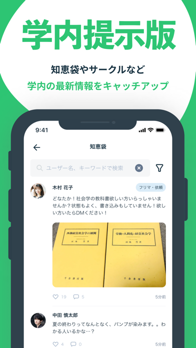
What the numbers say: Penmark 大学生の時間割アプリ、履修・課題管理に対応 runs a light set where the background shifts from screenshot to screenshot (first shot #2CC474) — each image has to stand on its own, so the captions carry more of the story. The accent colour we picked up, #FCCC4C, is the one to reuse for badges, arrows and highlighted words if you borrow this look. Hit Use this style to open the editor with these exact colours and drop your own screenshot in.
Notice the first screenshot in particular. It's the one users see in search results and on the product page, and it's where most apps spend their best caption and tightest design. Look at the proportion of background to phone, where the text sits, what one thing the image is trying to communicate.
Want to see how other Education apps approach the same problem? Browse more Education apps in the showcase.
Take what works into your own screenshots
Open LaunchShots and design your App Store & Google Play screenshots — pick a device frame, drop captions, ship in minutes. Free, in your browser.
Open the screenshot editor →Apps with a similar look
Closest background + accent colours among the listings we've analysed — useful when you want to see the same palette handled by a different team.