Chart position — tracked daily by LaunchShots
Screenshot changes — detected by LaunchShots
Screenshot style breakdown
Sampled from 6 of GAP Türkiye | Online Alışveriş's App Store screenshots — background, accent and theme, measured by LaunchShots (not something Apple publishes).
#ECF4F4 bg
#CFD6D6
#546C84 accent
#111111 text
Reading the caption text from the screenshots in your browser…
Screenshots


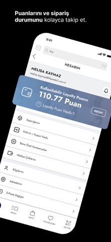


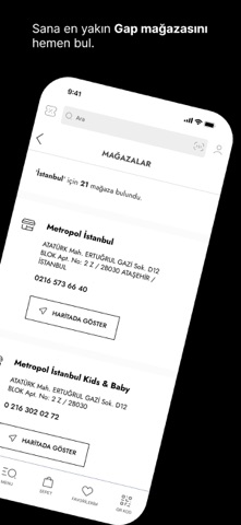
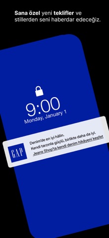
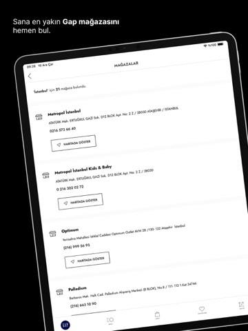
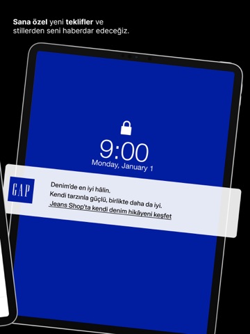
iPad screenshots


Icon palette
About this app
Bizi bir araya getiren her şeyi, hep beraber kutlamak için gelin Gap’te buluşalım. Dünyadaki en ikonik giyim ve aksesuar markalarından biri olan Gap, 1969’da San Francisco’da kuruldu. Gap’in koleksiyonları modern bir gardırobun temelini inşa etmek için dizayn edildi. İlk uluslararası mağazasını 1987’de Londra’da açan Gap, hem online mağazalarıyla, hem de dünya çapında 2000’e yakın mağazasıyla müşterilerine ulaşmaya devam ediyor. Gap bugün Türkiye’de 33 mağazası, uygulaması ve online satış sitesiyle, tişörtler, sweatshirtler, pantolonlar ve denim parçalar gibi, bir gardıropta mutlaka bulunması gereken kıyafetler için en iyi seçenek olmaya devam ediyor. Gap; gerçek bireysellik ruhunun bir kutlaması, bir davranış, düşünce yapısı ve hayata bakış açısıdır. Gap Türkiye uygulaması ile Gap dünyasına dair her şeyden haberdar olabilirsin. Tarzını yansıtan ürünleri keşfemek, modayı ve trend…
App details
What you can learn from GAP Türkiye | Online Alışveriş
Every shipping app on the App Store has gone through the same decisions you're working through right now: which screenshot goes first, what caption sits over it, which device frame to show, what color the background should be. The 15 screenshots above are GAP Türkiye | Online Alışveriş's answers to those questions — they're public, they're real, and they made it through Apple's review.
What the numbers say: GAP Türkiye | Online Alışveriş runs a mixed light-and-dark set where the background shifts from screenshot to screenshot (first shot #ECF4F4) — each image has to stand on its own, so the captions carry more of the story. The accent colour we picked up, #546C84, is the one to reuse for badges, arrows and highlighted words if you borrow this look. Hit Use this style to open the editor with these exact colours and drop your own screenshot in.
Notice the first screenshot in particular. It's the one users see in search results and on the product page, and it's where most apps spend their best caption and tightest design. Look at the proportion of background to phone, where the text sits, what one thing the image is trying to communicate.
Want to see how other Shopping apps approach the same problem? Browse more Shopping apps in the showcase.
Take what works into your own screenshots
Open LaunchShots and design your App Store & Google Play screenshots — pick a device frame, drop captions, ship in minutes. Free, in your browser.
Open the screenshot editor →Apps with a similar look
Closest background + accent colours among the listings we've analysed — useful when you want to see the same palette handled by a different team.