Chart position — tracked daily by LaunchShots
Screenshot style breakdown
Sampled from 6 of World of Airports's App Store screenshots — background, accent and theme, measured by LaunchShots (not something Apple publishes).
#C4DCEC bg
#ACC1CF
#5C542C accent
#111111 text
Screenshots


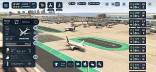


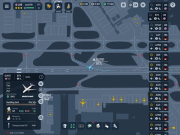
iPad screenshots


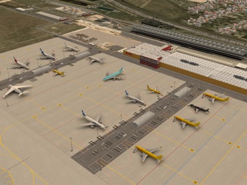
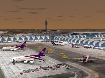


Icon palette
About this app
WORLD OF AIRPORTS モバイルで楽しめるリアルな航空ゲームのひとつで、自分だけの空港を築き、管理し、成長させましょう。 World of Airports は、空港運営、航空会社づくり、マルチプレイヤー要素を組み合わせた独自の航空体験です。実在の場所に着想を得た空港を運営し、フライトを計画し、航空機フリートを管理し、世界中のプレイヤーと協力しましょう。 一般的な空港ゲームとは違い、ここでは実際のプレイヤーの航空機が、ほかのプレイヤーが管理する空港の間を飛び交います。すべての空港は、成長し続ける共有のグローバルネットワークの一部です。 空港運営を管理 • 航空機の到着と出発を調整 • ゲートを割り当て、駐機スポットの利用を計画 • 空港の容量とサービス効率を管理 • インフラを拡張し、新しい可能性を解放 • 運営を最適化して、交通量と収益を伸ばす 各航空機は次のフライトの前に、すべての作業を終える必要があります。乗客の搭乗と降機、手荷物の積み下ろし、燃料補給、地上サービスを時間内に完了させましょう。よい計画こそ、成功する空…
App details
What you can learn from World of Airports
Every shipping app on the App Store has gone through the same decisions you're working through right now: which screenshot goes first, what caption sits over it, which device frame to show, what color the background should be. The 18 screenshots above are World of Airports's answers to those questions — they're public, they're real, and they made it through Apple's review.
What the numbers say: World of Airports runs a mixed light-and-dark set where the background shifts from screenshot to screenshot (first shot #C4DCEC) — each image has to stand on its own, so the captions carry more of the story. The accent colour we picked up, #5C542C, is the one to reuse for badges, arrows and highlighted words if you borrow this look. Hit Use this style to open the editor with these exact colours and drop your own screenshot in.
Notice the first screenshot in particular. It's the one users see in search results and on the product page, and it's where most apps spend their best caption and tightest design. Look at the proportion of background to phone, where the text sits, what one thing the image is trying to communicate.
Want to see how other Games apps approach the same problem? Browse more Games apps in the showcase.
Take what works into your own screenshots
Open LaunchShots and design your App Store & Google Play screenshots — pick a device frame, drop captions, ship in minutes. Free, in your browser.
Open the screenshot editor →Apps with a similar look
Closest background + accent colours among the listings we've analysed — useful when you want to see the same palette handled by a different team.