Chart position — tracked daily by LaunchShots
Screenshot style breakdown
Sampled from 6 of Фризио фигурное катание 3D's App Store screenshots — background, accent and theme, measured by LaunchShots (not something Apple publishes).
#F4F4F4 bg
#D6D6D6
#44ACF4 accent
#111111 text
Reading the caption text from the screenshots in your browser…
Screenshots

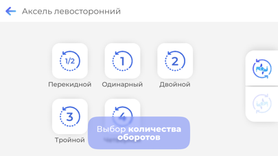
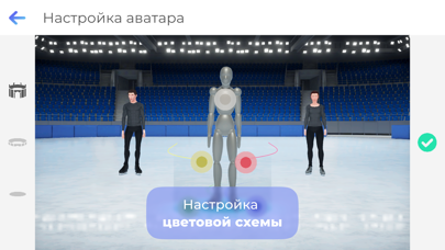
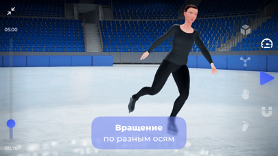
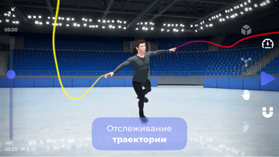

iPad screenshots

Icon palette
About this app
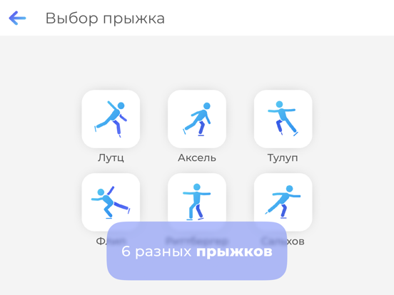
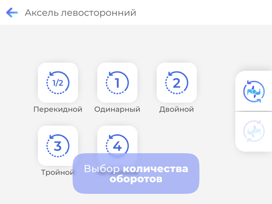
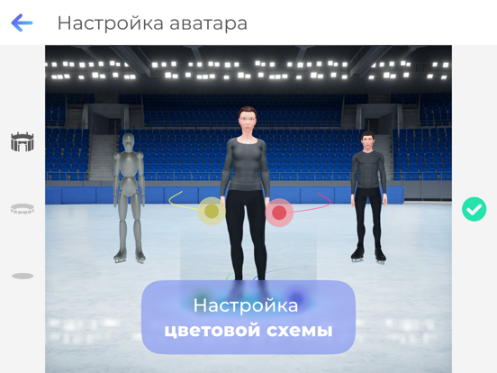
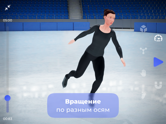
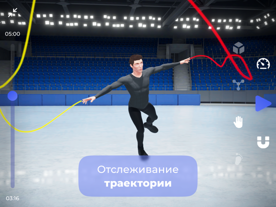
Фризио - бесплатное мобильное приложение, созданное для любителей и спортсменов, родителей и тренеров, для облегчения обучению прыжкам в фигурном катании с помощью 3D. Фризио создан для вас независимо от вашего опыта. 3D графика и искусственный интеллект соединились для Вас в нашем приложении. Фризио, как личный тренер с персональным контентом – 6 элементов фигурного катания – поможет организовать, изучить и улучшить вашу технику на льду. • 3D модели Уникальная технология 3D поможет вам изучить 6 прыжков фигурного катания. Режим отображения скелета детально демонстрирует всю анатомию движений человеческого тела. Вы найдете исчерпывающую информацию о частях тела, задействованных в прыжках, и как применять эти знания для собственной стабилизации при исполнении элементов фигурного катания. • 3 типа аватара Настройки аватара позволяют адаптировать 3D модели под свои параметры. Функция ото…
App details
What you can learn from Фризио фигурное катание 3D
Every shipping app on the App Store has gone through the same decisions you're working through right now: which screenshot goes first, what caption sits over it, which device frame to show, what color the background should be. The 12 screenshots above are Фризио фигурное катание 3D's answers to those questions — they're public, they're real, and they made it through Apple's review.
What the numbers say: Фризио фигурное катание 3D runs a mixed light-and-dark set where the background shifts from screenshot to screenshot (first shot #F4F4F4) — each image has to stand on its own, so the captions carry more of the story. The accent colour we picked up, #44ACF4, is the one to reuse for badges, arrows and highlighted words if you borrow this look. Hit Use this style to open the editor with these exact colours and drop your own screenshot in.
Notice the first screenshot in particular. It's the one users see in search results and on the product page, and it's where most apps spend their best caption and tightest design. Look at the proportion of background to phone, where the text sits, what one thing the image is trying to communicate.
Want to see how other Sports apps approach the same problem? Browse more Sports apps in the showcase.
Take what works into your own screenshots
Open LaunchShots and design your App Store & Google Play screenshots — pick a device frame, drop captions, ship in minutes. Free, in your browser.
Open the screenshot editor →Apps with a similar look
Closest background + accent colours among the listings we've analysed — useful when you want to see the same palette handled by a different team.