Chart position — tracked daily by LaunchShots
Screenshot style breakdown
Sampled from 6 of Call of Duty: Mobile VN's App Store screenshots — background, accent and theme, measured by LaunchShots (not something Apple publishes).
#0C0C0C bg
#2E2E2E
#94645C accent
#FFFFFF text
Screenshots

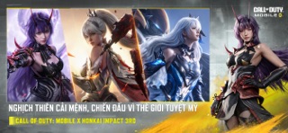


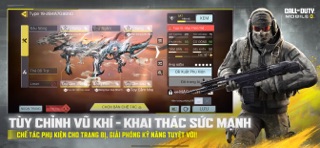


iPad screenshots


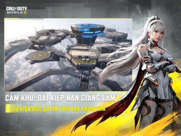


Icon palette
About this app
Quyết định phát hành trò chơi điện tử G1 trên mạng số 133/QĐ-PTTH&TTĐT do Cục Phát thanh, truyền hình và thông tin điện tử cấp ngày 16/03/2026. https://giayphep.abei.gov.vn/g1/131971 GAME BẮN SÚNG AAA ĐỈNH CAO TRÊN DI ĐỘNG! Huyền thoại FPS! CALL OF DUTY: MOBILE VN là Game Bắn Súng Đối Kháng AAA được yêu thích toàn cầu, mang lại trải nghiệm chiến đấu chuẩn mực nhất. Tham gia ngay chế độ Battle Royale 100 người, các trận Multiplayer (PvP) 5v5 đầy kịch tính và Khám Phá - Chiến Đấu - Rút Lui đầy kịch tính trong chế độ DMZ. Trải nghiệm chiến đấu được đồng bộ hóa và tối ưu hoàn hảo cho Di Động, mang lại chất lượng và cảm giác đỉnh cao hàng đầu! Chiến Binh COD, hãy sẵn sàng cho những trận đấu AAA căng thẳng nhất trên Di Động! [CÁC CHẾ ĐỘ CHIẾN ĐẤU ĐỈNH CAO] - BATTLE ROYALE - SINH TỒN 100 NGƯỜI: Sinh tồn trên bản đồ rộng lớn. Điều khiển trực thăng và xe tăng để làm chủ cuộc đua sinh tồn đến …
App details
What you can learn from Call of Duty: Mobile VN
Every shipping app on the App Store has gone through the same decisions you're working through right now: which screenshot goes first, what caption sits over it, which device frame to show, what color the background should be. The 16 screenshots above are Call of Duty: Mobile VN's answers to those questions — they're public, they're real, and they made it through Apple's review.
What the numbers say: Call of Duty: Mobile VN runs a dark set where the background shifts from screenshot to screenshot (first shot #0C0C0C) — each image has to stand on its own, so the captions carry more of the story. The accent colour we picked up, #94645C, is the one to reuse for badges, arrows and highlighted words if you borrow this look. Hit Use this style to open the editor with these exact colours and drop your own screenshot in.
Notice the first screenshot in particular. It's the one users see in search results and on the product page, and it's where most apps spend their best caption and tightest design. Look at the proportion of background to phone, where the text sits, what one thing the image is trying to communicate.
Want to see how other Games apps approach the same problem? Browse more Games apps in the showcase.
Take what works into your own screenshots
Open LaunchShots and design your App Store & Google Play screenshots — pick a device frame, drop captions, ship in minutes. Free, in your browser.
Open the screenshot editor →Apps with a similar look
Closest background + accent colours among the listings we've analysed — useful when you want to see the same palette handled by a different team.