Chart position — tracked daily by LaunchShots
Screenshot style breakdown
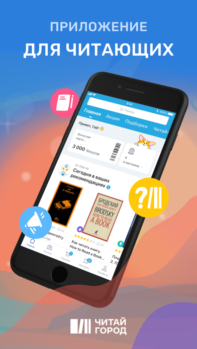
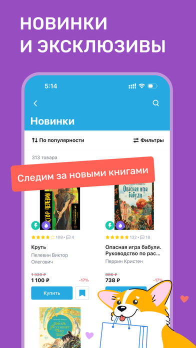
Sampled from 6 of Читай-город: книжный магазин's App Store screenshots — background, accent and theme, measured by LaunchShots (not something Apple publishes).
#2C7CDC bg
#498EE0
#ECB48C accent
#FFFFFF text
Screenshots




Icon palette
About this app
Давайте знакомиться, мы — Читай-город! В нашем приложении, которое связывает интернет-магазин и более 500 книжных по всей стране, можно: – Покупать книги, сувениры, канцелярию себе или в подарок. Можно воспользоваться услугой «Забрать за 1 час», выбрав самый удобный для вас способ получения. Или оформить экспресс-доставку — чтобы получить заветный томик скорее. – Делать предзаказы на новинки. Многие из них есть только у нас, причём с эксклюзивными подарками! – Получать рекомендации через сервис «Я в магазине». Выберите Читай-город, в котором находитесь, и мы покажем его новинки и топы — указав стеллаж и полку. Или введите название книги, которая интересует, чтобы узнать, где она стоит. Ещё можем посоветовать вам историю почти по любому запросу. Например, что-то о котиках ;) – Быстро узнавать об акциях, скидках, получать и тратить бонусы. – Выбирать книги на основе наших статей и со…
App details
What you can learn from Читай-город: книжный магазин
Every shipping app on the App Store has gone through the same decisions you're working through right now: which screenshot goes first, what caption sits over it, which device frame to show, what color the background should be. The 9 screenshots above are Читай-город: книжный магазин's answers to those questions — they're public, they're real, and they made it through Apple's review.
What the numbers say: Читай-город: книжный магазин runs a mixed light-and-dark set where the background shifts from screenshot to screenshot (first shot #2C7CDC) — each image has to stand on its own, so the captions carry more of the story. The accent colour we picked up, #ECB48C, is the one to reuse for badges, arrows and highlighted words if you borrow this look. Hit Use this style to open the editor with these exact colours and drop your own screenshot in.
Notice the first screenshot in particular. It's the one users see in search results and on the product page, and it's where most apps spend their best caption and tightest design. Look at the proportion of background to phone, where the text sits, what one thing the image is trying to communicate.
Want to see how other Book apps approach the same problem? Browse more Book apps in the showcase.
Take what works into your own screenshots
Open LaunchShots and design your App Store & Google Play screenshots — pick a device frame, drop captions, ship in minutes. Free, in your browser.
Open the screenshot editor →Apps with a similar look
Closest background + accent colours among the listings we've analysed — useful when you want to see the same palette handled by a different team.