Chart position — tracked daily by LaunchShots
Screenshot changes — detected by LaunchShots
Screenshot style breakdown
Sampled from 6 of ワンバンク: 共有カードとAI家計簿アプリ's App Store screenshots — background, accent and theme, measured by LaunchShots (not something Apple publishes).
#FCFCEC bg
#DDDDCF
#FCCC1C accent
#111111 text
Screenshots
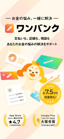
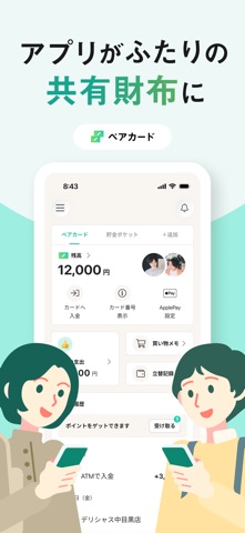
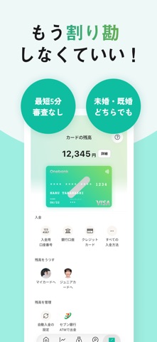


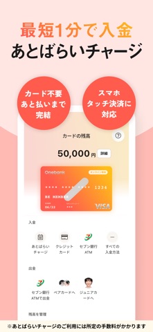
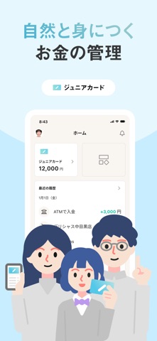
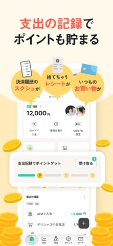
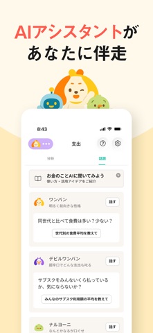
iPad screenshots


Icon palette
About this app
【ワンバンクとは】 ワンバンクは、がんばらなくても自然とお金が整う、次世代型のAI家計簿です。 AIアシスタントが支出を学習し、次の行動をやさしくサポート。 面倒な設定なしでゲーム感覚で続けられるから、お金の不安が自然とクリアになります。 他にも、ペアカードによるカップルのお金管理や、あとばらいチャージで柔軟な支払いも可能。日常の支払いをスムーズにする機能が充実しています。 ワンバンクで「がんばらなくていいお金の管理」、はじめてみませんか? (「ワンバンク」は「B/43」から名前が変更になりました) 【ワンバンクカードの種類】 用途に応じて3つのタイプ(家族カードとしても利用可能)をご用意しています。ひとつのアプリで併用が可能です。 <ワンバンクペアカード> カップルや夫婦で!1つの口座に2枚のカード。2人で残高を共有して使える共同口座に2枚のカードを発行して使えます。婚姻関係がなくても利用できます。 <ワンバンクマイカード> 初めての一人暮らしや家計管理デビューに!一人暮らしの生活費の管理や、個人のお小遣い…
App details
What you can learn from ワンバンク: 共有カードとAI家計簿アプリ
Every shipping app on the App Store has gone through the same decisions you're working through right now: which screenshot goes first, what caption sits over it, which device frame to show, what color the background should be. The 18 screenshots above are ワンバンク: 共有カードとAI家計簿アプリ's answers to those questions — they're public, they're real, and they made it through Apple's review.
What the numbers say: ワンバンク: 共有カードとAI家計簿アプリ runs a light set with one background colour (#FCFCEC) carried across every screenshot — the listing reads as a single poster when the shots sit side by side in search results. The accent colour we picked up, #FCCC1C, is the one to reuse for badges, arrows and highlighted words if you borrow this look. Hit Use this style to open the editor with these exact colours and drop your own screenshot in.
Notice the first screenshot in particular. It's the one users see in search results and on the product page, and it's where most apps spend their best caption and tightest design. Look at the proportion of background to phone, where the text sits, what one thing the image is trying to communicate.
Want to see how other Finance apps approach the same problem? Browse more Finance apps in the showcase.
Take what works into your own screenshots
Open LaunchShots and design your App Store & Google Play screenshots — pick a device frame, drop captions, ship in minutes. Free, in your browser.
Open the screenshot editor →Apps with a similar look
Closest background + accent colours among the listings we've analysed — useful when you want to see the same palette handled by a different team.