Chart position — tracked daily by LaunchShots
Screenshot style breakdown
Sampled from 4 of DARTSLIVE Home's App Store screenshots — background, accent and theme, measured by LaunchShots (not something Apple publishes).
#E4E4E4 bg
#C8C8C8
#FCDC1C accent
#111111 text
Reading the caption text from the screenshots in your browser…
Screenshots

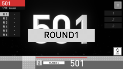
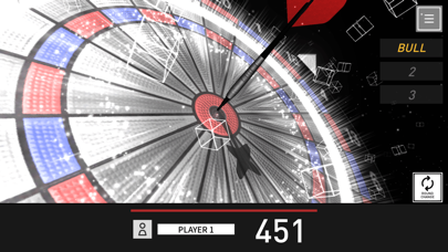
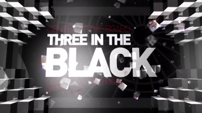
iPad screenshots


Icon palette
About this app
ダーツライブ3と変わらないエキサイティングな体験をご自宅で。 専用ダーツボードと連動するダーツライブホームアプリなら、家族や友人と一緒に、初心者から上級者までどなたでもお楽しみいただけます。 ※本アプリの利用には、対応する専用ダーツボードが必要です。対応機種については、公式ウェブサイトをご確認ください。 ■主な機能 ・ダーツライブ3を自宅で:業務用マシンのグラフィック、サウンド、アワードムービーを再現し、臨場感あふれる本格的なダーツ体験を自宅で楽しめます。 ・豊富なゲームモード:ゼロワンやクリケットなどの定番ゲームから、練習ゲームやパーティーゲームまで多彩に搭載。 ・オンライン対戦(ライブマッチ):フレンドや世界のプレイヤーと、自宅からいつでも対戦できます。 ・CPU対戦(ロボライバル):9段階のレベル設定で、一人でも実践的な練習が可能。自分のペースでスキルアップできます。 ・スコア管理:ダーツライブ公式レーティングで実力を正確に測定し、成長を実感できます。 ・ミッション機能:様々なミッションに挑戦し…
App details
What you can learn from DARTSLIVE Home
Every shipping app on the App Store has gone through the same decisions you're working through right now: which screenshot goes first, what caption sits over it, which device frame to show, what color the background should be. The 8 screenshots above are DARTSLIVE Home's answers to those questions — they're public, they're real, and they made it through Apple's review.
What the numbers say: DARTSLIVE Home runs a mixed light-and-dark set where the background shifts from screenshot to screenshot (first shot #E4E4E4) — each image has to stand on its own, so the captions carry more of the story. The accent colour we picked up, #FCDC1C, is the one to reuse for badges, arrows and highlighted words if you borrow this look. Hit Use this style to open the editor with these exact colours and drop your own screenshot in.
Notice the first screenshot in particular. It's the one users see in search results and on the product page, and it's where most apps spend their best caption and tightest design. Look at the proportion of background to phone, where the text sits, what one thing the image is trying to communicate.
Want to see how other Sports apps approach the same problem? Browse more Sports apps in the showcase.
Take what works into your own screenshots
Open LaunchShots and design your App Store & Google Play screenshots — pick a device frame, drop captions, ship in minutes. Free, in your browser.
Open the screenshot editor →Apps with a similar look
Closest background + accent colours among the listings we've analysed — useful when you want to see the same palette handled by a different team.