Chart position — tracked daily by LaunchShots
Screenshot style breakdown
Sampled from 4 of Dieta Keto- Contador de carbos's App Store screenshots — background, accent and theme, measured by LaunchShots (not something Apple publishes).
#FCF4C4 bg
#DDD6AC
#FCBC5C accent
#111111 text
Screenshots


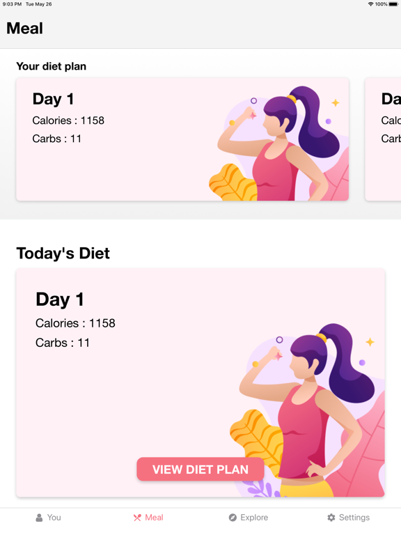
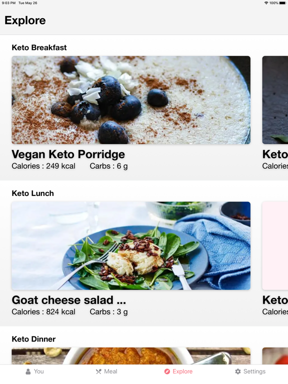
iPad screenshots



Icon palette
About this app
Transforma tu salud con Keto Diet, la aplicación definitiva para seguir la dieta cetogénica de forma sencilla y efectiva. Controla tus carbohidratos, descubre recetas deliciosas y alcanza tus objetivos de pérdida de peso con un plan personalizado diseñado para tu estilo de vida. ¿CANSADO DE DIETAS COMPLICADAS? Sabemos que seguir la dieta keto puede parecer abrumador: calcular macros, contar carbohidratos netos, planificar comidas... Keto Diet elimina toda esa complejidad. Nuestra aplicación te guía paso a paso, convirtiendo el proceso cetogénico en algo natural y sostenible. Miles de usuarios en España ya han descubierto cómo perder peso sin pasar hambre ni renunciar al sabor. TU COMPAÑERA PERFECTA PARA EL DÍA DE LA MADRE Este mayo, cuida de ti misma o regala salud a quien más quieres. Hemos preparado menús especiales pensados para compartir momentos inolvidables mientras mantienes …
App details
What you can learn from Dieta Keto- Contador de carbos
Every shipping app on the App Store has gone through the same decisions you're working through right now: which screenshot goes first, what caption sits over it, which device frame to show, what color the background should be. The 10 screenshots above are Dieta Keto- Contador de carbos's answers to those questions — they're public, they're real, and they made it through Apple's review.
What the numbers say: Dieta Keto- Contador de carbos runs a light set where the background shifts from screenshot to screenshot (first shot #FCF4C4) — each image has to stand on its own, so the captions carry more of the story. The accent colour we picked up, #FCBC5C, is the one to reuse for badges, arrows and highlighted words if you borrow this look. Hit Use this style to open the editor with these exact colours and drop your own screenshot in.
Notice the first screenshot in particular. It's the one users see in search results and on the product page, and it's where most apps spend their best caption and tightest design. Look at the proportion of background to phone, where the text sits, what one thing the image is trying to communicate.
Want to see how other Food & Drink apps approach the same problem? Browse more Food & Drink apps in the showcase.
Take what works into your own screenshots
Open LaunchShots and design your App Store & Google Play screenshots — pick a device frame, drop captions, ship in minutes. Free, in your browser.
Open the screenshot editor →Apps with a similar look
Closest background + accent colours among the listings we've analysed — useful when you want to see the same palette handled by a different team.