Screenshot style breakdown
Sampled from 6 of TODOSURF - TDS's App Store screenshots — background, accent and theme, measured by LaunchShots (not something Apple publishes).
#041C2C bg
#273B49
#F4E414 accent
#FFFFFF text
Screenshots
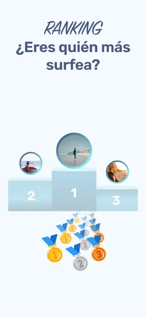
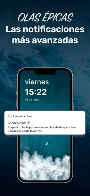
Icon palette
About this app
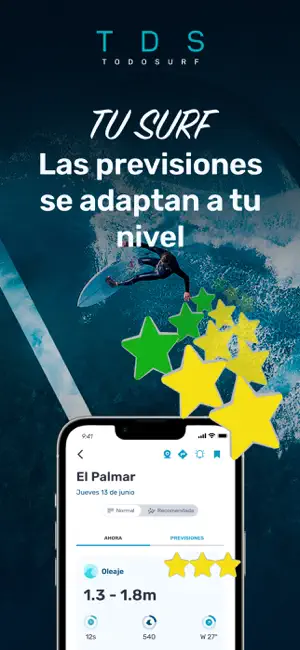
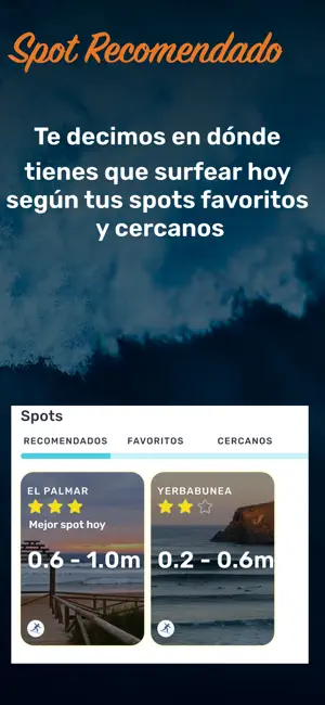
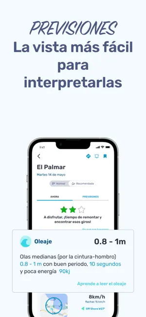
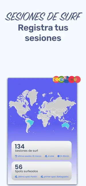
TodoSurf analiza las previsiones de oleaje y te recomienda los mejores spots cerca de ti según tu nivel de surf, tus playas favoritas y las condiciones locales. Tanto si estás empezando y buscas olas seguras como si eres un surfista experimentado en busca de sesiones de calidad, TodoSurf te ayuda a tomar mejores decisiones cada día. Spot Recomendado – Descubre dónde surfear hoy Nuestra funcionalidad premium Spot Recomendado analiza cientos de puntos de previsión y te ayuda a encontrar el mejor spot cercano para surfear. • Recomendaciones personalizadas según tu nivel de surf • Basadas en tus spots favoritos y cercanos • Tiene en cuenta oleaje, viento, mareas y mar de fondo (swell) • Actualizado diariamente con las últimas previsiones Previsiones de Surf a 14 días Entiende el océano con previsiones diseñadas para surfistas. • Previsiones adaptadas a tu nivel de surf • Valoraciones…
App details
What you can learn from TODOSURF - TDS
Every shipping app on the App Store has gone through the same decisions you're working through right now: which screenshot goes first, what caption sits over it, which device frame to show, what color the background should be. The 6 screenshots above are TODOSURF - TDS's answers to those questions — they're public, they're real, and they made it through Apple's review.
What the numbers say: TODOSURF - TDS runs a mixed light-and-dark set where the background shifts from screenshot to screenshot (first shot #041C2C) — each image has to stand on its own, so the captions carry more of the story. The accent colour we picked up, #F4E414, is the one to reuse for badges, arrows and highlighted words if you borrow this look. Hit Use this style to open the editor with these exact colours and drop your own screenshot in.
Notice the first screenshot in particular. It's the one users see in search results and on the product page, and it's where most apps spend their best caption and tightest design. Look at the proportion of background to phone, where the text sits, what one thing the image is trying to communicate.
Want to see how other Sports apps approach the same problem? Browse more Sports apps in the showcase.
Take what works into your own screenshots
Open LaunchShots and design your App Store & Google Play screenshots — pick a device frame, drop captions, ship in minutes. Free, in your browser.
Open the screenshot editor →Apps with a similar look
Closest background + accent colours among the listings we've analysed — useful when you want to see the same palette handled by a different team.