Chart position — tracked daily by LaunchShots
Screenshot changes — detected by LaunchShots
Screenshot style breakdown
Sampled from 6 of SOKOLOV: ювелирный магазин's App Store screenshots — background, accent and theme, measured by LaunchShots (not something Apple publishes).
#E4D4C4 bg
#C8BAAC
#D4946C accent
#111111 text
Reading the caption text from the screenshots in your browser…
Screenshots

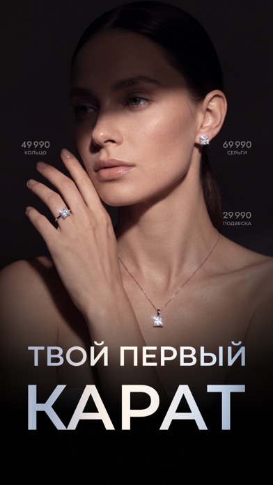
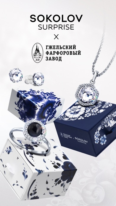
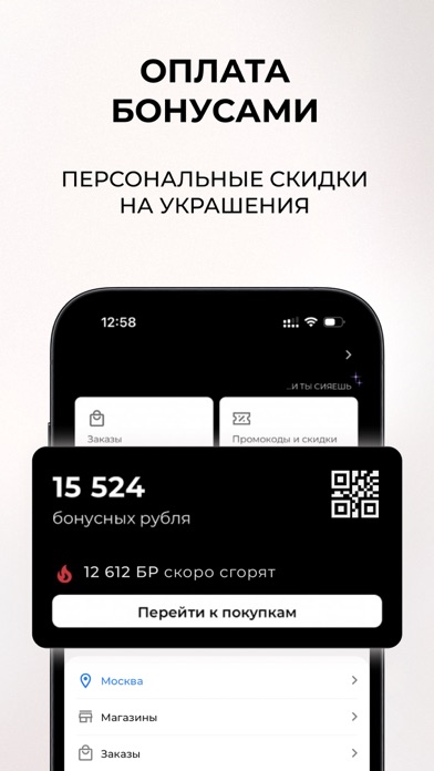
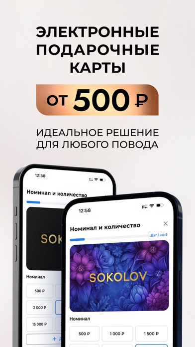
Icon palette
About this app
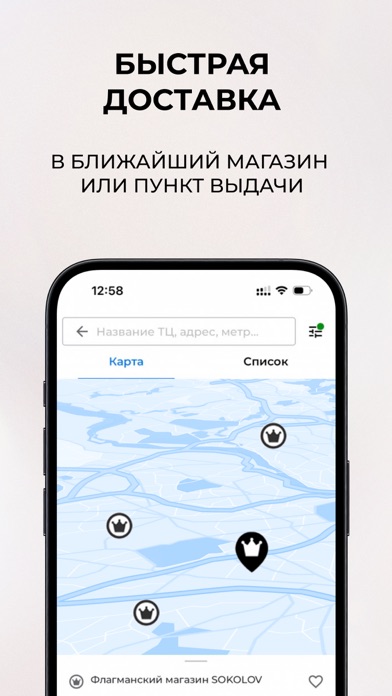
Добро пожаловать в ювелирный магазин SOKOLOV! Подобрать украшение с драгоценными камнями? Найти обручальное кольцо с бриллиантом? Купить наручные часы из драгоценного металла? Всё это можно сделать в удобном приложении! Используйте подробную систему фильтров, чтобы заранее указать любое предпочтение: от размера кольца и длины цепи до цвета камней и вида декоративного покрытия. Онлайн-магазин SOKOLOV – это личный ювелир, который всегда сумеет предложить вам лучшее украшение по выгодной цене. Побалуйте себя или найдите подарок для близкого человека – ювелирные изделия SOKOLOV помогут сохранить самые важные мгновения жизни! В официальном приложении: – узнавайте первыми об акциях и скидках; – оформляйте быструю доставку в ближайший флагманский магазин; – выбирайте из более 32 000 моделей в наличии; – делайте удобный заказ в пару кликов; – регистрируйтесь в «Бонусной программе mySOKOLOV». …
App details
What you can learn from SOKOLOV: ювелирный магазин
Every shipping app on the App Store has gone through the same decisions you're working through right now: which screenshot goes first, what caption sits over it, which device frame to show, what color the background should be. The 7 screenshots above are SOKOLOV: ювелирный магазин's answers to those questions — they're public, they're real, and they made it through Apple's review.
What the numbers say: SOKOLOV: ювелирный магазин runs a mixed light-and-dark set where the background shifts from screenshot to screenshot (first shot #E4D4C4) — each image has to stand on its own, so the captions carry more of the story. The accent colour we picked up, #D4946C, is the one to reuse for badges, arrows and highlighted words if you borrow this look. Hit Use this style to open the editor with these exact colours and drop your own screenshot in.
Notice the first screenshot in particular. It's the one users see in search results and on the product page, and it's where most apps spend their best caption and tightest design. Look at the proportion of background to phone, where the text sits, what one thing the image is trying to communicate.
Want to see how other Shopping apps approach the same problem? Browse more Shopping apps in the showcase.
Take what works into your own screenshots
Open LaunchShots and design your App Store & Google Play screenshots — pick a device frame, drop captions, ship in minutes. Free, in your browser.
Open the screenshot editor →Apps with a similar look
Closest background + accent colours among the listings we've analysed — useful when you want to see the same palette handled by a different team.