Chart position — tracked daily by LaunchShots
Screenshot style breakdown
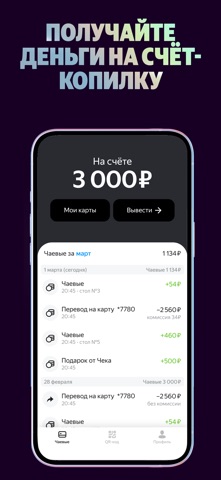
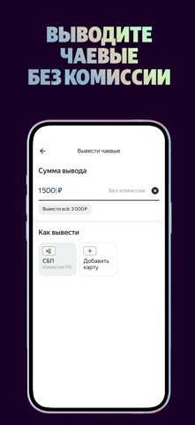
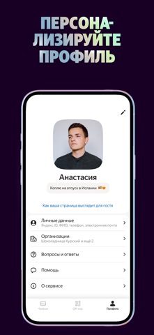
Sampled from 5 of Яндекс Чаевые: на карту по QR's App Store screenshots — background, accent and theme, measured by LaunchShots (not something Apple publishes).
#140424 bg
#342742
#547444 accent
#FFFFFF text
Screenshots


Icon palette
About this app
Чаевые на карту по QR-коду без комиссии Яндекс Чаевые — это сервис, с которым клиенты могут оставлять чаевые онлайн с телефона по QR-коду. Быстро, безопасно и на 30% больше, чем раньше. Для кого: - для ресторанов, отелей, салонов красоты, курьерских служб. - для самостоятельных исполнителей из сферы услуг. Сервис поможет организовать приём чаевых представителям любой сферы, где это актуально. Для клиентов оплата чаевых будет простой и удобной. Владельцам бизнеса и администраторам: - помогаем с материалами - интегрируем QR-коды в кассовые системы, присылаем визитки, стикеры и тейблтенты. Снимаем нагрузку с бухгалтера Сотрудники получают чаевые напрямую от гостей по договору дарения — это не облагается налогами. Собираем для вас отзывы Вместе с чаевыми клиенты могут оставить в сервисе комментарий об исполнителе и поставить ему оценку. В общий котёл или персонально Добавляйте в си…
App details
What you can learn from Яндекс Чаевые: на карту по QR
Every shipping app on the App Store has gone through the same decisions you're working through right now: which screenshot goes first, what caption sits over it, which device frame to show, what color the background should be. The 5 screenshots above are Яндекс Чаевые: на карту по QR's answers to those questions — they're public, they're real, and they made it through Apple's review.
What the numbers say: Яндекс Чаевые: на карту по QR runs a dark set with one background colour (#140424) carried across every screenshot — the listing reads as a single poster when the shots sit side by side in search results. The accent colour we picked up, #547444, is the one to reuse for badges, arrows and highlighted words if you borrow this look. Hit Use this style to open the editor with these exact colours and drop your own screenshot in.
Notice the first screenshot in particular. It's the one users see in search results and on the product page, and it's where most apps spend their best caption and tightest design. Look at the proportion of background to phone, where the text sits, what one thing the image is trying to communicate.
Want to see how other Business apps approach the same problem? Browse more Business apps in the showcase.
Take what works into your own screenshots
Open LaunchShots and design your App Store & Google Play screenshots — pick a device frame, drop captions, ship in minutes. Free, in your browser.
Open the screenshot editor →Apps with a similar look
Closest background + accent colours among the listings we've analysed — useful when you want to see the same palette handled by a different team.