Chart position — tracked daily by LaunchShots
Screenshot style breakdown
Sampled from 6 of DigiSport's App Store screenshots — background, accent and theme, measured by LaunchShots (not something Apple publishes).
#FCFCFC bg
#DDDDDD
#1C245C accent
#111111 text
Screenshots


iPad screenshots




Icon palette
About this app
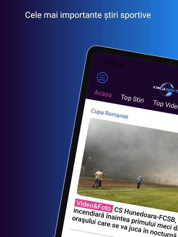
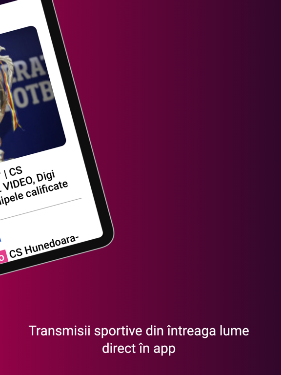
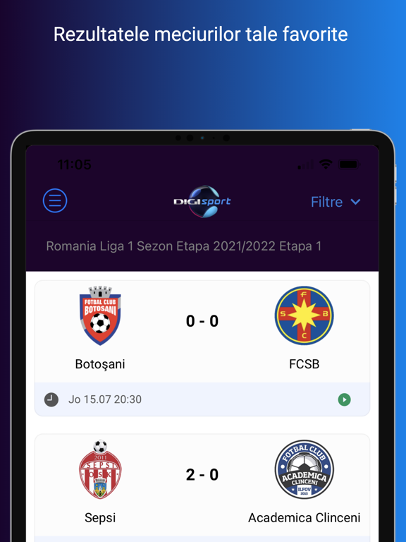
Aplicația Digi Sport îți oferă în timp real cele mai importante informații din lumea sportului, la o viteză superioară și cu o navigare îmbunătățită. Cele mai tari dueluri din fotbal, meciurile Simonei Halep, aruncările Cristinei Neagu sau cursele spectaculoase din Formula 1 și din MotoGP sunt doar câteva dintre evenimentele transmise și vor fi la doar un click distanță de tine. Spectacolul campionilor este în direct pe telefonul tău! Aplicația Digi Sport reprezintă playmaker-ul virtual care nu trebuie să-ți lipsească din telefon. Ești plecat și nu poți fii pe stadion la meciul echipei favorite? Aici poți urmări în direct posturile Digi Sport 1, Digi Sport 2, Digi Sport 3 și Digi Sport 4. În plus, vei putea accesa și meciurile transmise exclusiv în aplicație. Aplicația Digi Sport asigură relația ta bună cu sportul și cu echipa favorită. Notificările, pe care le alegi chiar tu,…
App details
What you can learn from DigiSport
Every shipping app on the App Store has gone through the same decisions you're working through right now: which screenshot goes first, what caption sits over it, which device frame to show, what color the background should be. The 14 screenshots above are DigiSport's answers to those questions — they're public, they're real, and they made it through Apple's review.
What the numbers say: DigiSport runs a mixed light-and-dark set where the background shifts from screenshot to screenshot (first shot #FCFCFC) — each image has to stand on its own, so the captions carry more of the story. The accent colour we picked up, #1C245C, is the one to reuse for badges, arrows and highlighted words if you borrow this look. Hit Use this style to open the editor with these exact colours and drop your own screenshot in.
Notice the first screenshot in particular. It's the one users see in search results and on the product page, and it's where most apps spend their best caption and tightest design. Look at the proportion of background to phone, where the text sits, what one thing the image is trying to communicate.
Want to see how other Sports apps approach the same problem? Browse more Sports apps in the showcase.
Take what works into your own screenshots
Open LaunchShots and design your App Store & Google Play screenshots — pick a device frame, drop captions, ship in minutes. Free, in your browser.
Open the screenshot editor →Apps with a similar look
Closest background + accent colours among the listings we've analysed — useful when you want to see the same palette handled by a different team.