Chart position — tracked daily by LaunchShots
Screenshot changes — detected by LaunchShots
Screenshot style breakdown
Sampled from 6 of Thai Life Insurance's App Store screenshots — background, accent and theme, measured by LaunchShots (not something Apple publishes).
#44A4FC bg
#3B90DD
#94DCFC accent
#111111 text
Screenshots



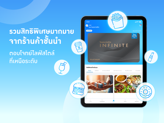
iPad screenshots


Icon palette
About this app
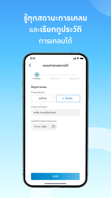
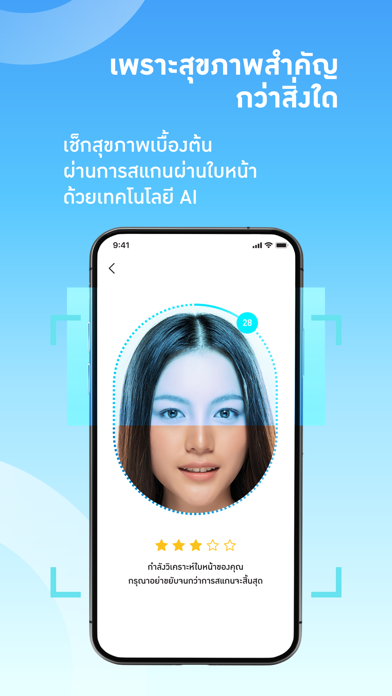
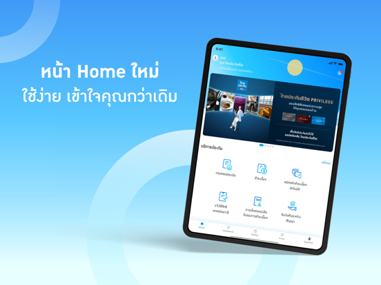
แอปพลิเคชันสำหรับลูกค้าไทยประกันชีวิต แอปพลิเคชัน ไทยประกันชีวิต "เพื่อนคู่คิด ดูแลชีวิตครบ" มากกว่าแอปพลิเคชัน คือ เพื่อนคู่คิด ที่พร้อมเคียงข้างทุกช่วงเวลาของชีวิต เพื่อนคู่คิด ที่ช่วยให้เรื่องประกันชีวิตเป็นเรื่องง่าย เพื่อนคู่คิด ที่เข้าใจความต้องการ เพื่อเป็นทุกคำตอบให้กับคุณ บริการด้านธุรกรรมประกันชีวิต เพื่อให้คุณสามารถเข้าถึงข้อมูลกรมธรรม์ พร้อมรายละเอียดความคุ้มครองได้ทุกที่ทุกเวลา และอีกหลากหลายการใช้งานที่พร้อมตอบทุกความต้องการของลูกค้าคนสำคัญเช่นคุณ อาทิ 1) ตรวจสอบข้อมูลกรมธรรม์ และความคุ้มครองของทุกกรมธรรม์ที่มีผลบังคับ 2) ผลประโยชน์ตามเงื่อนไขกรมธรรม์ 3) เปลี่ยนแปลงข้อมูลกรมธรรม์ (ที่อยู่ หรือเบอร์โทรศัพท์ หรืออีเมล) 4) แจ้งใช้สิทธิลดหย่อนภาษี 5) ดาวน์โหลดหนังสือรับรองการชำระเบี้ยประกันภัย 6) แสดงรายการเบี้ยประกันภัยที่ต้องชำระ และประวัติการชำระเงิน 7) การเข้าร่วมกิจกรรมสำหรับไทยประกันชีวิต ไลฟ์ฟิต ได้แก่ กิจกรรมเพื่อสะสมคะแนนไลฟ์ฟิต การทำแบบประเมินสุขภาพ การเ…
App details
What you can learn from Thai Life Insurance
Every shipping app on the App Store has gone through the same decisions you're working through right now: which screenshot goes first, what caption sits over it, which device frame to show, what color the background should be. The 16 screenshots above are Thai Life Insurance's answers to those questions — they're public, they're real, and they made it through Apple's review.
What the numbers say: Thai Life Insurance runs a light set where the background shifts from screenshot to screenshot (first shot #44A4FC) — each image has to stand on its own, so the captions carry more of the story. The accent colour we picked up, #94DCFC, is the one to reuse for badges, arrows and highlighted words if you borrow this look. Hit Use this style to open the editor with these exact colours and drop your own screenshot in.
Notice the first screenshot in particular. It's the one users see in search results and on the product page, and it's where most apps spend their best caption and tightest design. Look at the proportion of background to phone, where the text sits, what one thing the image is trying to communicate.
Want to see how other Lifestyle apps approach the same problem? Browse more Lifestyle apps in the showcase.
Take what works into your own screenshots
Open LaunchShots and design your App Store & Google Play screenshots — pick a device frame, drop captions, ship in minutes. Free, in your browser.
Open the screenshot editor →Apps with a similar look
Closest background + accent colours among the listings we've analysed — useful when you want to see the same palette handled by a different team.