Chart position — tracked daily by LaunchShots
Screenshot changes — detected by LaunchShots
Screenshot style breakdown
Sampled from 6 of Guardians: Mis Guardias's App Store screenshots — background, accent and theme, measured by LaunchShots (not something Apple publishes).
#3464EC bg
#5079EE
#94B4FC accent
#FFFFFF text
Reading the caption text from the screenshots in your browser…
Screenshots


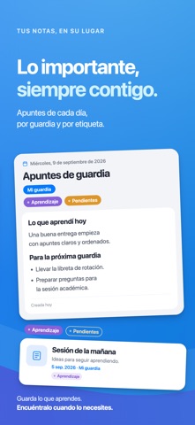
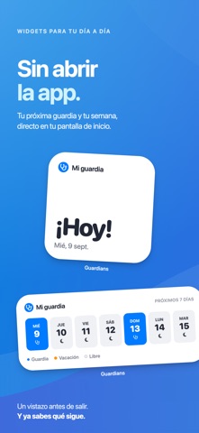

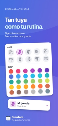
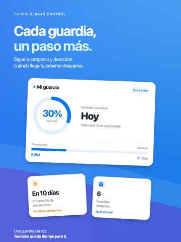
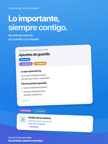
iPad screenshots



Icon palette
About this app
Guardians es la agenda médica diseñada para residentes, internos, estudiantes de medicina y profesionales con ciclos rotativos. La que no encaja en un calendario tradicional. Configuras tu patrón de guardia una sola vez — ciclos A, A-B, hasta A-G, personalizados o por días de la semana — y Guardians proyecta tus turnos, vacaciones y descansos hacia adelante. Sin hojas de cálculo, sin contar días con los dedos. TODA TU AGENDA, DE UN VISTAZO - Ciclos A a A-G, días personalizados o días específicos de la semana - Vacaciones con pausa y reanudación automática del ciclo - Detección de fines de semana completos libres - Agrega las guardias de tus amigos para coordinar planes - Porcentaje del ciclo, próxima guardia, días hasta tu próximo fin de semana libre NOTAS QUE IMPORTAN - Notas diarias con formato markdown - Adjunta fotos para recordar el día - Organiza con etiquetas personalizadas - …
App details
What you can learn from Guardians: Mis Guardias
Every shipping app on the App Store has gone through the same decisions you're working through right now: which screenshot goes first, what caption sits over it, which device frame to show, what color the background should be. The 12 screenshots above are Guardians: Mis Guardias's answers to those questions — they're public, they're real, and they made it through Apple's review.
What the numbers say: Guardians: Mis Guardias runs a mixed light-and-dark set where the background shifts from screenshot to screenshot (first shot #3464EC) — each image has to stand on its own, so the captions carry more of the story. The accent colour we picked up, #94B4FC, is the one to reuse for badges, arrows and highlighted words if you borrow this look. Hit Use this style to open the editor with these exact colours and drop your own screenshot in.
Notice the first screenshot in particular. It's the one users see in search results and on the product page, and it's where most apps spend their best caption and tightest design. Look at the proportion of background to phone, where the text sits, what one thing the image is trying to communicate.
Want to see how other Medical apps approach the same problem? Browse more Medical apps in the showcase.
Take what works into your own screenshots
Open LaunchShots and design your App Store & Google Play screenshots — pick a device frame, drop captions, ship in minutes. Free, in your browser.
Open the screenshot editor →Apps with a similar look
Closest background + accent colours among the listings we've analysed — useful when you want to see the same palette handled by a different team.