Chart position — tracked daily by LaunchShots
Screenshot style breakdown
Sampled from 6 of 天気と風と波's App Store screenshots — background, accent and theme, measured by LaunchShots (not something Apple publishes).
#4C5C64 bg
#657279
#FC6C04 accent
#FFFFFF text
Screenshots
Icon palette
About this app
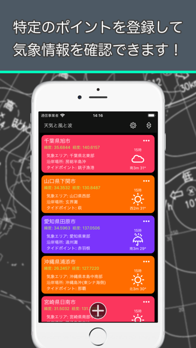
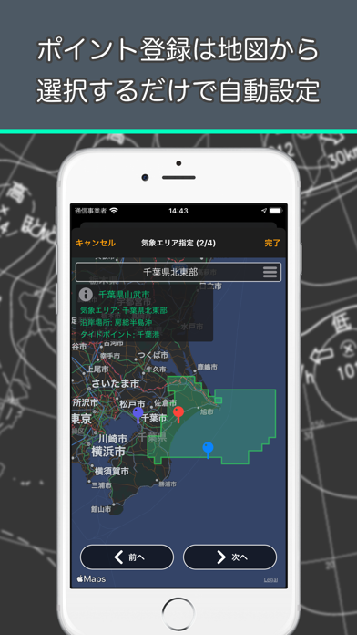
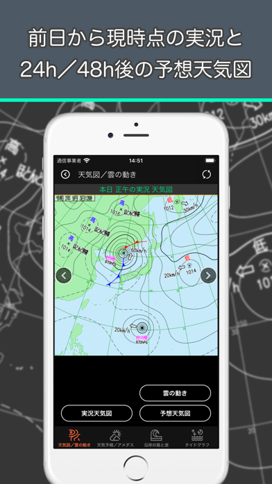
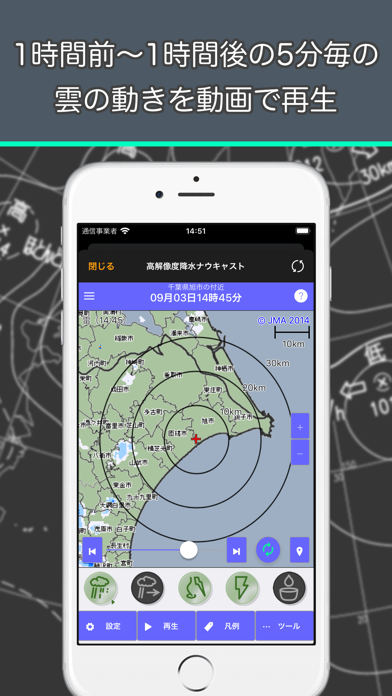
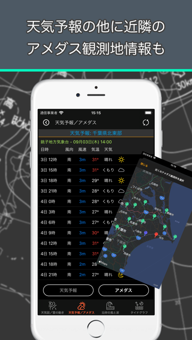
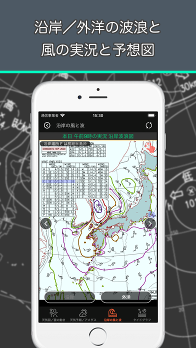
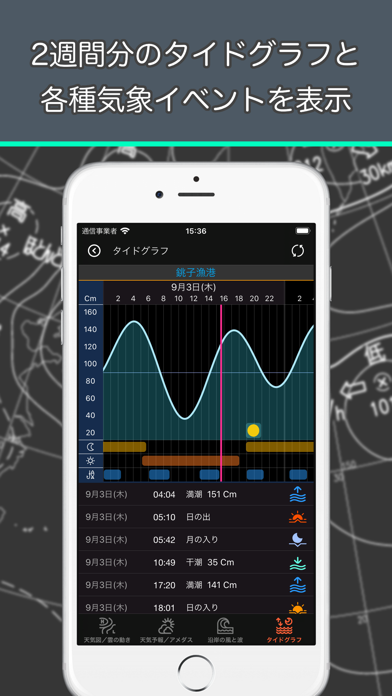
「天気と風と波」は気象庁が公開しているパブリックデータを利用し、天気図、天気予報、沿岸や外洋の風と波情報、タイドグラフ等を確認できます。 情報は全て気象庁発表のデータを利用しています。 気象情報を確認するポイントを複数設定できます。設定は簡単で地図からポイントを指定するだけで自動設定できます。 ポイントの情報は、対象となる気象エリア、沿岸場所、タイドポイント等を手動で設定することもできます。 ポイントは、メイン画面にカード形式で表示し、直近の予報(天気、気温、風向、風速)をひと目で確認できます。 カードは3色に色分けできます。 確認できるポイントの詳細情報は以下の通りです。 1. 実況天気図と予報天気図 2. 高解像度降水ナウキャスト(雨雲や雷の動き) 3. 3時間毎の天気予報 4. アメダスの観測情報(全国1,296ヶ所) 5. 沿岸と外洋の実況波浪図、予想波浪図 6. タイドグラフ(全国239ヶ所) 気象庁サイトではかなり多くの情報を見ることができますが、このアプリではそれらの情報を整理して簡単な操作で…
App details
What you can learn from 天気と風と波
Every shipping app on the App Store has gone through the same decisions you're working through right now: which screenshot goes first, what caption sits over it, which device frame to show, what color the background should be. The 7 screenshots above are 天気と風と波's answers to those questions — they're public, they're real, and they made it through Apple's review.
What the numbers say: 天気と風と波 runs a dark set where the background shifts from screenshot to screenshot (first shot #4C5C64) — each image has to stand on its own, so the captions carry more of the story. The accent colour we picked up, #FC6C04, is the one to reuse for badges, arrows and highlighted words if you borrow this look. Hit Use this style to open the editor with these exact colours and drop your own screenshot in.
Notice the first screenshot in particular. It's the one users see in search results and on the product page, and it's where most apps spend their best caption and tightest design. Look at the proportion of background to phone, where the text sits, what one thing the image is trying to communicate.
Want to see how other Weather apps approach the same problem? Browse more Weather apps in the showcase.
Take what works into your own screenshots
Open LaunchShots and design your App Store & Google Play screenshots — pick a device frame, drop captions, ship in minutes. Free, in your browser.
Open the screenshot editor →Apps with a similar look
Closest background + accent colours among the listings we've analysed — useful when you want to see the same palette handled by a different team.