Chart position — tracked daily by LaunchShots
Screenshot style breakdown
Sampled from 6 of Учи Мед (Учи Анат)'s App Store screenshots — background, accent and theme, measured by LaunchShots (not something Apple publishes).
#04C4D4 bg
#03ACBA
#84E4EC accent
#111111 text
Screenshots


iPad screenshots



Icon palette
About this app
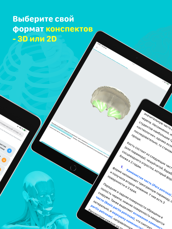
Приложение «Учи Мед» позволяет всесторонне подготовиться к занятиям по анатомии, гистологии, биохимии и физиологии или освежить старые знания. Краткие конспекты без воды содержат выжимку теории. Полноценные 3D препараты в остеологии и артрологии. Увидел незнакомое анатомическое образование? Нажми на него и откроется иллюстрация, где цветом, а не стрелкой оно выделено на картинке. Больше не нужно отодвигать книгу и доставать атлас - все в одном месте. Подробные видеоролики помогут закрепить теорию. Латинские карточки позволяют быстрее и правильно запоминать термины. Проверь свои теоретические знания по авторским тестам, а практические навыки по тестам с иллюстрациями. Кроме того, начни уже сейчас формировать клиническое мышление! Для этого в некоторых разделах будут клинические задачи, основанные на знаниях анатомии, а также интересные факты из клиники. ИНФОРМАЦИЯ ОБ ИСПОЛЬЗОВА…
App details
What you can learn from Учи Мед (Учи Анат)
Every shipping app on the App Store has gone through the same decisions you're working through right now: which screenshot goes first, what caption sits over it, which device frame to show, what color the background should be. The 17 screenshots above are Учи Мед (Учи Анат)'s answers to those questions — they're public, they're real, and they made it through Apple's review.
What the numbers say: Учи Мед (Учи Анат) runs a mixed light-and-dark set where the background shifts from screenshot to screenshot (first shot #04C4D4) — each image has to stand on its own, so the captions carry more of the story. The accent colour we picked up, #84E4EC, is the one to reuse for badges, arrows and highlighted words if you borrow this look. Hit Use this style to open the editor with these exact colours and drop your own screenshot in.
Notice the first screenshot in particular. It's the one users see in search results and on the product page, and it's where most apps spend their best caption and tightest design. Look at the proportion of background to phone, where the text sits, what one thing the image is trying to communicate.
Want to see how other Medical apps approach the same problem? Browse more Medical apps in the showcase.
Take what works into your own screenshots
Open LaunchShots and design your App Store & Google Play screenshots — pick a device frame, drop captions, ship in minutes. Free, in your browser.
Open the screenshot editor →Apps with a similar look
Closest background + accent colours among the listings we've analysed — useful when you want to see the same palette handled by a different team.