Chart position — tracked daily by LaunchShots
Screenshot style breakdown
Sampled from 6 of Технопарк — магазин техники's App Store screenshots — background, accent and theme, measured by LaunchShots (not something Apple publishes).
#0C141C bg
#2E343B
#0494C4 accent
#FFFFFF text
Screenshots


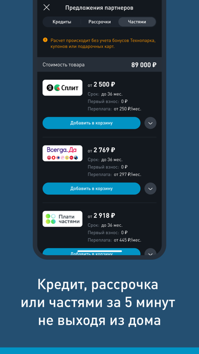


iPad screenshots

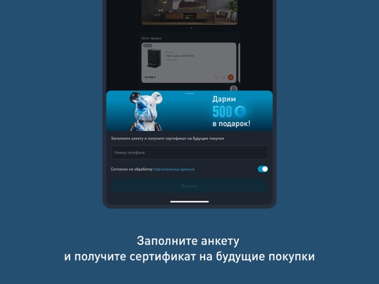


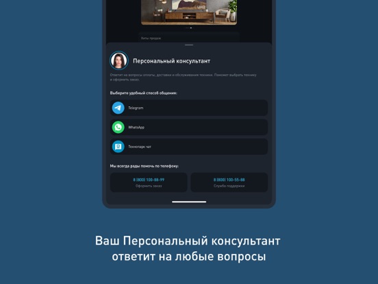

Icon palette
About this app
Технопарк — интернет-магазин премиальной техники. В приложении вам доступны персональный консультант, бонусная программа, заказ и доставка электроники по всей России. ПРЕИМУЩЕСТВА ПРИЛОЖЕНИЯ — Бытовая техника для дома и электроника от ведущих мировых производителей: BORK, QYRON, Dyson, Samsung, Smeg и др. — Последние новинки на рынке техники и эксклюзивные модели. — Актуальный статус заказа на главной странице приложения. — Сканирование QR-кодов для быстрого доступа к информации о товаре в магазине. — Множество акций и специальных предложений для выгодных покупок. КАТАЛОГ ТОВАРОВ Наш интернет-магазин техники предлагает большой каталог премиум-товаров различных категорий: аудиотехника, бытовая техника для дома, различная электроника и смартфоны. Здесь вы точно найдете все необходимое для современной комфортной жизни. ИНФОРМАЦИЯ О ТОВАРЕ Все сведения о товаре собраны в одном месте: про…
App details
What you can learn from Технопарк — магазин техники
Every shipping app on the App Store has gone through the same decisions you're working through right now: which screenshot goes first, what caption sits over it, which device frame to show, what color the background should be. The 18 screenshots above are Технопарк — магазин техники's answers to those questions — they're public, they're real, and they made it through Apple's review.
What the numbers say: Технопарк — магазин техники runs a dark set where the background shifts from screenshot to screenshot (first shot #0C141C) — each image has to stand on its own, so the captions carry more of the story. The accent colour we picked up, #0494C4, is the one to reuse for badges, arrows and highlighted words if you borrow this look. Hit Use this style to open the editor with these exact colours and drop your own screenshot in.
Notice the first screenshot in particular. It's the one users see in search results and on the product page, and it's where most apps spend their best caption and tightest design. Look at the proportion of background to phone, where the text sits, what one thing the image is trying to communicate.
Want to see how other Shopping apps approach the same problem? Browse more Shopping apps in the showcase.
Take what works into your own screenshots
Open LaunchShots and design your App Store & Google Play screenshots — pick a device frame, drop captions, ship in minutes. Free, in your browser.
Open the screenshot editor →Apps with a similar look
Closest background + accent colours among the listings we've analysed — useful when you want to see the same palette handled by a different team.