Chart position — tracked daily by LaunchShots
Screenshot style breakdown
Sampled from 4 of Secure-VPN's App Store screenshots — background, accent and theme, measured by LaunchShots (not something Apple publishes).
#0C0C1C bg
#2E2E3B
#1C9CC4 accent
#FFFFFF text
Screenshots

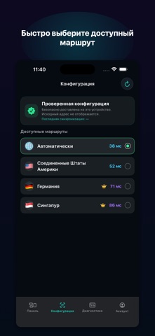
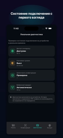

iPad screenshots


Icon palette
About this app
Secure-VPN — iPhone / iPad • Использовать камеру • Выбрать из Фото • Безопасно доставлена на это устройство. Исходный адрес не отображается. • Запустить защищённое подключение • Доступные маршруты • Время · Вниз · Отдача · Выбранный маршрут • Диагностика выполняется на устройстве. История просмотра и содержимое VPN-трафика не анализируются, не сохраняются и не передаются. • Удалить конфигурацию 30 минут в день, сброс в полночь по местному времени. Получите 45 минут в режиме «Авто». Только один пропуск, действует 24 часа. 3 дня бесплатно для новых подписчиков. Продлевается ежемесячно. Новым подписчикам при наличии права доступны 3 бесплатных дня. Отмена — в аккаунте Apple. Подписка снимает только лимит времени в этом приложении. Она не включает и не продаёт сторонние подписки, узлы, маршруты или сетевые услуги. Продвижение • Действительное приглашение: +1 день автоузла. • Первая реал…
App details
What you can learn from Secure-VPN
Every shipping app on the App Store has gone through the same decisions you're working through right now: which screenshot goes first, what caption sits over it, which device frame to show, what color the background should be. The 8 screenshots above are Secure-VPN's answers to those questions — they're public, they're real, and they made it through Apple's review.
What the numbers say: Secure-VPN runs a dark set with one background colour (#0C0C1C) carried across every screenshot — the listing reads as a single poster when the shots sit side by side in search results. The accent colour we picked up, #1C9CC4, is the one to reuse for badges, arrows and highlighted words if you borrow this look. Hit Use this style to open the editor with these exact colours and drop your own screenshot in.
Notice the first screenshot in particular. It's the one users see in search results and on the product page, and it's where most apps spend their best caption and tightest design. Look at the proportion of background to phone, where the text sits, what one thing the image is trying to communicate.
Want to see how other Productivity apps approach the same problem? Browse more Productivity apps in the showcase.
Take what works into your own screenshots
Open LaunchShots and design your App Store & Google Play screenshots — pick a device frame, drop captions, ship in minutes. Free, in your browser.
Open the screenshot editor →Apps with a similar look
Closest background + accent colours among the listings we've analysed — useful when you want to see the same palette handled by a different team.