Chart position — tracked daily by LaunchShots
Screenshot style breakdown
Sampled from 5 of 漫画 / コミック 読むならFOD マンガ's App Store screenshots — background, accent and theme, measured by LaunchShots (not something Apple publishes).
#1C1C24 bg
#3B3B42
#BC0424 accent
#FFFFFF text
Screenshots
iPad screenshots
Icon palette
About this app
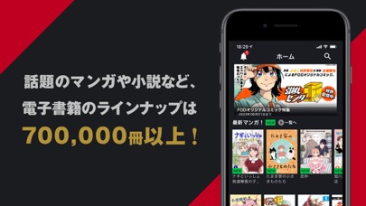
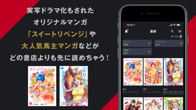
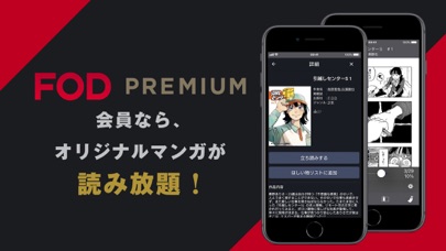
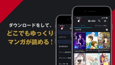
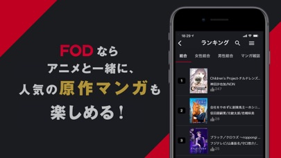
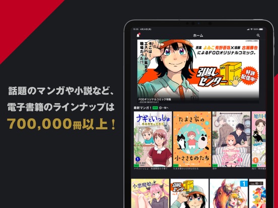
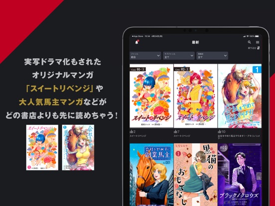
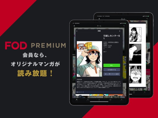
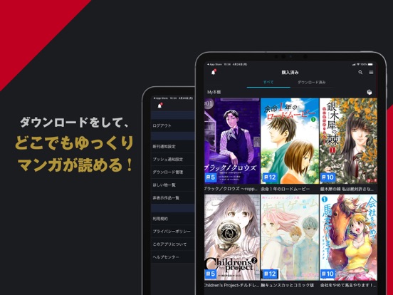
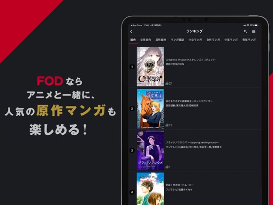
【FODマンガとは】 フジテレビが運営するマンガ配信サービスです。 話題のマンガなど電子書籍のラインナップは700,000冊以上! 登録不要で、まずはマンガを無料で立ち読みして楽しめます。 毎週続々と新刊入荷中! このアプリは、FODで購入したマンガの専用ビューアです。 【FODマンガの特徴】 ●実写ドラマ化もされたオリジナルマンガ「スイートリベンジ」や大人気馬主マンガなどがどの書店よりも先に読めちゃう! ●FODプレミアム会員なら、オリジナルマンガが読み放題! ●ダウンロードをして、ゆっくりマンガが読める! ●アニメと一緒に、人気の原作マンガもFODなら読める! 利用規約 https://fod.fujitv.co.jp/s/policy/terms/ プライバシーポリシー https://fod.fujitv.co.jp/s/policy/privacy/
App details
What you can learn from 漫画 / コミック 読むならFOD マンガ
Every shipping app on the App Store has gone through the same decisions you're working through right now: which screenshot goes first, what caption sits over it, which device frame to show, what color the background should be. The 10 screenshots above are 漫画 / コミック 読むならFOD マンガ's answers to those questions — they're public, they're real, and they made it through Apple's review.
What the numbers say: 漫画 / コミック 読むならFOD マンガ runs a dark set with one background colour (#1C1C24) carried across every screenshot — the listing reads as a single poster when the shots sit side by side in search results. The accent colour we picked up, #BC0424, is the one to reuse for badges, arrows and highlighted words if you borrow this look. Hit Use this style to open the editor with these exact colours and drop your own screenshot in.
Notice the first screenshot in particular. It's the one users see in search results and on the product page, and it's where most apps spend their best caption and tightest design. Look at the proportion of background to phone, where the text sits, what one thing the image is trying to communicate.
Want to see how other Book apps approach the same problem? Browse more Book apps in the showcase.
Take what works into your own screenshots
Open LaunchShots and design your App Store & Google Play screenshots — pick a device frame, drop captions, ship in minutes. Free, in your browser.
Open the screenshot editor →Apps with a similar look
Closest background + accent colours among the listings we've analysed — useful when you want to see the same palette handled by a different team.