Chart position — tracked daily by LaunchShots
Screenshot style breakdown
Sampled from 6 of WARPATH: Huân Chương Chiến Hỏa's App Store screenshots — background, accent and theme, measured by LaunchShots (not something Apple publishes).
#0C1C2C bg
#2E3B49
#445C74 accent
#FFFFFF text
Screenshots


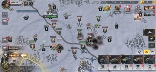
iPad screenshots


Icon palette
About this app
Hãy trải nghiệm bản đồ hàng hải mới! Nghiền nát Hạm Đội Hắc Quạ và chiến đấu giành Vị Trí Chiến Lược trên biển! Nhiệm vụ của bạn: Phối hợp các lực lượng của bạn và đánh bại lũ Hắc Quạ trên cả không trung, mặt đất lẫn mặt nước. Sử dụng kho vũ khí hiện đại mạnh mẽ để phòng thủ Căn Cứ của bạn và đột phá vòng bao vây của Hắc Quạ. Hãy đối đầu trực diện quân Hắc Quạ, vượt qua các hạm đội của chúng và trở thành bá chủ đại dương! PHẦN CHƠI HÀNH ĐỘNG BẮN TỈA HẤP DẪN Rèn giũa kỹ năng trong hơn một trăm nhiệm vụ, lấy bối cảnh từ nhiều chiến trường đa dạng ở cả trên bộ lẫn trên không. Thu thập các loại súng trường tấn công, súng trường bắn tỉa mạnh mẽ và nhiều vũ khí khác. ""Độ"" súng bằng linh kiện mới để tạo ra kho vũ khí lợi hại nhất thế giới. Cơ chế điều khiển mượt mà, hình ảnh đồ họa tuyệt đẹp và âm thanh được thiết kế tuyệt vời cùng với nhiều góc quay chậm sẽ tim bạn đập liên hồi. CHIẾN LƯ…
App details
What you can learn from WARPATH: Huân Chương Chiến Hỏa
Every shipping app on the App Store has gone through the same decisions you're working through right now: which screenshot goes first, what caption sits over it, which device frame to show, what color the background should be. The 12 screenshots above are WARPATH: Huân Chương Chiến Hỏa's answers to those questions — they're public, they're real, and they made it through Apple's review.
What the numbers say: WARPATH: Huân Chương Chiến Hỏa runs a mixed light-and-dark set where the background shifts from screenshot to screenshot (first shot #0C1C2C) — each image has to stand on its own, so the captions carry more of the story. The accent colour we picked up, #445C74, is the one to reuse for badges, arrows and highlighted words if you borrow this look. Hit Use this style to open the editor with these exact colours and drop your own screenshot in.
Notice the first screenshot in particular. It's the one users see in search results and on the product page, and it's where most apps spend their best caption and tightest design. Look at the proportion of background to phone, where the text sits, what one thing the image is trying to communicate.
Want to see how other Games apps approach the same problem? Browse more Games apps in the showcase.
Take what works into your own screenshots
Open LaunchShots and design your App Store & Google Play screenshots — pick a device frame, drop captions, ship in minutes. Free, in your browser.
Open the screenshot editor →Apps with a similar look
Closest background + accent colours among the listings we've analysed — useful when you want to see the same palette handled by a different team.