Chart position — tracked daily by LaunchShots
Screenshot changes — detected by LaunchShots
Screenshot style breakdown
Sampled from 6 of Choosy: Essensplaner & Rezepte's App Store screenshots — background, accent and theme, measured by LaunchShots (not something Apple publishes).
#F4FCFC bg
#D6DDDD
#3CCCB4 accent
#111111 text
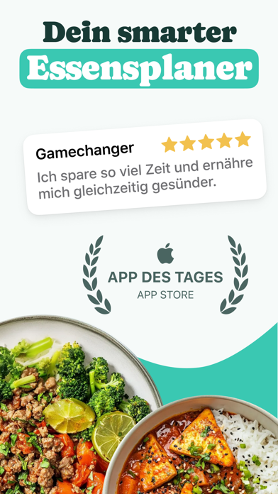
- #1Dein smarter Essensplaner
- #2Rezepte 100% fiir dich Swipe durch Vorschlage
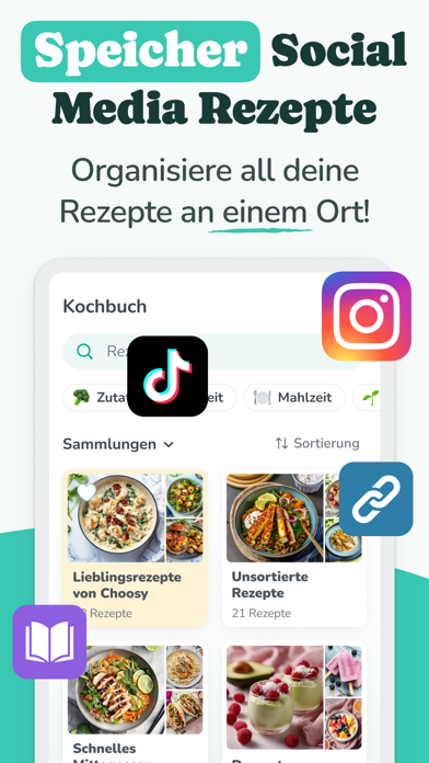
- #3Media Rezepte Organisiere all deine Rezepte an einem Ort!
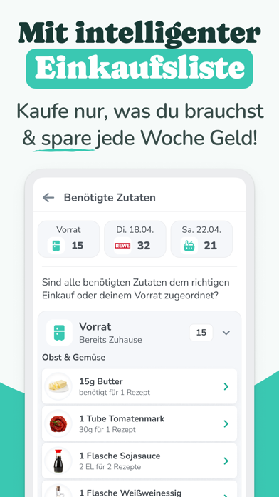
- #4Mit intelligenter Kaufe nur, was du brauchst & spare jede Woche Geld!
- #5Auf Wunsch liefern lassen Bequem wie eine Kochbox
- #6ohne Diät Gesunde Ernährung kann so einfach sein!
Captions read from the screenshots (OCR, may contain small errors): 6 headlines, 7.8 words on average (longest 12).
Screenshots





Icon palette
About this app
"Was essen wir heute?" Kaum eine Frage sorgt im vollen Familien- und Arbeitsalltag für so viel regelmäßigen Stress. Zwischen Job, Hausaufgaben und Hobbys bleibt oft einfach keine Energie mehr für aufwendige Essenspläne oder kreative Rezeptideen. Genau hier kommt Choosy ins Spiel. "Seitdem wir Choosy als Familie nutzen, ernähren wir uns gesünder, abwechslungsreicher, günstiger und mit weniger Aufwand. Sowas habe ich seit Jahren gesucht." - Anja, 37 Wir nehmen dir den "Mental Load" der täglichen Essensplanung komplett ab. Choosy ist dein digitaler Assistent, der dir Woche für Woche Zeit, Geld und Nerven spart - damit du dich auf die Dinge konzentrieren kannst, die wirklich zählen. --- FAMILIENALLTAG LEICHT GEMACHT --- Schluss mit Nörgeln am Esstisch! Choosy lernt den Geschmack deines Haushalts. Ob flexitarisch, vegan oder schnelle Familienküche - die App schlägt euch Gerichte vor, die …
App details
What you can learn from Choosy: Essensplaner & Rezepte
Every shipping app on the App Store has gone through the same decisions you're working through right now: which screenshot goes first, what caption sits over it, which device frame to show, what color the background should be. The 9 screenshots above are Choosy: Essensplaner & Rezepte's answers to those questions — they're public, they're real, and they made it through Apple's review.
What the numbers say: Choosy: Essensplaner & Rezepte runs a light set with one background colour (#F4FCFC) carried across every screenshot — the listing reads as a single poster when the shots sit side by side in search results. The accent colour we picked up, #3CCCB4, is the one to reuse for badges, arrows and highlighted words if you borrow this look. Hit Use this style to open the editor with these exact colours and drop your own screenshot in.
Notice the first screenshot in particular. It's the one users see in search results and on the product page, and it's where most apps spend their best caption and tightest design. Look at the proportion of background to phone, where the text sits, what one thing the image is trying to communicate.
Want to see how other Food & Drink apps approach the same problem? Browse more Food & Drink apps in the showcase.
Take what works into your own screenshots
Open LaunchShots and design your App Store & Google Play screenshots — pick a device frame, drop captions, ship in minutes. Free, in your browser.
Open the screenshot editor →Apps with a similar look
Closest background + accent colours among the listings we've analysed — useful when you want to see the same palette handled by a different team.