Chart position — tracked daily by LaunchShots
Screenshot changes — detected by LaunchShots
Screenshot style breakdown
Sampled from 6 of Oxide: Survival Island's App Store screenshots — background, accent and theme, measured by LaunchShots (not something Apple publishes).
#040404 bg
#272727
#545424 accent
#FFFFFF text
Screenshots


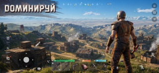

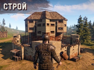
iPad screenshots




Icon palette
About this app
Oxide: Survival Island - новая игра, основанная на Survival Simulator! И вот ты здесь, один на необитаемом острове. Опасности поджидают тебя на каждому шагу: голод, дикие животные, враги, холод, - сможешь ли ты противостоять им? А теперь остановись, переведи дух и подумай. Шаг 1: собрать ресурсы и создать инструменты. Шаг 2: построить убежище и смастерить одежду. Шаг 3, создать оружие, выйти на охоту и добыть еду. Не забывай о других игроках, населяющих этот остров. А лучше найди союзников, чтобы сражаться плечом к плечу! План ясен? Тогда вперед! Сделай все, чтобы остаться в живых! Удачи! Особенности: - Собственные сервера, что позволяет игроку без потерь сохранять весь прогресс и увеличивает количество игроков на одном сервере; - Расширенная карта: лес, океан, заправка и базы, где можно найти бочки с лутом; - Система друзей. Теперь можно добавлять других игроков в друзья и видеть, ко…
App details
What you can learn from Oxide: Survival Island
Every shipping app on the App Store has gone through the same decisions you're working through right now: which screenshot goes first, what caption sits over it, which device frame to show, what color the background should be. The 18 screenshots above are Oxide: Survival Island's answers to those questions — they're public, they're real, and they made it through Apple's review.
What the numbers say: Oxide: Survival Island runs a mixed light-and-dark set where the background shifts from screenshot to screenshot (first shot #040404) — each image has to stand on its own, so the captions carry more of the story. The accent colour we picked up, #545424, is the one to reuse for badges, arrows and highlighted words if you borrow this look. Hit Use this style to open the editor with these exact colours and drop your own screenshot in.
Notice the first screenshot in particular. It's the one users see in search results and on the product page, and it's where most apps spend their best caption and tightest design. Look at the proportion of background to phone, where the text sits, what one thing the image is trying to communicate.
Want to see how other Games apps approach the same problem? Browse more Games apps in the showcase.
Take what works into your own screenshots
Open LaunchShots and design your App Store & Google Play screenshots — pick a device frame, drop captions, ship in minutes. Free, in your browser.
Open the screenshot editor →Apps with a similar look
Closest background + accent colours among the listings we've analysed — useful when you want to see the same palette handled by a different team.