Chart position — tracked daily by LaunchShots
Screenshot style breakdown
Sampled from 3 of еКапуста – займы на карту's App Store screenshots — background, accent and theme, measured by LaunchShots (not something Apple publishes).
#FCFCFC bg
#DDDDDD
#FC8C14 accent
#111111 text
Screenshots
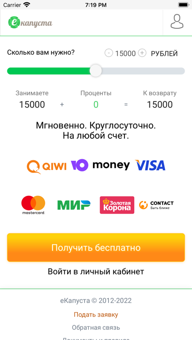
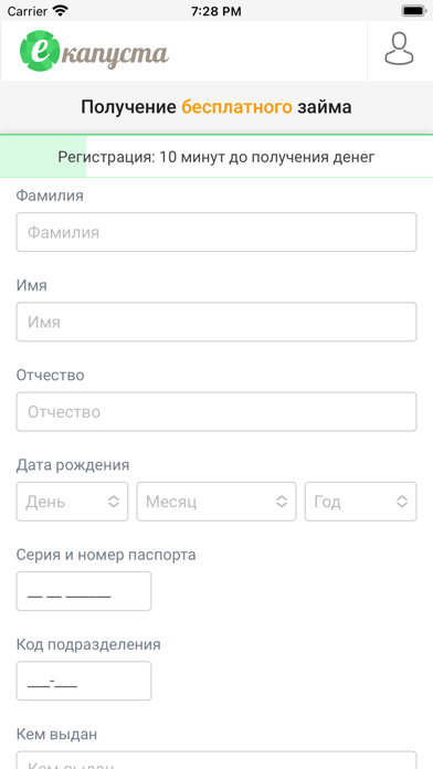
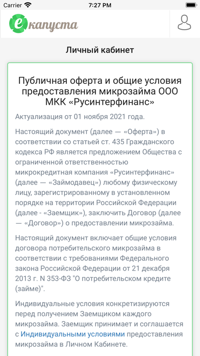
Icon palette
About this app
Новым клиентам: Мы руководствуемся принципами честности, простоты и удобства. Воспользовавшись нашим приложением будьте уверены в отсутствии скрытых комиссий, оперативной поддержке и безопасности ваших данных. В этом уже убедилось более 7 миллионов клиентов. Единожды пройдя регистрацию, вы получаете надежного финансового помощника в любой точке мира. Преимущества получения онлайн-займа в еКапусте: – Мгновенно принимаем решение и переводим деньги на карту, кошелек или счёт – Для регистрации требуется только паспорт РФ и 10 минут времени – Полная стоимость пользования займом известна сразу – Отсутствие комиссий за погашение займа – Работаем круглосуточно, без праздников и выходных – Максимально доступная сумма займа увеличивается по мере пользования сервисом – Поддержка в чате и по телефону 24/7 – Отличная репутация: оценка 5.0 на Яндексе на основе отзывов клиентов, 9 лет на рынке Для о…
App details
What you can learn from еКапуста – займы на карту
Every shipping app on the App Store has gone through the same decisions you're working through right now: which screenshot goes first, what caption sits over it, which device frame to show, what color the background should be. The 3 screenshots above are еКапуста – займы на карту's answers to those questions — they're public, they're real, and they made it through Apple's review.
What the numbers say: еКапуста – займы на карту runs a light set with one background colour (#FCFCFC) carried across every screenshot — the listing reads as a single poster when the shots sit side by side in search results. The accent colour we picked up, #FC8C14, is the one to reuse for badges, arrows and highlighted words if you borrow this look. Hit Use this style to open the editor with these exact colours and drop your own screenshot in.
Notice the first screenshot in particular. It's the one users see in search results and on the product page, and it's where most apps spend their best caption and tightest design. Look at the proportion of background to phone, where the text sits, what one thing the image is trying to communicate.
Want to see how other Finance apps approach the same problem? Browse more Finance apps in the showcase.
Take what works into your own screenshots
Open LaunchShots and design your App Store & Google Play screenshots — pick a device frame, drop captions, ship in minutes. Free, in your browser.
Open the screenshot editor →Apps with a similar look
Closest background + accent colours among the listings we've analysed — useful when you want to see the same palette handled by a different team.