Chart position — tracked daily by LaunchShots
Screenshot style breakdown
Sampled from 6 of قافية's App Store screenshots — background, accent and theme, measured by LaunchShots (not something Apple publishes).
#FCFCFC bg
#DDDDDD
#B49C6C accent
#111111 text
Screenshots
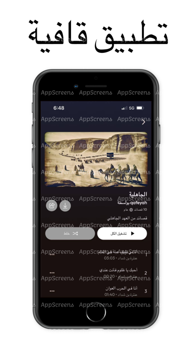


iPad screenshots


Icon palette
About this app
تطبيق “قافية” هو تطبيق متخصص في تقديم الشعر العربي النبطي والفصيح، حيث يهدف إلى نشر التراث الشعري العربي بطريقة عصرية وجذابة. يتيح التطبيق للمستخدمين الاستماع إلى قصائد متنوعة بأصوات شعراء بارزين ومؤدين محترفين، مما يضفي على تجربة الاستماع عمقًا وحسًا فنيًا متميزًا. تطبيق “قافية” يقدم نافذة مبتكرة على عالم الشعر العربي، حيث يتيح الاستمتاع بقصائد شعرية عريقة ومعاصرة بأداء صوتي مؤثر وملهم. من خلال هذه المنصة الرقمية يتم تقديم القصائد بصيغة صوتية تعزز من الأثر العاطفي والجمالي للكلمات. كما يقدم التطبيق مكتبة غنية تضم مجموعة واسعة من القصائد، تشمل شعر الفصحى والشعر النبطي، مع خيارات للاستماع إلى قصائد ملهمة من مختلف العصور والمدارس الشعرية. يمكن للمستخدمين عبر تطبيق “قافية” اكتشاف مكتبة شاسعة من القصائد التي تنتمي لمختلف العصور والمدارس الشعرية، من الشعر الجاهلي مرورًا بالعصر الأندلسي وصولاً إلى الشعر الحديث.ويمكن للمستخدمين البحث بسهولة عن قصائد معينة أو شعراء مفضلين، بالإضافة إلى إمكانية…
App details
What you can learn from قافية
Every shipping app on the App Store has gone through the same decisions you're working through right now: which screenshot goes first, what caption sits over it, which device frame to show, what color the background should be. The 13 screenshots above are قافية's answers to those questions — they're public, they're real, and they made it through Apple's review.
What the numbers say: قافية runs a light set with one background colour (#FCFCFC) carried across every screenshot — the listing reads as a single poster when the shots sit side by side in search results. The accent colour we picked up, #B49C6C, is the one to reuse for badges, arrows and highlighted words if you borrow this look. Hit Use this style to open the editor with these exact colours and drop your own screenshot in.
Notice the first screenshot in particular. It's the one users see in search results and on the product page, and it's where most apps spend their best caption and tightest design. Look at the proportion of background to phone, where the text sits, what one thing the image is trying to communicate.
Want to see how other Music apps approach the same problem? Browse more Music apps in the showcase.
Take what works into your own screenshots
Open LaunchShots and design your App Store & Google Play screenshots — pick a device frame, drop captions, ship in minutes. Free, in your browser.
Open the screenshot editor →Apps with a similar look
Closest background + accent colours among the listings we've analysed — useful when you want to see the same palette handled by a different team.