Screenshot style breakdown
Sampled from 6 of Lusha: Routines et émotions's App Store screenshots — background, accent and theme, measured by LaunchShots (not something Apple publishes).
#EC4444 bg
#EE5E5E
#5CCC7C accent
#FFFFFF text
- #1yr < compétences sociales ct tâches du quotidien
- #3Adaptez les rapidement à tout moment
- #4Un jeu vidéo ludique pour transformer ses comportements = Y=,
- #5Améliorez ses compétences sociales gräceraujeur
- #6Développez son intelligence émotionnelle
Captions read from the screenshots (OCR, may contain small errors): 5 headlines, 6.6 words on average (longest 10).
Screenshots


iPad screenshots


Icon palette
About this app
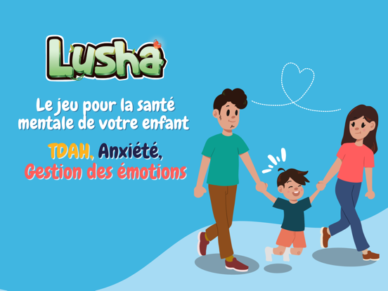
Découvrez Lusha, un jeu immersif pour aider les enfants à renforcer leur santé mentale et à s'épanouir (TDAH, troubles du comportement, gestion des émotions, anxiété). POUR VOUS PARENTS : Lusha offre un soutien concret en intégrant des conseils issus de programme de santé mentale comme le programme Barkley. Accédez à des outils et des informations clés pour gérer plus efficacement la santé mentale de votre enfant. Suivez et partagez ses progrès avec les professionnels de santé grâce au tableau de bord de Lusha, facilitant la prise de décisions éclairées et favorisant une approche collaborative de la gestion de sa santé mentale. POUR VOTRE ENFANT (6 à 12 ans): Plongez le dans un univers captivant de jungle où son avatar rencontre des animaux bienveillants qui l'aident à mieux comprendre ses comportements, ses émotions et ses rapports sociaux et lui offrent des conseils pratiques basés…
App details
What you can learn from Lusha: Routines et émotions
Every shipping app on the App Store has gone through the same decisions you're working through right now: which screenshot goes first, what caption sits over it, which device frame to show, what color the background should be. The 16 screenshots above are Lusha: Routines et émotions's answers to those questions — they're public, they're real, and they made it through Apple's review.
What the numbers say: Lusha: Routines et émotions runs a mixed light-and-dark set where the background shifts from screenshot to screenshot (first shot #EC4444) — each image has to stand on its own, so the captions carry more of the story. The accent colour we picked up, #5CCC7C, is the one to reuse for badges, arrows and highlighted words if you borrow this look. Hit Use this style to open the editor with these exact colours and drop your own screenshot in.
Notice the first screenshot in particular. It's the one users see in search results and on the product page, and it's where most apps spend their best caption and tightest design. Look at the proportion of background to phone, where the text sits, what one thing the image is trying to communicate.
Want to see how other Medical apps approach the same problem? Browse more Medical apps in the showcase.
Take what works into your own screenshots
Open LaunchShots and design your App Store & Google Play screenshots — pick a device frame, drop captions, ship in minutes. Free, in your browser.
Open the screenshot editor →Apps with a similar look
Closest background + accent colours among the listings we've analysed — useful when you want to see the same palette handled by a different team.