Screenshot style breakdown
Sampled from 3 of WBGT - 暑さ指数's App Store screenshots — background, accent and theme, measured by LaunchShots (not something Apple publishes).
#FCFCFC bg
#DDDDDD
#FCF454 accent
#111111 text
Screenshots
iPad screenshots


Icon palette
About this app
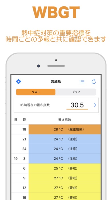
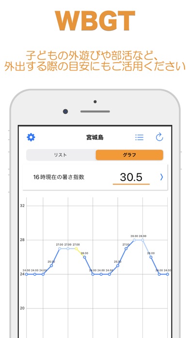
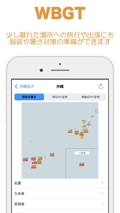
【概要】 近年、猛暑により熱中症による救急搬送が増えております。 その対策に少しでもお力になればと思い作成しました。 気象庁や環境省からも例年猛暑の観測が強化されております。 本アプリケーションは気温・湿度・気象条件から求めた暑さ指数(WBGT)を簡単に確認することが出来ます。 ・熱中症対策の重要指標を時間ごとの予報と共に確認できます。 ・子どもの外遊びや部活など、外出する際の目安にもご活用ください。 ・少し離れた場所への旅行や出張にも服装や暑さ対策の準備ができます。 【主な機能】 ・現在位置、全国の暑さ指数(WBGT) 今後も機能など増やしていきます! 「こんな機能が欲しい」「こうしたら使いやすいのに」等々、ご要望があればコメントをどうぞ!
App details
What you can learn from WBGT - 暑さ指数
Every shipping app on the App Store has gone through the same decisions you're working through right now: which screenshot goes first, what caption sits over it, which device frame to show, what color the background should be. The 6 screenshots above are WBGT - 暑さ指数's answers to those questions — they're public, they're real, and they made it through Apple's review.
What the numbers say: WBGT - 暑さ指数 runs a light set with one background colour (#FCFCFC) carried across every screenshot — the listing reads as a single poster when the shots sit side by side in search results. The accent colour we picked up, #FCF454, is the one to reuse for badges, arrows and highlighted words if you borrow this look. Hit Use this style to open the editor with these exact colours and drop your own screenshot in.
Notice the first screenshot in particular. It's the one users see in search results and on the product page, and it's where most apps spend their best caption and tightest design. Look at the proportion of background to phone, where the text sits, what one thing the image is trying to communicate.
Want to see how other Weather apps approach the same problem? Browse more Weather apps in the showcase.
Take what works into your own screenshots
Open LaunchShots and design your App Store & Google Play screenshots — pick a device frame, drop captions, ship in minutes. Free, in your browser.
Open the screenshot editor →Apps with a similar look
Closest background + accent colours among the listings we've analysed — useful when you want to see the same palette handled by a different team.