Chart position — tracked daily by LaunchShots
Screenshot style breakdown
Sampled from 6 of EWE Go - Elektroauto laden's App Store screenshots — background, accent and theme, measured by LaunchShots (not something Apple publishes).
#343434 bg
#505050
#FCF404 accent
#FFFFFF text
- #1Einfach. Entspannt.
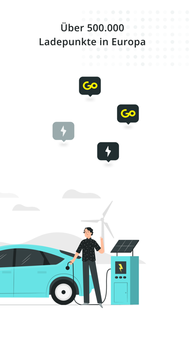
- #3Uber 500.000 Ladepunkte in Europa FY
- #4Ubersichtliche Ansicht der Karte Ze Q
- #5Details zu jedem Ladepunkt == R
- #6Finde EWE Go Ladestationen entlang deiner Route
Captions read from the screenshots (OCR, may contain small errors): 5 headlines, 5.4 words on average (longest 7).
Screenshots




Icon palette
About this app
Einfach. Entspannt. Ankommen. Mit der EWE Go App lädst du dein E-Auto zuverlässig – überall dort, wo du unterwegs bist. 100 % Strom aus erneuerbaren Energien. Mit dem EWE Go Ladetarif lädst du flächendeckend zum fairen Preis – ohne versteckte Kosten: • 0,52 € pro kWh an EWE Go Ladestationen • 0,62 € pro kWh an Partnerstationen • Keine Grundgebühr – volle Flexibilität • Kostenlose EWE Go Ladekarte inklusive Das Beste daran: Die Preise gelten auch fürs Schnellladen (HPC) So einfach kann Laden sein: fair, easy, transparent. Deine Vorteile auf einen Blick: * Finde freie Ladepunkte über die Kartenansicht * Lass dich direkt zur passenden Ladestation navigieren * Starte und beende den Ladevorgang per App oder Ladekarte * Bezahle sicher und transparent über die App – monatlich gesammelt * Filtere nach Ladeleistung, Steckertyp oder Standorttyp (z. B. Supermarkt oder WC) So funktioniert’s:…
App details
What you can learn from EWE Go - Elektroauto laden
Every shipping app on the App Store has gone through the same decisions you're working through right now: which screenshot goes first, what caption sits over it, which device frame to show, what color the background should be. The 7 screenshots above are EWE Go - Elektroauto laden's answers to those questions — they're public, they're real, and they made it through Apple's review.
What the numbers say: EWE Go - Elektroauto laden runs a mixed light-and-dark set where the background shifts from screenshot to screenshot (first shot #343434) — each image has to stand on its own, so the captions carry more of the story. The accent colour we picked up, #FCF404, is the one to reuse for badges, arrows and highlighted words if you borrow this look. Hit Use this style to open the editor with these exact colours and drop your own screenshot in.
Notice the first screenshot in particular. It's the one users see in search results and on the product page, and it's where most apps spend their best caption and tightest design. Look at the proportion of background to phone, where the text sits, what one thing the image is trying to communicate.
Want to see how other Navigation apps approach the same problem? Browse more Navigation apps in the showcase.
Take what works into your own screenshots
Open LaunchShots and design your App Store & Google Play screenshots — pick a device frame, drop captions, ship in minutes. Free, in your browser.
Open the screenshot editor →Apps with a similar look
Closest background + accent colours among the listings we've analysed — useful when you want to see the same palette handled by a different team.