Chart position — tracked daily by LaunchShots
Screenshot changes — detected by LaunchShots
Screenshot style breakdown
Sampled from 6 of Flipper: Ten Uyumunu Yakala!'s App Store screenshots — background, accent and theme, measured by LaunchShots (not something Apple publishes).
#341C2C bg
#503B49
#7C3464 accent
#FFFFFF text
Screenshots


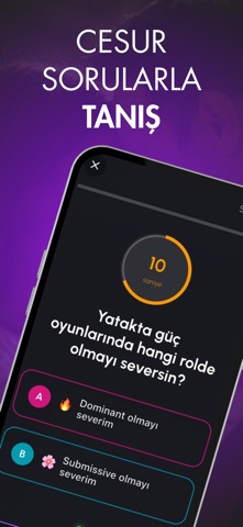

iPad screenshots
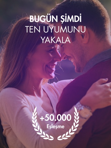

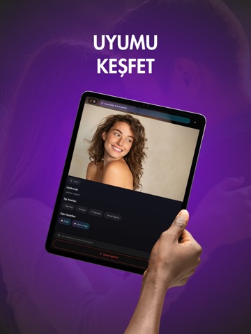


Icon palette
About this app
Sağa-sola kaydırmalı klasik flört uygulamalarını unut. Flipper, gizem, heyecan ve gerçek bağlantıyı bir araya getiren yeni nesil tanışma platformudur. Her kart bir sır, her çevirme yeni bir ihtimal, her eşleşme gerçek bir kıvılcım potansiyeli taşır. **Kart Çevir. Kıvılcımı Yakala. Ten Uyumunu Keşfet.** Flipper'da her şey adım adım ilerler. Önce enerjiyi hissedersin, sonra detayları keşfedersin. Çekim önce gelir, fotoğraflar ve profil bilgileri yavaşça ortaya çıkar. Sohbeti kim başlatacak, ilk adımı kim atacak, bağlantı nasıl büyüyecek - hepsi senin elinde. **Nasıl Çalışır?** **1. Bugün Şimdi Ten Uyumunu Yakala** Kartı çevir, yakınındaki biriyle tanış. +50.000 eşleşme ile büyüyen bir toplulukta yerini al. **2. Oyuna Katıl, Ten Uyumunu Test Et** Hemen profil fotoğrafı değil, önce oyun. Kartları çevirerek kimin seninle vibe uyumuna sahip olduğunu keşfet. **3. Uyumunu Keşfet** Ces…
App details
What you can learn from Flipper: Ten Uyumunu Yakala!
Every shipping app on the App Store has gone through the same decisions you're working through right now: which screenshot goes first, what caption sits over it, which device frame to show, what color the background should be. The 16 screenshots above are Flipper: Ten Uyumunu Yakala!'s answers to those questions — they're public, they're real, and they made it through Apple's review.
What the numbers say: Flipper: Ten Uyumunu Yakala! runs a dark set where the background shifts from screenshot to screenshot (first shot #341C2C) — each image has to stand on its own, so the captions carry more of the story. The accent colour we picked up, #7C3464, is the one to reuse for badges, arrows and highlighted words if you borrow this look. Hit Use this style to open the editor with these exact colours and drop your own screenshot in.
Notice the first screenshot in particular. It's the one users see in search results and on the product page, and it's where most apps spend their best caption and tightest design. Look at the proportion of background to phone, where the text sits, what one thing the image is trying to communicate.
Want to see how other Social Networking apps approach the same problem? Browse more Social Networking apps in the showcase.
Take what works into your own screenshots
Open LaunchShots and design your App Store & Google Play screenshots — pick a device frame, drop captions, ship in minutes. Free, in your browser.
Open the screenshot editor →Apps with a similar look
Closest background + accent colours among the listings we've analysed — useful when you want to see the same palette handled by a different team.