Chart position — tracked daily by LaunchShots
Screenshot style breakdown
Sampled from 5 of Nakedpress's App Store screenshots — background, accent and theme, measured by LaunchShots (not something Apple publishes).
#E4FCCC bg
#C8DDB3
#FC6444 accent
#111111 text
- #55 Weeks Weight Loss § Weeks Maag GERD
Captions read from the screenshots (OCR, may contain small errors): 1 headline, 8 words on average (longest 8).
Screenshots
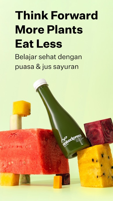
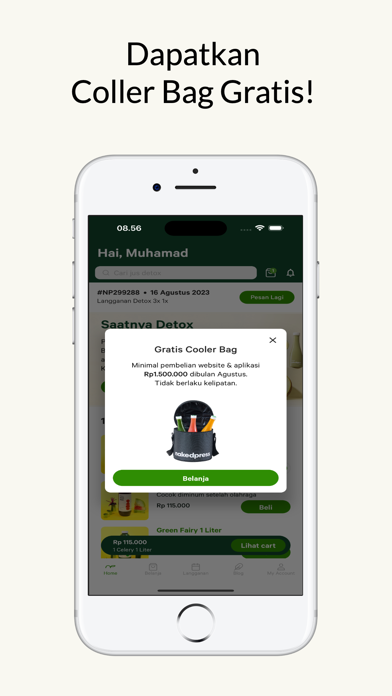
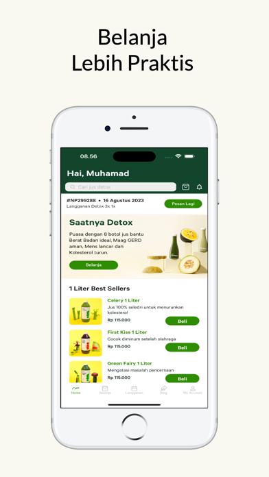
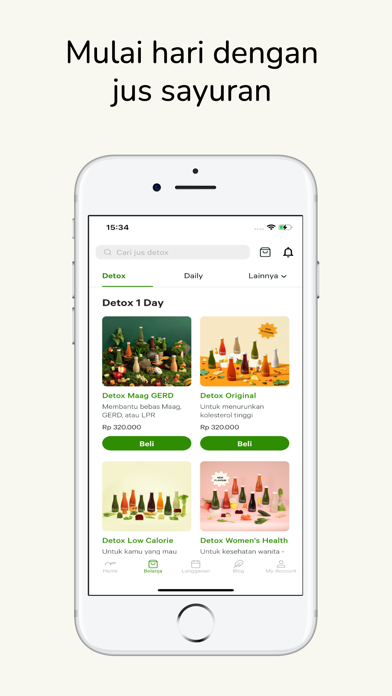
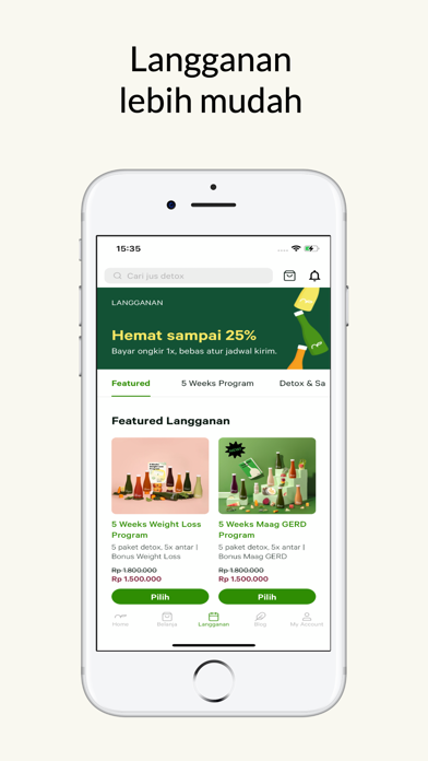
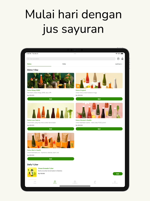
iPad screenshots


Icon palette
About this app
Mau belajar hidup sehat, tapi bingung mulai dari mana? Mau rajin minum jus sayuran tapi gak mau ngerasain ribet buat bikinnya? Download aplikasi nakedpress sekarang & dapetin berbagai info menarik & terkini seputar kesehatan, promo-promo & cerita inspirasi dari real customer nakedpress. nakedpress muncul di tahun 2015 dengan tujuan yang sederhana, menjual minuman yang bermanfaat bagi kesehatan. Berdasarkan berbagai jurnal medis dan studi kasus pelanggan, kami telah berhasil menciptakan 7 program nakedpress : Detox Original, Detox Maag GERD, Detox Low Calorie, Detox High Calorie, Detox Mens Teratur, 5 Weeks for weight loss & Maag GERD, 1 Liter. Kenapa harus download nakedpress? - Pesan jus jauh lebih mudah & praktis - Rasa cold pressed juice yang fresh, tanpa pengawet & pemanis tambahan - Lebih dari 1000 real testimoni yang berhasil kembali sehat dengan Detox - 1 Paket Detox nakedpress…
App details
What you can learn from Nakedpress
Every shipping app on the App Store has gone through the same decisions you're working through right now: which screenshot goes first, what caption sits over it, which device frame to show, what color the background should be. The 10 screenshots above are Nakedpress's answers to those questions — they're public, they're real, and they made it through Apple's review.
What the numbers say: Nakedpress runs a light set with one background colour (#E4FCCC) carried across every screenshot — the listing reads as a single poster when the shots sit side by side in search results. The accent colour we picked up, #FC6444, is the one to reuse for badges, arrows and highlighted words if you borrow this look. Hit Use this style to open the editor with these exact colours and drop your own screenshot in.
Notice the first screenshot in particular. It's the one users see in search results and on the product page, and it's where most apps spend their best caption and tightest design. Look at the proportion of background to phone, where the text sits, what one thing the image is trying to communicate.
Want to see how other Food & Drink apps approach the same problem? Browse more Food & Drink apps in the showcase.
Take what works into your own screenshots
Open LaunchShots and design your App Store & Google Play screenshots — pick a device frame, drop captions, ship in minutes. Free, in your browser.
Open the screenshot editor →Apps with a similar look
Closest background + accent colours among the listings we've analysed — useful when you want to see the same palette handled by a different team.