Chart position — tracked daily by LaunchShots
Screenshot changes — detected by LaunchShots
Screenshot style breakdown
Sampled from 6 of Yahoo!マップ - 最新地図、ナビや乗換案内も's App Store screenshots — background, accent and theme, measured by LaunchShots (not something Apple publishes).
#FCFCFC bg
#DDDDDD
#FCA404 accent
#111111 text
Screenshots


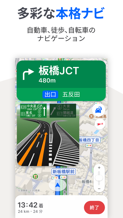
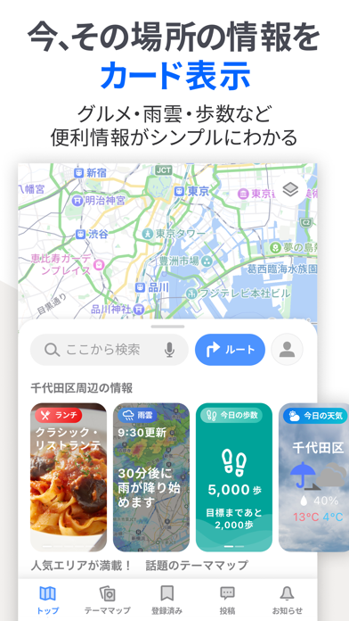


iPad screenshots


Icon palette
About this app
◆Yahoo!マップの特長◆ ・迷わない地図デザイン:見やすい文字やアイコンで知りたい情報がすぐに探せます。 ・わかりやすいナビ:車、自転車、徒歩移動にターンバイターン方式のナビを採用。目的地まで迷わず行けます。 ・テーママップ:「ラーメンマップ」「EV充電スポットマップ」など用途に応じた専用地図。 ・混雑予報:施設周辺や電車の混雑度がわかります。 ■まち歩きに最適、迷わない地図デザイン ・文字やアイコンはくっきり大きく、道路や建物の表現はシンプルに。欲しい情報がパッと目に入ります。 ・看板の目立つ施設や地下鉄の出口番号など、実際に歩く時に必要な情報が充実。 ・主要駅や地下街まで詳しくわかる屋内マップ。階ごとの地図で安心して移動できます。 ・文字のサイズを「標準」「やや大きい」「大きい」から選べます。 ■目的地までの経路や所要時間のわかる「ルート検索」 ・ルート検索は車・徒歩・公共交通機関・自転車・フライトの5つの移動手段から選択できます。 ・車のルートは「おすすめ」「高速優先」「一般優先」の3種類から選べま…
App details
What you can learn from Yahoo!マップ - 最新地図、ナビや乗換案内も
Every shipping app on the App Store has gone through the same decisions you're working through right now: which screenshot goes first, what caption sits over it, which device frame to show, what color the background should be. The 13 screenshots above are Yahoo!マップ - 最新地図、ナビや乗換案内も's answers to those questions — they're public, they're real, and they made it through Apple's review.
What the numbers say: Yahoo!マップ - 最新地図、ナビや乗換案内も runs a light set with one background colour (#FCFCFC) carried across every screenshot — the listing reads as a single poster when the shots sit side by side in search results. The accent colour we picked up, #FCA404, is the one to reuse for badges, arrows and highlighted words if you borrow this look. Hit Use this style to open the editor with these exact colours and drop your own screenshot in.
Notice the first screenshot in particular. It's the one users see in search results and on the product page, and it's where most apps spend their best caption and tightest design. Look at the proportion of background to phone, where the text sits, what one thing the image is trying to communicate.
Want to see how other Navigation apps approach the same problem? Browse more Navigation apps in the showcase.
Take what works into your own screenshots
Open LaunchShots and design your App Store & Google Play screenshots — pick a device frame, drop captions, ship in minutes. Free, in your browser.
Open the screenshot editor →Apps with a similar look
Closest background + accent colours among the listings we've analysed — useful when you want to see the same palette handled by a different team.