Chart position — tracked daily by LaunchShots
Screenshot style breakdown
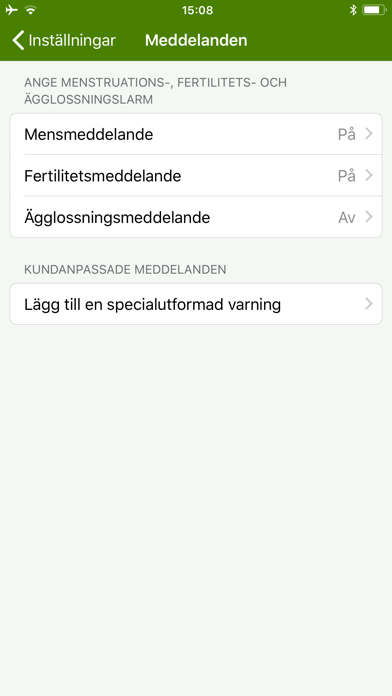
Sampled from 6 of Menskoll Lite's App Store screenshots — background, accent and theme, measured by LaunchShots (not something Apple publishes).
#4C8404 bg
#659527
#6CC4C4 accent
#FFFFFF text
Reading the caption text from the screenshots in your browser…
Screenshots



Icon palette
About this app
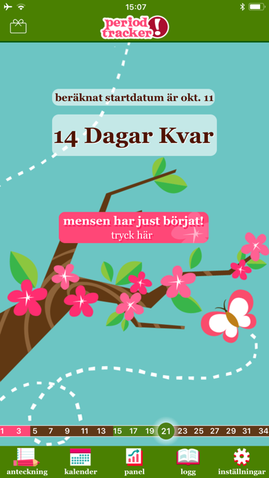
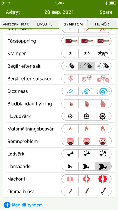
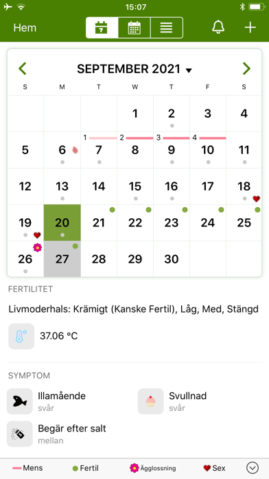
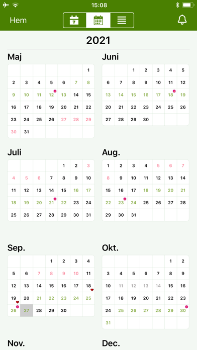
Menskoll är ENKELT och SNYGGT. * Tryck på en knapp när din mens börjar varje månad. Menskoll loggar dina datum och beräknar genomsnittet av de 3 senaste månadernas menstruationscykler för att förutsäga när nästa mens kommer att börja. * Titta på dina nuvarande och kommande mensdatum, ägglossning och fertila dagar, ditt humör och dina symptom i en enkel kalender med månadsvy. * Pryd din iPhones hemskärm med en snygg och diskret ikon. Det står helt enkelt "P Tracker". Menskoll har MASSOR MED FUNKTIONER. * Gör dagliga noteringar av humör och symptom under mensen * Exportera dina mensdatum och anteckningar till e-post backup eller för nästa besök hos doktorn. * Se antalet dagar till din nästa mens eller hur många dagar du gått över tiden. * Vet när du är mest fertil genom gulliga ikoner på din startskärm under din beräknade ägglossnings- och fertilitetsperiod. * Skydda din information med …
App details
What you can learn from Menskoll Lite
Every shipping app on the App Store has gone through the same decisions you're working through right now: which screenshot goes first, what caption sits over it, which device frame to show, what color the background should be. The 9 screenshots above are Menskoll Lite's answers to those questions — they're public, they're real, and they made it through Apple's review.
What the numbers say: Menskoll Lite runs a mixed light-and-dark set where the background shifts from screenshot to screenshot (first shot #4C8404) — each image has to stand on its own, so the captions carry more of the story. The accent colour we picked up, #6CC4C4, is the one to reuse for badges, arrows and highlighted words if you borrow this look. Hit Use this style to open the editor with these exact colours and drop your own screenshot in.
Notice the first screenshot in particular. It's the one users see in search results and on the product page, and it's where most apps spend their best caption and tightest design. Look at the proportion of background to phone, where the text sits, what one thing the image is trying to communicate.
Want to see how other Health & Fitness apps approach the same problem? Browse more Health & Fitness apps in the showcase.
Take what works into your own screenshots
Open LaunchShots and design your App Store & Google Play screenshots — pick a device frame, drop captions, ship in minutes. Free, in your browser.
Open the screenshot editor →Apps with a similar look
Closest background + accent colours among the listings we've analysed — useful when you want to see the same palette handled by a different team.