Chart position — tracked daily by LaunchShots
Screenshot style breakdown
Sampled from 6 of はてなブックマーク's App Store screenshots — background, accent and theme, measured by LaunchShots (not something Apple publishes).
#049CD4 bg
#27A9DA
#048C74 accent
#FFFFFF text
Screenshots
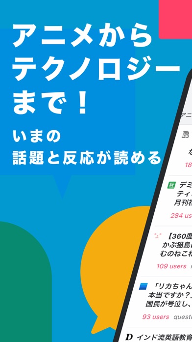
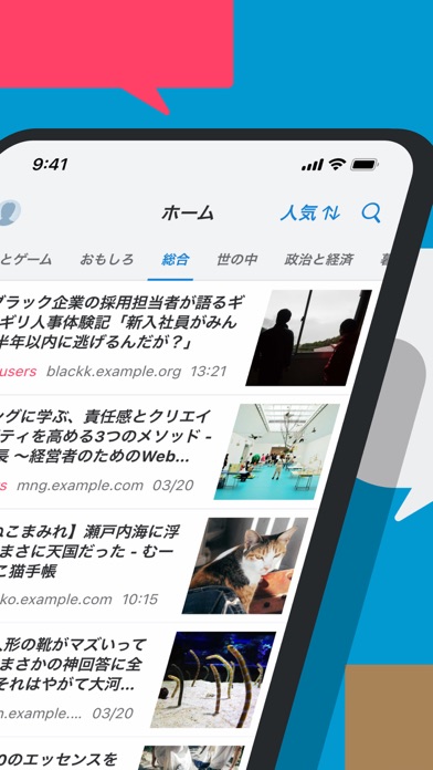
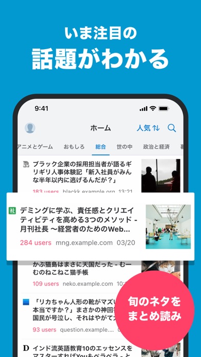
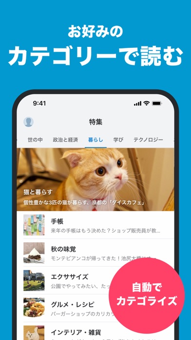
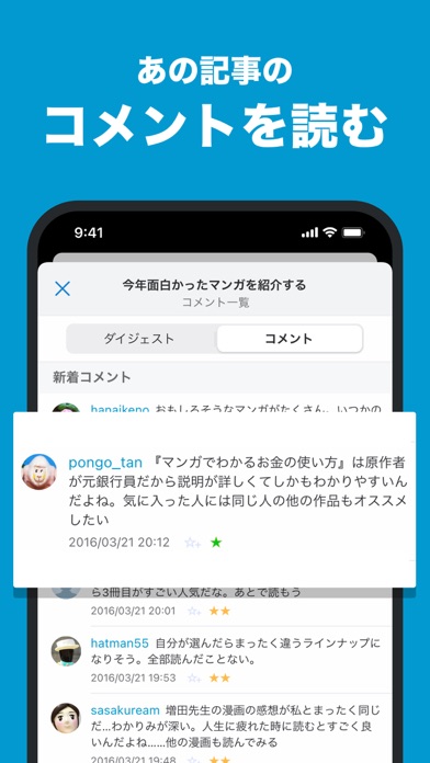
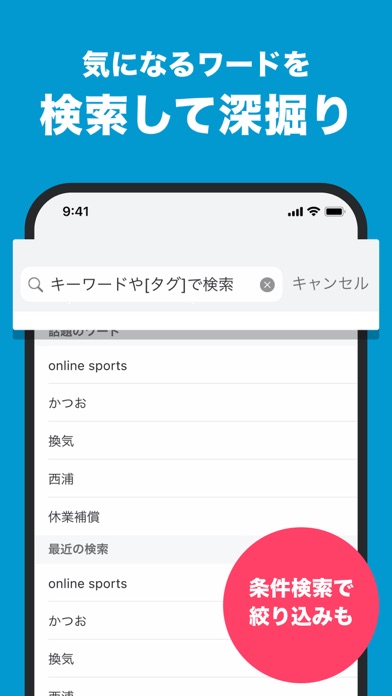
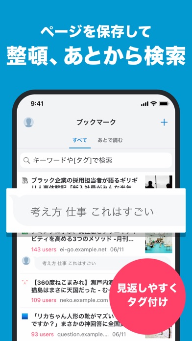
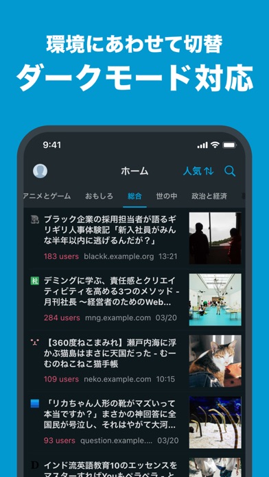
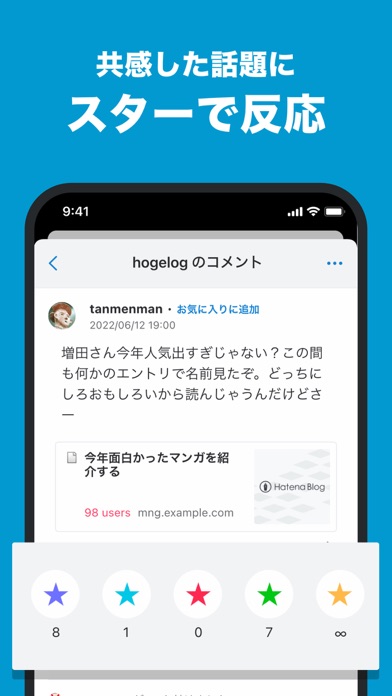
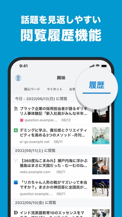
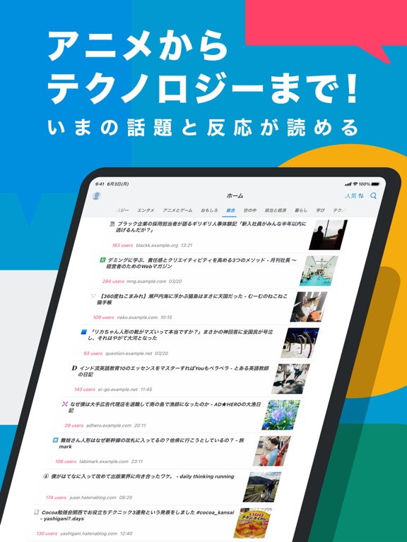
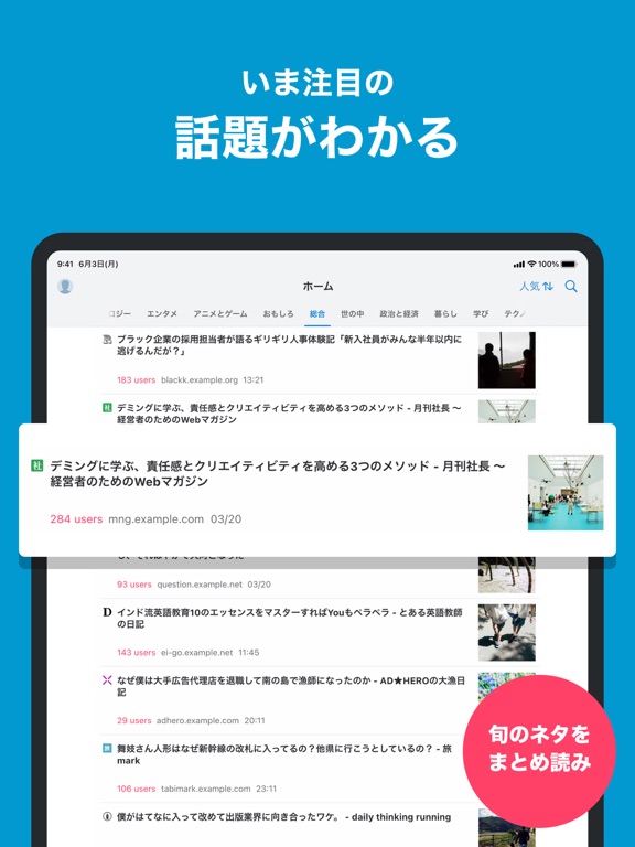
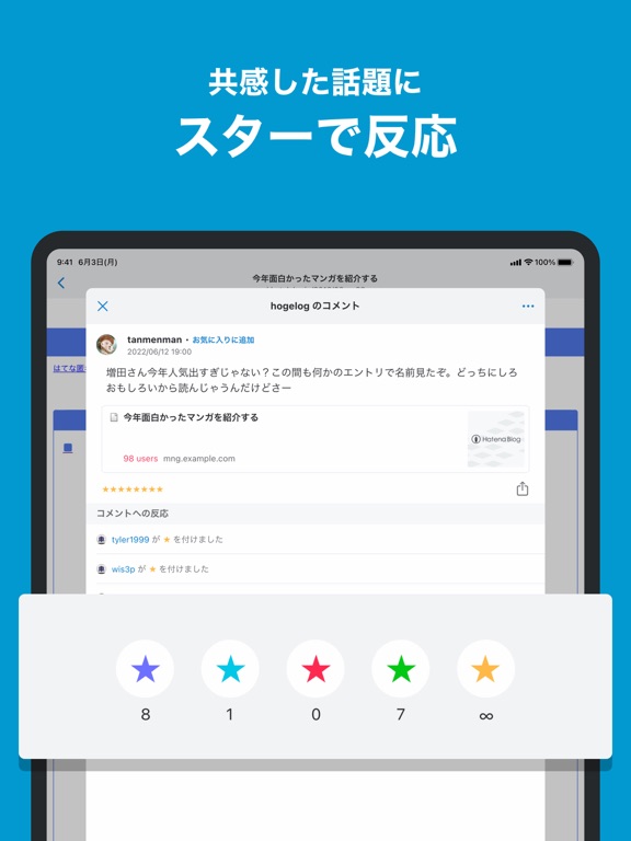
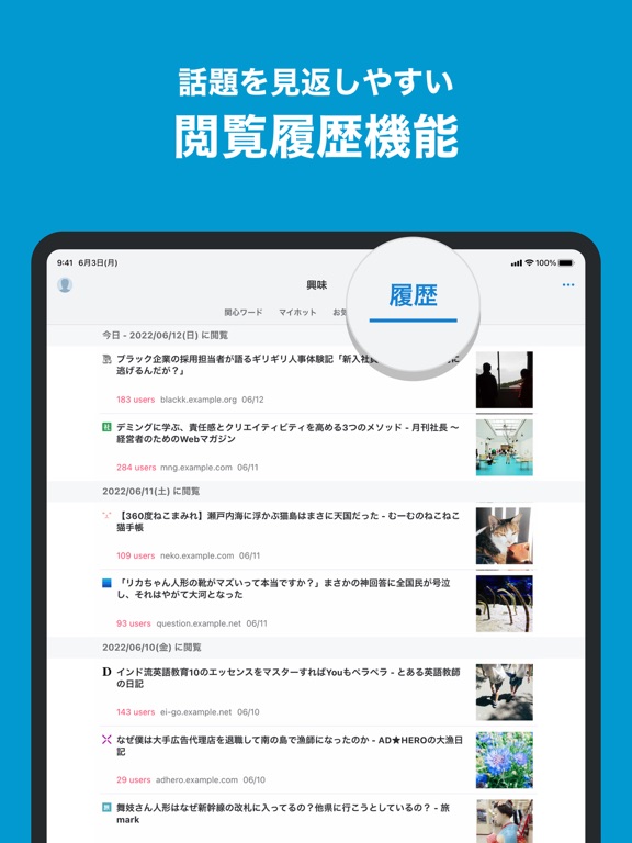
iPad screenshots
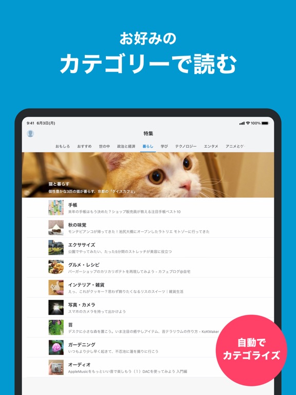
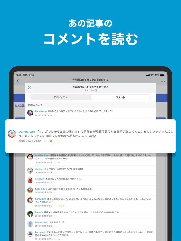
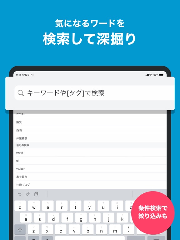
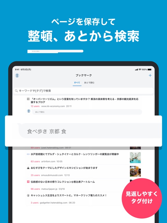

Icon palette
About this app
累計2.5億ブックマーク・1,000万を超えるサイトが読める! 国内最大ブックマークサービス「はてなブックマーク」公式アプリ ◆ はてなブックマーク(はてブ)の特徴 ・ネットの話題を、みんなのコメントと一緒に楽しめる ・政治ニュースからWebマンガまで、10種類のカテゴリと80種類以上の特集を用意 ・学術論文からラーメン店まで、検索機能で“みんなのオススメ”を発見 ・ブラウザや他のニュースアプリでも、ブックマークの追加や、人気コメントが発見できる ◆ ログイン機能でもっと便利に ・好きなページにコメントして、みんなと共有しよう ・気の合うユーザーをフォローして、ブックマークを見せ合おう ・ウィジェットで、未読ブックマークをサクッと消化 ・「ゲーム」「映画」「ジャニーズ」など、好きなキーワードを登録して最新情報をフォロー ◆ より良い体験のために もしこのアプリを気に入っていただけたら、ストアレビューから応援いただけると嬉しいです! 「私の好きな機能」や「こんな機能があったら良いな」をみんなに共有してみませんか? ◆ 問…
App details
What you can learn from はてなブックマーク
Every shipping app on the App Store has gone through the same decisions you're working through right now: which screenshot goes first, what caption sits over it, which device frame to show, what color the background should be. The 19 screenshots above are はてなブックマーク's answers to those questions — they're public, they're real, and they made it through Apple's review.
What the numbers say: はてなブックマーク runs a dark set with one background colour (#049CD4) carried across every screenshot — the listing reads as a single poster when the shots sit side by side in search results. The accent colour we picked up, #048C74, is the one to reuse for badges, arrows and highlighted words if you borrow this look. Hit Use this style to open the editor with these exact colours and drop your own screenshot in.
Notice the first screenshot in particular. It's the one users see in search results and on the product page, and it's where most apps spend their best caption and tightest design. Look at the proportion of background to phone, where the text sits, what one thing the image is trying to communicate.
Want to see how other News apps approach the same problem? Browse more News apps in the showcase.
Take what works into your own screenshots
Open LaunchShots and design your App Store & Google Play screenshots — pick a device frame, drop captions, ship in minutes. Free, in your browser.
Open the screenshot editor →Apps with a similar look
Closest background + accent colours among the listings we've analysed — useful when you want to see the same palette handled by a different team.