Chart position — tracked daily by LaunchShots
Screenshot changes — detected by LaunchShots
Screenshot style breakdown
Sampled from 6 of NAVITIME(地図と乗換の総合ナビ)'s App Store screenshots — background, accent and theme, measured by LaunchShots (not something Apple publishes).
#14141C bg
#34343B
#FCD444 accent
#FFFFFF text
Screenshots

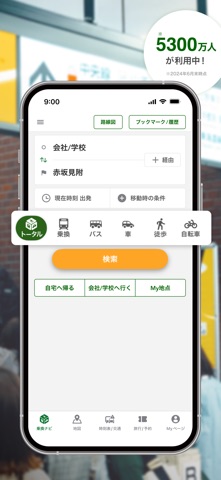


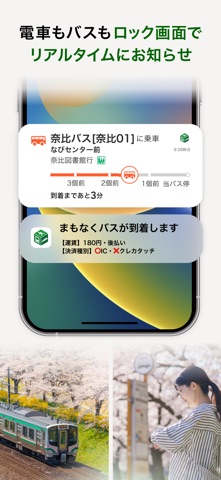
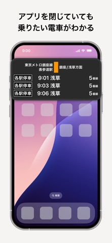


iPad screenshots
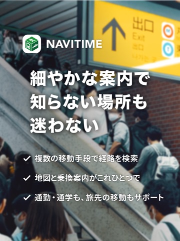


Icon palette
About this app
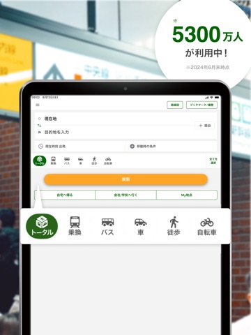
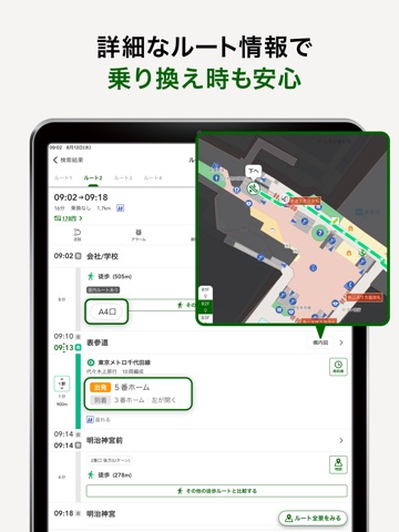
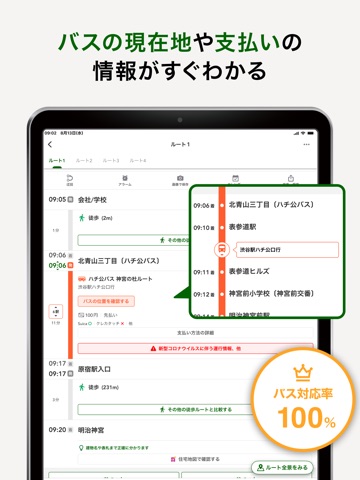
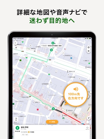
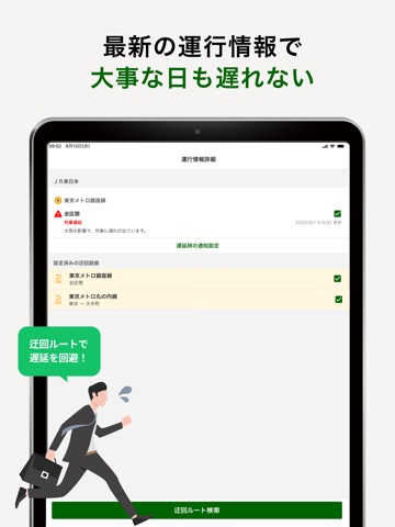
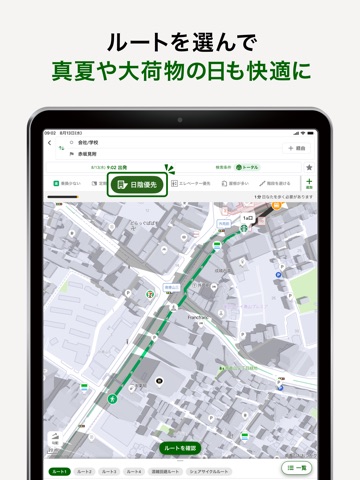
◆ 5,300万人*が利用する、日本最大級の総合ナビゲーション「NAVITIME」 徒歩・電車・バス・車・自転車・飛行機・シェアサイクルまで、あらゆる移動手段を組み合わせて目的地まで案内するトータルナビアプリです。青春18きっぷなどのフリーパスを優先したルート検索や、プロも使う住宅地図まで対応しているのは、NAVITIMEならではの強みです。 真夏の厳しい暑さ、ベビーカーや車いすでの移動、突然の電車遅延など、移動の悩みに寄り添い、リアルタイムデータと最適なルート計算で、いつでも安心しておでかけできるルートを提案します。 *当社サービス全体の月間ユニークユーザー数合計(2024年6月末時点) ◆◆◆ おでかけがもっと快適になる注目の新機能 ◆◆◆ ■ 涼しい時間が多いルート 夏の厳しい暑さの日でも、日陰や地下街、冷房の効いた車内を通るルートを優先してご案内します。電車の日差しが当たりにくい車両や弱冷房車、駅の待合室の位置に加え、ルート結果画面で紫外線量や暑さ指数もアイコンで確認できます。 ■ だれでも安心なバリアフリールート 駅のエレベ…
App details
What you can learn from NAVITIME(地図と乗換の総合ナビ)
Every shipping app on the App Store has gone through the same decisions you're working through right now: which screenshot goes first, what caption sits over it, which device frame to show, what color the background should be. The 20 screenshots above are NAVITIME(地図と乗換の総合ナビ)'s answers to those questions — they're public, they're real, and they made it through Apple's review.
What the numbers say: NAVITIME(地図と乗換の総合ナビ) runs a mixed light-and-dark set where the background shifts from screenshot to screenshot (first shot #14141C) — each image has to stand on its own, so the captions carry more of the story. The accent colour we picked up, #FCD444, is the one to reuse for badges, arrows and highlighted words if you borrow this look. Hit Use this style to open the editor with these exact colours and drop your own screenshot in.
Notice the first screenshot in particular. It's the one users see in search results and on the product page, and it's where most apps spend their best caption and tightest design. Look at the proportion of background to phone, where the text sits, what one thing the image is trying to communicate.
Want to see how other Navigation apps approach the same problem? Browse more Navigation apps in the showcase.
Take what works into your own screenshots
Open LaunchShots and design your App Store & Google Play screenshots — pick a device frame, drop captions, ship in minutes. Free, in your browser.
Open the screenshot editor →Apps with a similar look
Closest background + accent colours among the listings we've analysed — useful when you want to see the same palette handled by a different team.