Screenshot changes — detected by LaunchShots
Screenshot style breakdown
Sampled from 5 of 觀天氣's App Store screenshots — background, accent and theme, measured by LaunchShots (not something Apple publishes).
#747474 bg
#878787
#04448C accent
#FFFFFF text
Screenshots




Icon palette
About this app
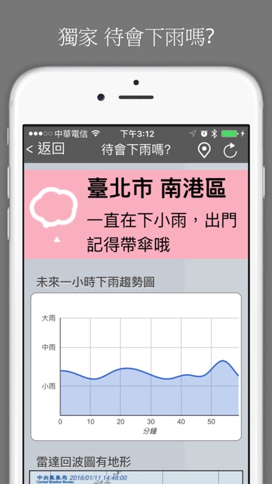
現在下雨嗎?待會下雨嗎?你那邊天氣如何?觀天氣獨家專利功能,PM2.5 空氣汙染資訊最完整,自動定位最近測站最方便。全新「報天氣」社群功能,讓全台使用者一起回報眼前的天氣實況——天氣,眼見為憑。 台灣天氣類 App 代名詞:觀天氣,最強大的天氣 APP 【功能簡介】: 1. 報天氣(全新登場!) 打開報天氣地圖,看全台網友回報的即時天氣實況與現場照片、影片;也可以隨手拍下你眼前的天空,與大家分享你所在地的天氣。發文、簽到累積積分,升級你的特派員等級。地圖同時提供雷達回波(可回看 14 天)、颱風路徑資訊與閃電分布圖層。 2. 台灣天氣資訊查詢、觀測 利用定位得知所在位置(鄉鎮市區)的天氣現況及未來幾天天氣情況。 3. 現在下雨嗎? 這不是預測,這是每幾分鐘就更新的即時資訊!根據中央氣象署在全台五百多個量測點的即時雨量,經過觀天氣的雲端運算並整理出最易理解的版面呈現。 4. 待會下雨嗎? 運用人工智慧技術對天氣雷達圖進行分析,精確預報未來一小時雨量變化,提供易於理解的外出建議。 5. 觀天氣影音台 氣象包羅萬象,觀天氣影音台讓你掌…
App details
What you can learn from 觀天氣
Every shipping app on the App Store has gone through the same decisions you're working through right now: which screenshot goes first, what caption sits over it, which device frame to show, what color the background should be. The 5 screenshots above are 觀天氣's answers to those questions — they're public, they're real, and they made it through Apple's review.
What the numbers say: 觀天氣 runs a dark set with one background colour (#747474) carried across every screenshot — the listing reads as a single poster when the shots sit side by side in search results. The accent colour we picked up, #04448C, is the one to reuse for badges, arrows and highlighted words if you borrow this look. Hit Use this style to open the editor with these exact colours and drop your own screenshot in.
Notice the first screenshot in particular. It's the one users see in search results and on the product page, and it's where most apps spend their best caption and tightest design. Look at the proportion of background to phone, where the text sits, what one thing the image is trying to communicate.
Want to see how other Weather apps approach the same problem? Browse more Weather apps in the showcase.
Take what works into your own screenshots
Open LaunchShots and design your App Store & Google Play screenshots — pick a device frame, drop captions, ship in minutes. Free, in your browser.
Open the screenshot editor →Apps with a similar look
Closest background + accent colours among the listings we've analysed — useful when you want to see the same palette handled by a different team.