Chart position — tracked daily by LaunchShots
Screenshot changes — detected by LaunchShots
Screenshot style breakdown
Sampled from 6 of ИИ Счетчик калорий и БЖУ Arise's App Store screenshots — background, accent and theme, measured by LaunchShots (not something Apple publishes).
#0CA46C bg
#2EB080
#0C5C34 accent
#FFFFFF text
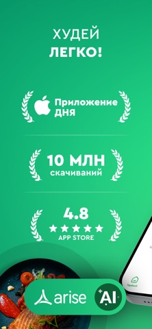
- #1ХУДЕЙ ЛЕГКО!
- #2СЧЕТЧИК КАЛОРИЙ!
- #3СДЕЛАЙТЕ ФОТО. ЗАПИШИТЕ. ГОТОВО.
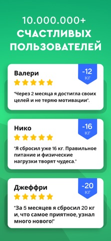
- #410.000.000+ СЧАСТЛИВЫХ ПОЛЬЗОВАТЕЛЕЙ
Captions read from the screenshots (OCR, may contain small errors): 4 headlines, 2.8 words on average (longest 4), mostly ALL CAPS.
Screenshots




Icon palette
About this app
Похудение начинается с понимания того, что ты ешь, — и с Arise это даётся легко. Arise — это приложение для подсчёта калорий и учёта еды на iPhone, которое помогает похудеть, питаться правильно и формировать привычки, которые действительно остаются с тобой. Оно устраняет главную причину, по которой люди бросают учёт: это долго, неудобно и легко забыть. С Arise ты записываешь любой приём пищи за секунды — ИИ-сканером еды, сканером штрихкодов или голосом. Поставь цель по снижению веса, смотри, как каждое блюдо вписывается в дневную норму калорий и БЖУ, и держись курса с сериями, напоминаниями и понятными графиками прогресса, пока здоровое питание не станет автоматическим. Более 10 миллионов загрузок и более 184 000 оценок в App Store — включая более 125 000 пятизвёздочных отзывов — делают Arise одним из самых надёжных счётчиков калорий. Рейтинг 4,6 звезды, доступно на 13 языках. Начни бе…
App details
What you can learn from ИИ Счетчик калорий и БЖУ Arise
Every shipping app on the App Store has gone through the same decisions you're working through right now: which screenshot goes first, what caption sits over it, which device frame to show, what color the background should be. The 10 screenshots above are ИИ Счетчик калорий и БЖУ Arise's answers to those questions — they're public, they're real, and they made it through Apple's review.
What the numbers say: ИИ Счетчик калорий и БЖУ Arise runs a dark set with one background colour (#0CA46C) carried across every screenshot — the listing reads as a single poster when the shots sit side by side in search results. The accent colour we picked up, #0C5C34, is the one to reuse for badges, arrows and highlighted words if you borrow this look. Hit Use this style to open the editor with these exact colours and drop your own screenshot in.
Notice the first screenshot in particular. It's the one users see in search results and on the product page, and it's where most apps spend their best caption and tightest design. Look at the proportion of background to phone, where the text sits, what one thing the image is trying to communicate.
Want to see how other Health & Fitness apps approach the same problem? Browse more Health & Fitness apps in the showcase.
Take what works into your own screenshots
Open LaunchShots and design your App Store & Google Play screenshots — pick a device frame, drop captions, ship in minutes. Free, in your browser.
Open the screenshot editor →Apps with a similar look
Closest background + accent colours among the listings we've analysed — useful when you want to see the same palette handled by a different team.