Chart position — tracked daily by LaunchShots
Screenshot changes — detected by LaunchShots
Screenshot style breakdown
Sampled from 6 of 楽天カード:明細確認アプリ's App Store screenshots — background, accent and theme, measured by LaunchShots (not something Apple publishes).
#FCECEC bg
#DDCFCF
#F46464 accent
#111111 text
Reading the caption text from the screenshots in your browser…
Screenshots


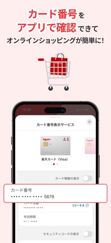
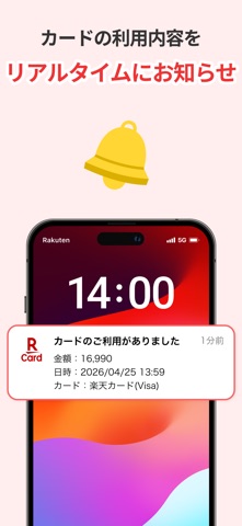
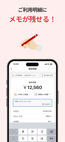
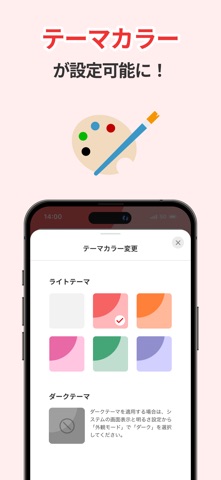


iPad screenshots

Icon palette
About this app
楽天カードの公式アプリ「楽天カードアプリ」 ◎指紋や顔認証で簡単・安全ログイン ◎いつでもどこでもご利用明細の確認が可能 ◎キャンペーンもポイントUP(楽天カードポイントプラス)情報も常に確認できる ◎会員サービスに簡単アクセス ◎総保有ポイントやお知らせ、サービス登録状況もカンタン確認 〈基本機能のご紹介〉 ・ホーム ご請求金額や引き落とし口座、サービスご利用状況の確認など ・ご利用明細 ご利用明細やお支払いの調整など ・キャンペーン 楽天カードのキャンペーンの紹介・エントリーなど ・ポイントUP(楽天カードポイントプラス) 楽天カードのポイントUP(楽天カードポイントプラス)の紹介など ・メニュー ご利用可能額の確認や楽天グループの金融サービスへのアクセス、アプリの設定など 〈その他おすすめ機能のご紹介〉 ・楽天ペイをワンタップで表示 ・ホーム画面のメッセージボックスで大事なお知らせもすぐわかる 〈ご注意〉 ・楽天カードをお持ちでない方は下記のリンクをブラウザーに入力、または「楽天カード」で検…
App details
What you can learn from 楽天カード:明細確認アプリ
Every shipping app on the App Store has gone through the same decisions you're working through right now: which screenshot goes first, what caption sits over it, which device frame to show, what color the background should be. The 10 screenshots above are 楽天カード:明細確認アプリ's answers to those questions — they're public, they're real, and they made it through Apple's review.
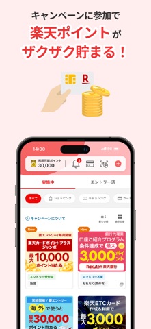
What the numbers say: 楽天カード:明細確認アプリ runs a light set with one background colour (#FCECEC) carried across every screenshot — the listing reads as a single poster when the shots sit side by side in search results. The accent colour we picked up, #F46464, is the one to reuse for badges, arrows and highlighted words if you borrow this look. Hit Use this style to open the editor with these exact colours and drop your own screenshot in.
Notice the first screenshot in particular. It's the one users see in search results and on the product page, and it's where most apps spend their best caption and tightest design. Look at the proportion of background to phone, where the text sits, what one thing the image is trying to communicate.
Want to see how other Finance apps approach the same problem? Browse more Finance apps in the showcase.
Take what works into your own screenshots
Open LaunchShots and design your App Store & Google Play screenshots — pick a device frame, drop captions, ship in minutes. Free, in your browser.
Open the screenshot editor →Apps with a similar look
Closest background + accent colours among the listings we've analysed — useful when you want to see the same palette handled by a different team.