Chart position — tracked daily by LaunchShots
Screenshot style breakdown
Sampled from 3 of パラレルスペース's App Store screenshots — background, accent and theme, measured by LaunchShots (not something Apple publishes).
#547CF4 bg
#6B8EF5
#2CBCAC accent
#FFFFFF text
Screenshots
Icon palette
About this app
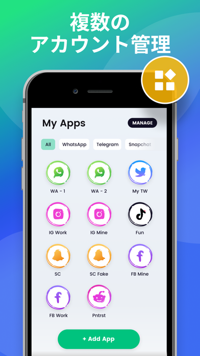
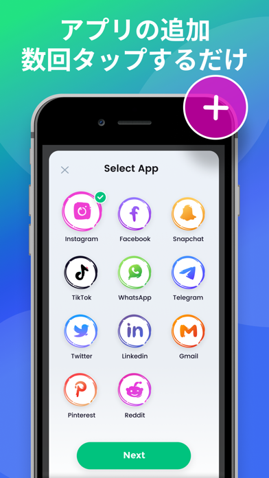
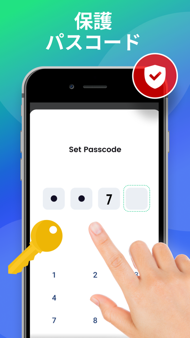
パラレルスペースアプリへようこそ! 一つのアプリで、ログアウト/ログインや異なるアカウント間の切り替えが必要な状況に直面したことがありますか?もしあなたの答えが「はい」なら、あなたは正しい道を歩んでいます。このアプリは、複数のソーシャルメディアアカウントを持ち、管理が難しいと感じているユーザーのために作られました。 アカウントの複製とは別に、Parallel Spaceは、あなたのデータのセキュリティを確保し、あなたのプライバシーを保護するために、アプリケーションのパスワードを設定するのに役立ちます。私たちのアプリは、ほぼすべての一般的なソーシャルメディアとサービスをサポートしています。 パラレルスペースの主な機能 - 複数のアカウントにログイン - 1台の携帯電話で複数のアカウントにログインし、オンライン状態を維持します。 - アカウントのセキュリティ - パスコードを設定し、自動的にログインすることができます。 - パスコード - プライバシーゾーンを構築し、プライベートなアカウントを保護します。 利用規約: https:/…
App details
What you can learn from パラレルスペース
Every shipping app on the App Store has gone through the same decisions you're working through right now: which screenshot goes first, what caption sits over it, which device frame to show, what color the background should be. The 3 screenshots above are パラレルスペース's answers to those questions — they're public, they're real, and they made it through Apple's review.
What the numbers say: パラレルスペース runs a dark set with one background colour (#547CF4) carried across every screenshot — the listing reads as a single poster when the shots sit side by side in search results. The accent colour we picked up, #2CBCAC, is the one to reuse for badges, arrows and highlighted words if you borrow this look. Hit Use this style to open the editor with these exact colours and drop your own screenshot in.
Notice the first screenshot in particular. It's the one users see in search results and on the product page, and it's where most apps spend their best caption and tightest design. Look at the proportion of background to phone, where the text sits, what one thing the image is trying to communicate.
Want to see how other Reference apps approach the same problem? Browse more Reference apps in the showcase.
Take what works into your own screenshots
Open LaunchShots and design your App Store & Google Play screenshots — pick a device frame, drop captions, ship in minutes. Free, in your browser.
Open the screenshot editor →Apps with a similar look
Closest background + accent colours among the listings we've analysed — useful when you want to see the same palette handled by a different team.